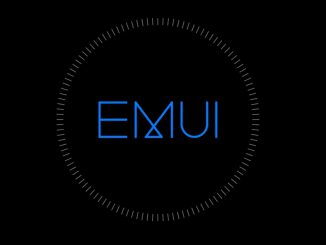
EMUI10 has finally landed on the P30 Pro, redesigning entire parts that were left untouched between EMUI8 and EMUI9.
Artículo disponible en Español | Article disponible en Français
Huawei has finally started rolling out the final version of EMUI10, based on Android 10. Surprisingly, the company has started deploying the final version a lot earlier than they did last year for EMUI9, with the P20 Pro or the Mate RS only getting EMUI9 at the end of December 2018/beginning of January 2019.
This new version introduces a more minimalistic layout, new animations and various other changes, renewing once again Huawei’s EmotionUI customization, although in a more drastic way than EMUI8 or EMUI9 did.
We also see the addition of a dark mode throughout the device, making reading on the smartphone a lot more comfortable. The company also promises that the new EMUI is a lot more responsive and faster overall, compared to EMUI9.
Sadly, we would rather say it right now: we heavily dislike this new version of EMUI, as the company has decided to move away from what they used to do in the past and choose a very modern, minimalistic approach. We are aware many users dislike EMUI, and bashed Huawei’s Android skin for years, although, from what we’ve seen over time and from actually having sold Huawei smartphones directly to customers, most people don’t know what EMUI is, or don’t actually mind it at all. Instead, those complaining are people having seen EMUI1.6 from 6 years ago and not having moved past that, or people that must find a fault somewhere, only being happy with Google’s terrible stock Android, which lacks half of what other manufacturer customizations have, such as the ability to record videos of the display, take scrollshots or many other features.
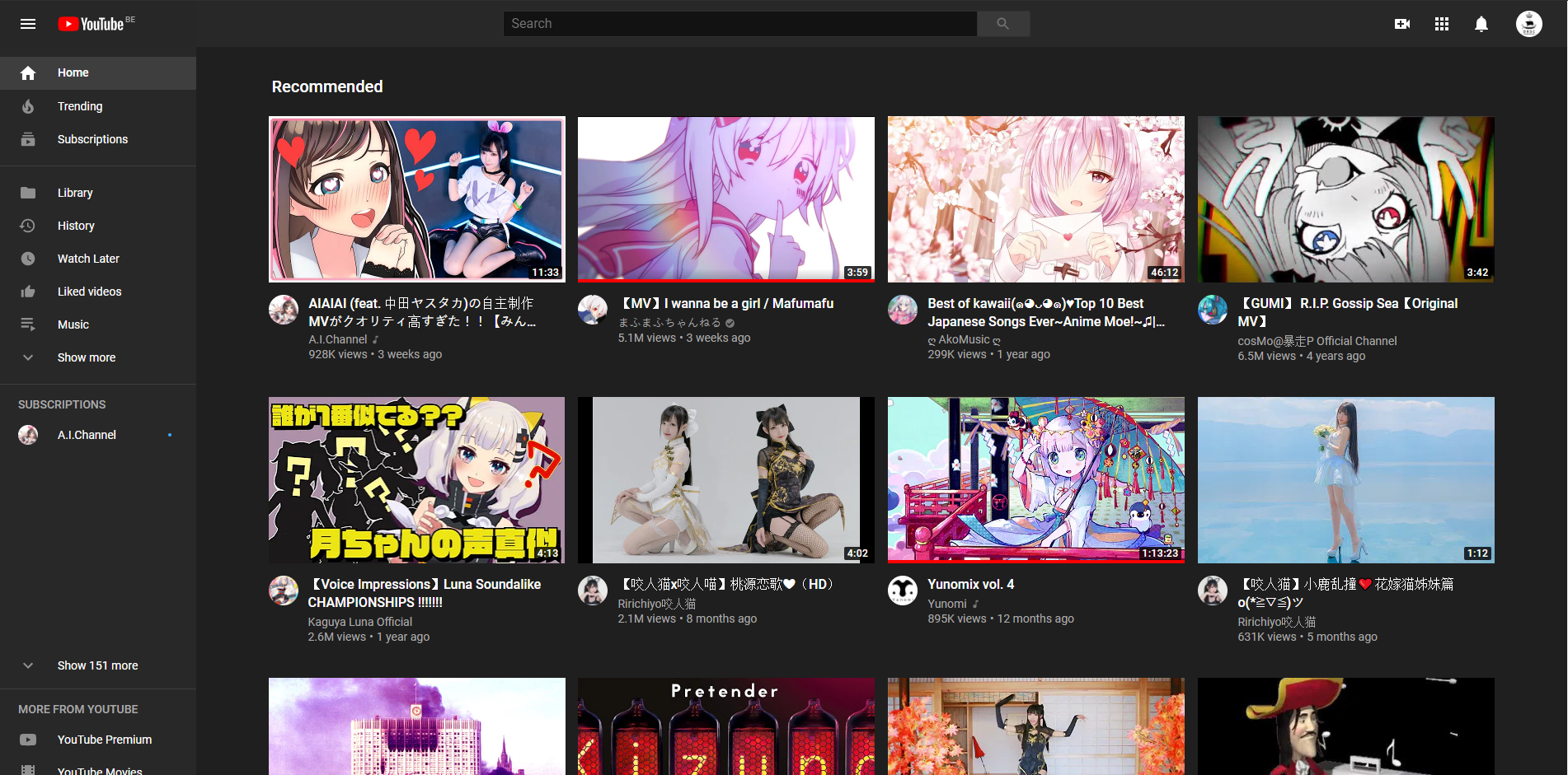
Coming back to the minimal layout, DRSC Publishers, DRSC Media’s owner, was amongst the pioneers of the use of minimalistic layouts on websites, having started using one over 7 years ago. What many companies seem to fail to understand in 2019 is that this minimalism does not work everywhere. Sometimes, things must be bloated, the existing space must be used. But for some reason, it would seem giving a bad user experience is a priority, with companies now running some kind of contest to see which userbase will have the biggest outcry. Right now, YouTube is winning, with their kiddie-like 8 video thumbnails welcome page. Huawei also seems to think its userbase is suddenly composed of either toddlers or extremely old people (we apologize in advance if someone feels attacked, but this is our impression), going as far as putting big text on the camera, as we’ll be able to see further. Here’s the current YouTube layout:
Anyway, as mentioned in the title of this article, we intend to have a very detailed look at EMUI10, covering as many details as possible, to an extend that some might get tired or even sick of it. We’ll start from the top (notifications panel), making our way through all the changes on the home screen and applications, the phone settings, animations and others. We are currently using a P30 Pro running EMUI10.0.0.168(C431E19R2P5patch01), and we’ll compare this to a P20 Pro running EMUI9.1.0.328(C432E5R1P9). Sometimes we might also compare the changes to EMUI8. Keep in mind that the EMUI9.1 version on the P20 Pro not always matches with the EMUI9.1 version on P30 Pro, with some features reserved to each device, meaning that EMUI10 on both devices will also be slightly different.
Let’s start by the basics, being the homage. Here’s the new one, side by side. Before going any further, we’ll make it clear here: the left side will always be EMUI9.1 and the right side EMUI10, unless specified otherwise:
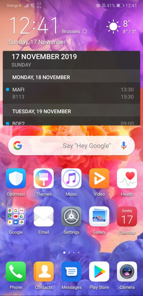
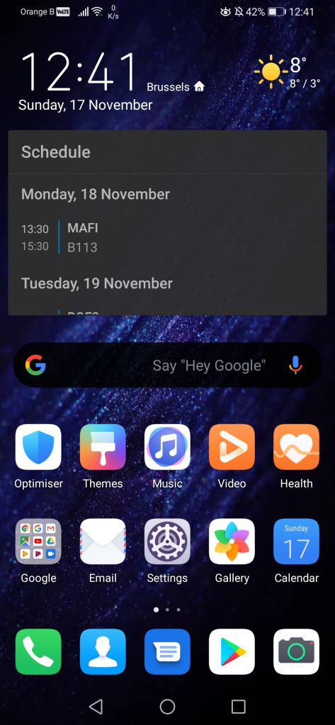
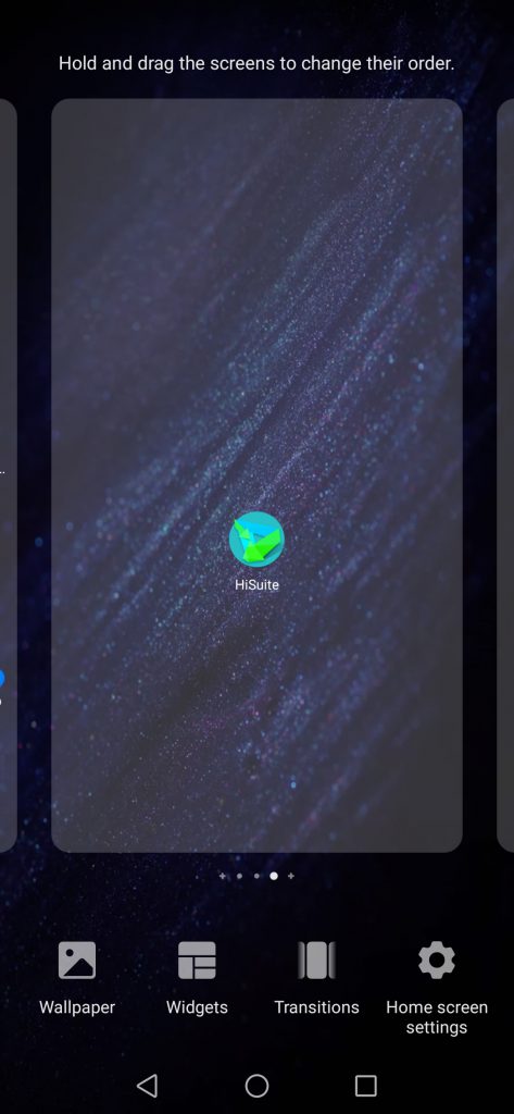
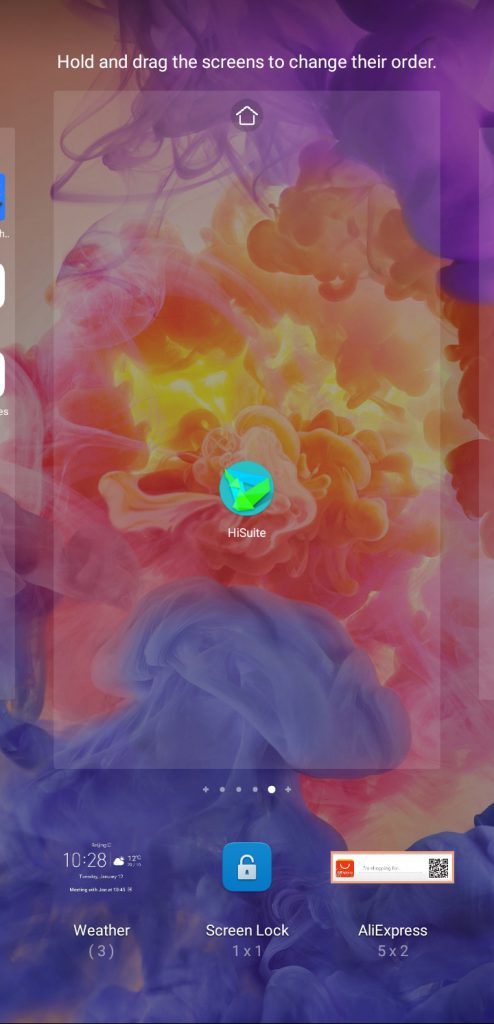
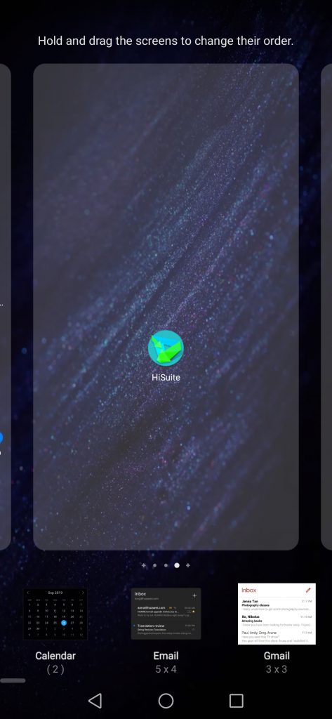
The customization of the home screen has not changed between EMUI9.1 to EMUI10. This is a shame, as the options included in EMUI8.1 and that were kept on EMUI9.0 on some devices such as the P20 Pro or the Mate RS Porsche Design were then removed with EMUI9.1, as we can see below:
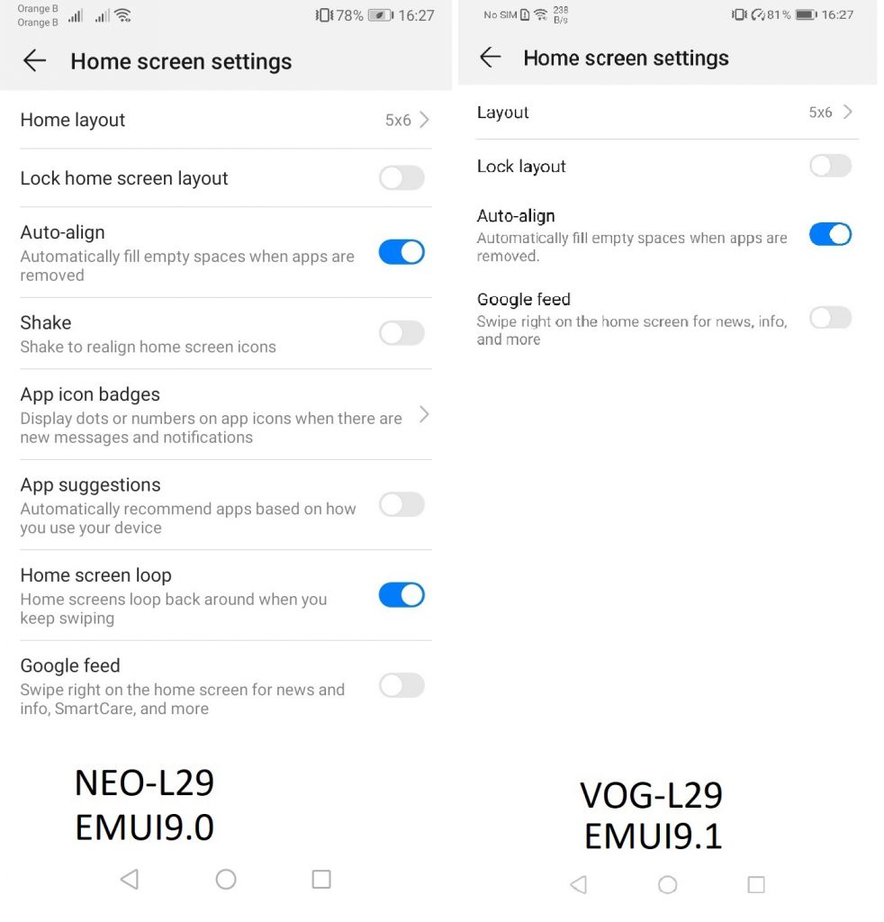
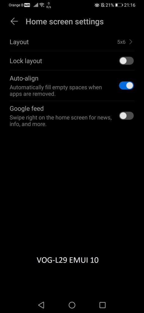
To access these customizations, the only option is “pinching” the screen, just as on EMUI9.1. Models that had other variants of EMUI before EMUI9.1 still have the option of long-pressing. Removing one option in newer versions but leaving both options in older versions is a rather curious design choice, but whatever:

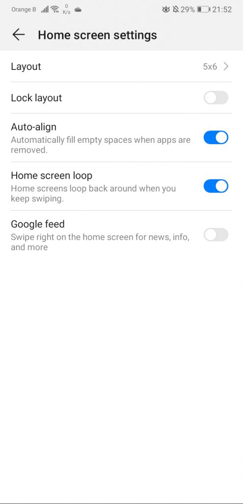
The settings screen itself has not changed much. We can see that the option to directly set a screen as home screen has been removed, although this is logical, as on the P30 Pro, one can’t have the home screen loop option. We can then notice the widgets have been slightly redesigned, with the most drastic change being the “Home screen settings”, moving from three dots to a cog:

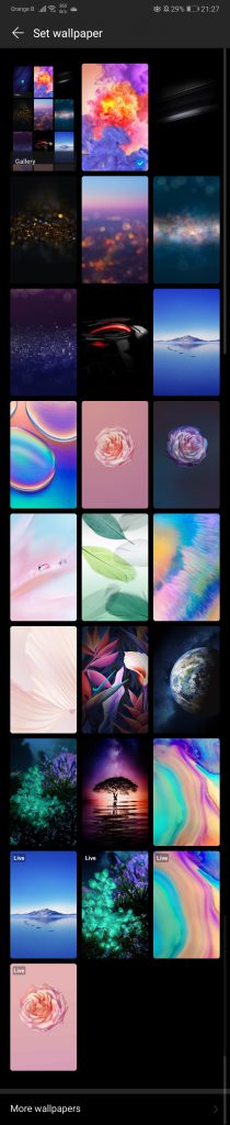
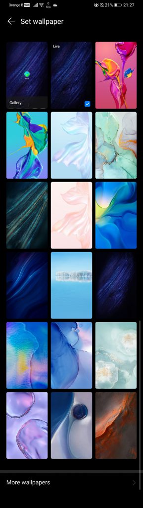
The wallpaper button allows users to switch to a different background. Ironically, the P20 Pro has a lot more stock wallpapers than the P30 Pro. This is not really a feature of EMUI10, as wallpapers can be downloaded from the Themes application, but it is still quite interesting to see the difference. The P20 Pro comes with 24 stock wallpapers, 4 of them being animated, and all of them being extremely beautiful to look at. Meanwhile, the P30 Pro only has 17, with one being animated. Of course, out of these 17, 3 are new, coming with EMUI10. Even more ironic, two themes added in a recent update, “Mirror Sea” and “Biarritz”, which came out with the two new colours of the P30 Pro, Mystic Blue and Misty Lavender, seem to now be gone:

The widgets section doesn’t seem to have changed much, and, if we are fully honest, we will not bother looking at every single widget available, otherwise this will turn into a widget review:
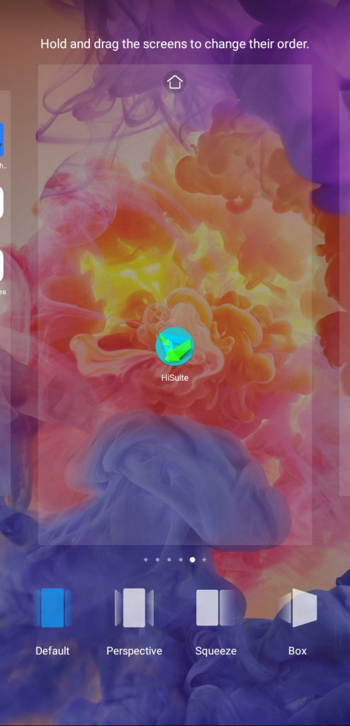
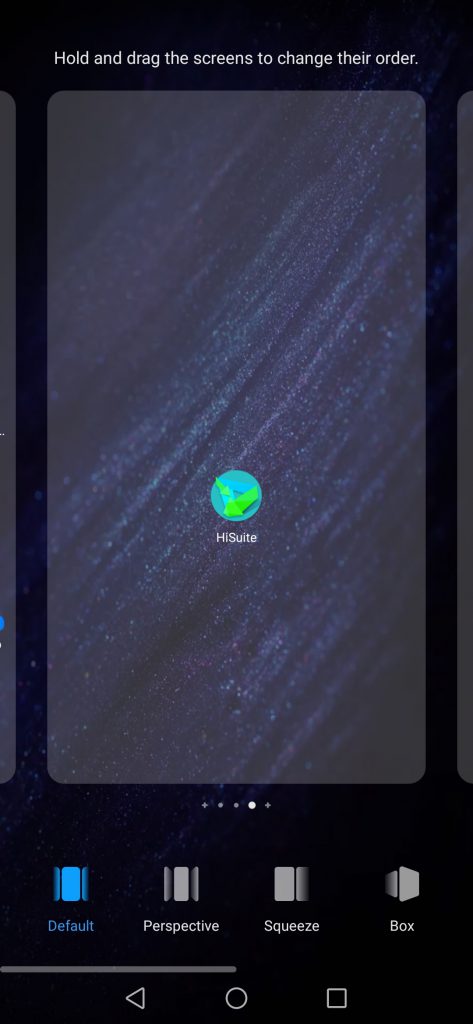
For transition animations, none has changed, with all of them still available and having the same icon. These include “Default”, “Perspective”, Squeeze”, “Box”, “Flip over”, “Rotate”, “Page” and “Windmill”:
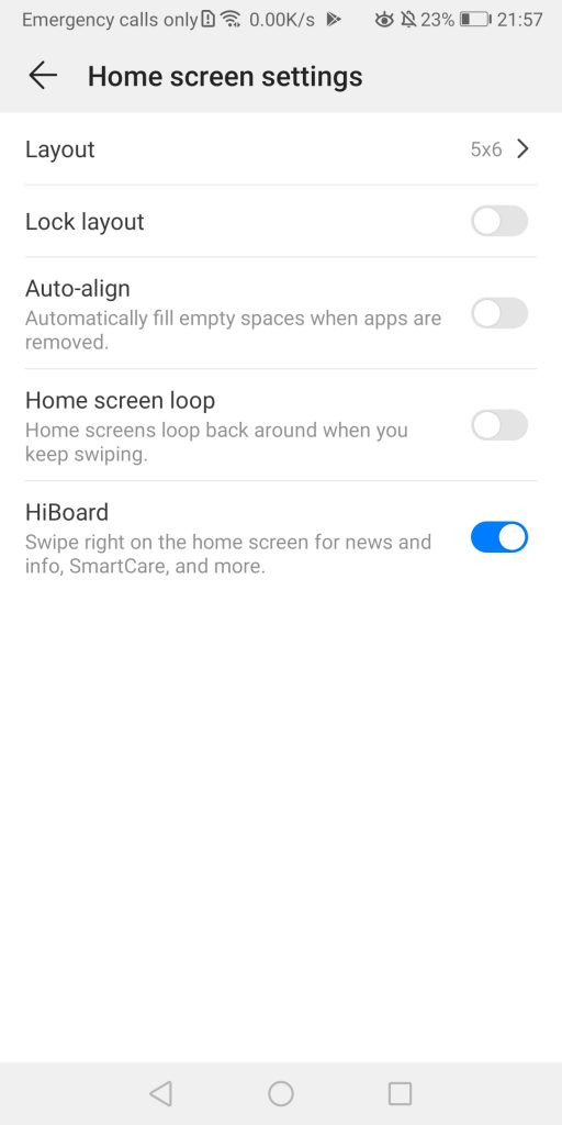
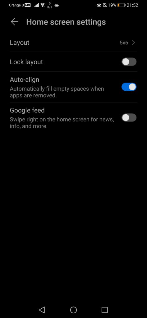
Last but not least, and as already covered, the “Home screen settings” allow users to pick how many applications they want to see per screen (if they use the default EMUI look, instead of the terrible app drawer from stock Android), to eventually lock this layout or auto-align applications automatically if one is uninstalled. Finally, it is also here where one can disable the horrible Google feed. Of course, we can mention here how Huawei is already actively replacing this feed with their own, with the Huawei Assistant (HiBoard) being in beta. Those interested can check out our full article on it here:
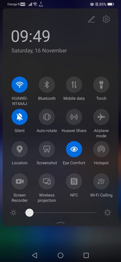
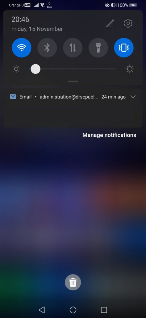
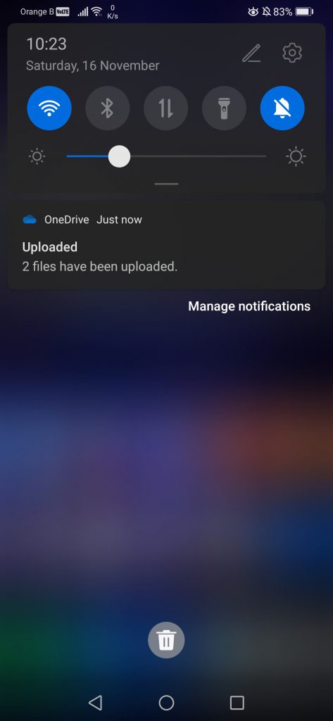
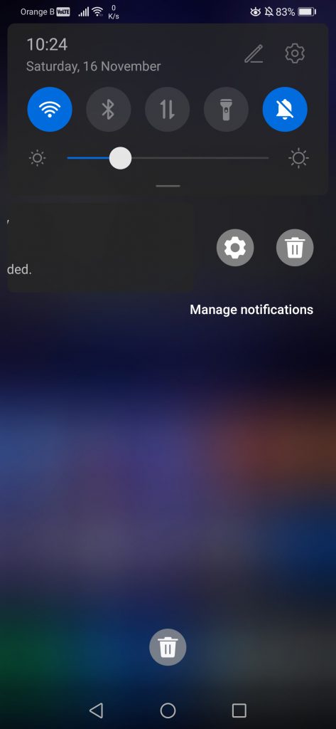
If we now have a look at the notifications panel, over which we’ve ranted for a whole paragraph, this one has been heavily redesigned. From the outside, nothing seems to have changed. In reality, the letters are now a lot brighter than before the update, and it doesn’t appear to be possible to change this. We can’t help but wonder whether having such bright letters might result in burn-in, although, at the luminosity we set the screen in general, this is highly unlikely. In this case, the top is EMUI9.1, the bottom is EMUI10:


Moving on to the actual notifications panel, the design has been entirely changed, with this one now taking the entire space on the screen, instead of roughly more than half of it, as it can be seen on the following screenshots. This has been achieved by making the icons bigger and placing 4 per row instead of 5, which, as we’ve already mentioned, we find quite annoying:
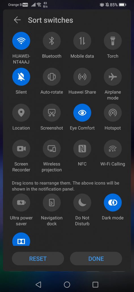
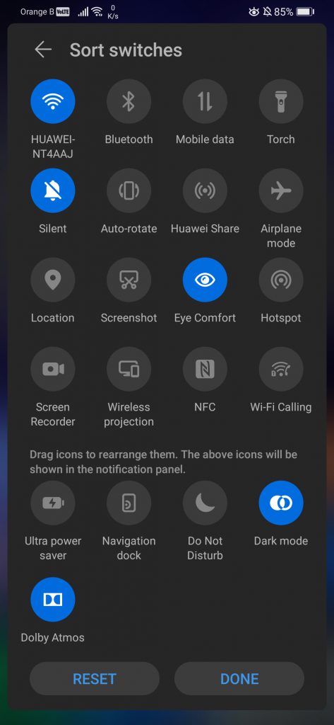
If we enter the edition mode to add or remove icons, we can see that little has changed, if not for the addition of a direct toggle for the dark mode. We can also notice that they’ve moved the “Reset” button to the bottom and added a “Done” button. However, if one uses the 3-key navigation menu, the last icon is cut off. This doesn’t happen if using the gestures navigation, although they could have easily adjusted this by making the icons slightly smaller if the user has the 3-key navigation menu enabled. Regardless, this is the kind of menu users access once and then never touch again, so this small design mistake is irrelevant:

And here’s a short video looking at the animations of the notifications panel. Yes, we’ll be covering every single detail:
Since this is the notifications panel, let’s have a look at the notifications themselves. These have been redesigned too, to match the aesthetics of the rest of the notification panel:

The main changes are in the options given to interact with said notifications. Full swipes left or right will delete the notifications, so nothing changed there. Swiping left slightly reveals a menu, allowing to delete said notification with the trash can, or access extra settings:
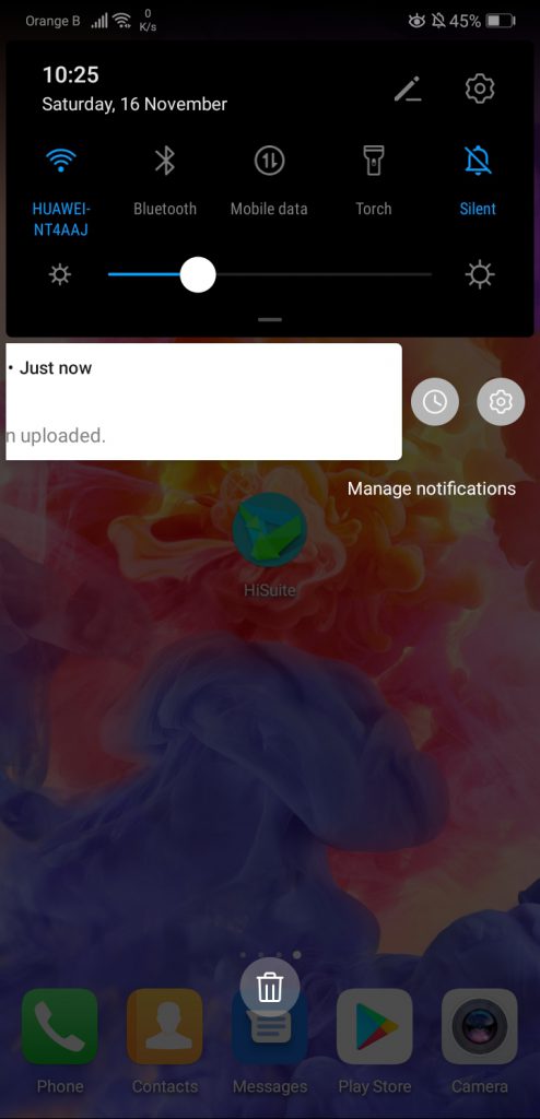
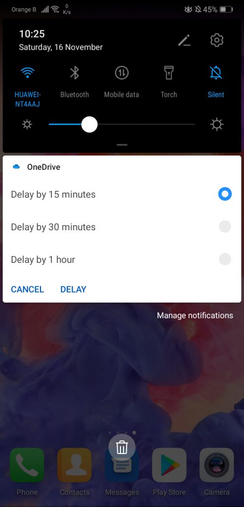
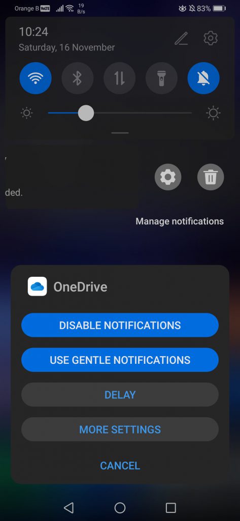
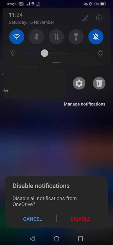
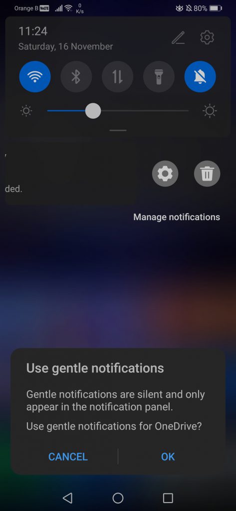
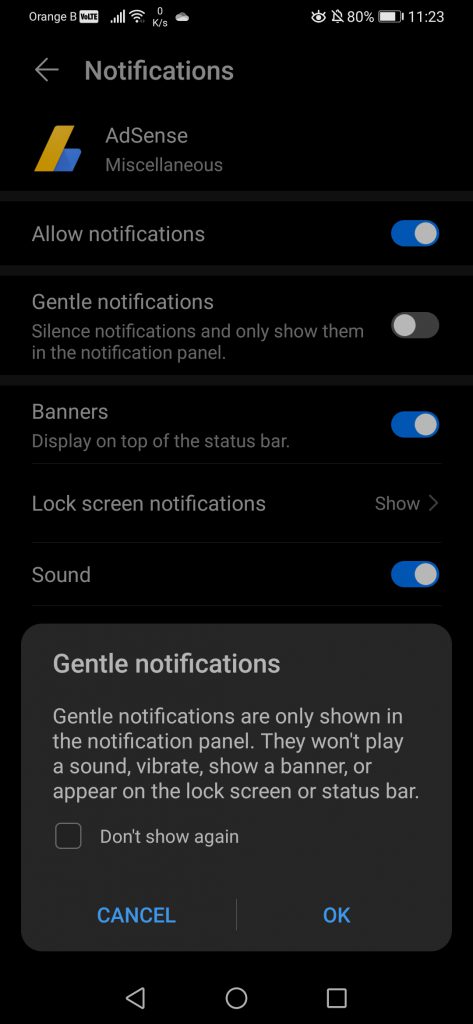
While previously it was only possible to delay them, now users can disable the notifications of that specific application, enable the “Gentle notifications”, which essentially restricts them to the notifications panel, delay them or access extra settings:

And here’s a video with the animation of the notifications in EMUI10:
We’ve also had a look at the box that appears whenever a new notification is displayed, and we’ve also slightly slowed down the video to properly see where said notification box appears and disappears:

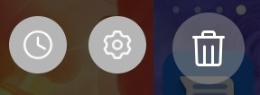
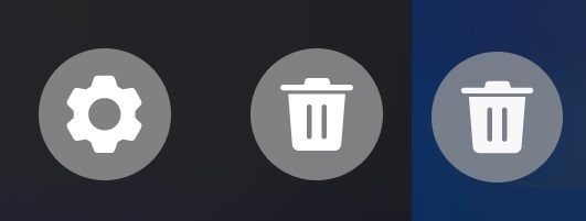
A small detail that changed and that yes, we are pointing out, is the new design of the notifications’ settings cog, as well as the trash can to clean the notifications area. Top is EMUI9.1, bottom is EMUI10:
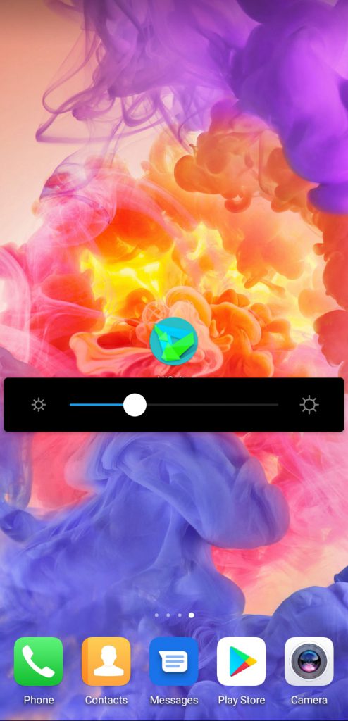
The last thing left to check out in the notifications bar is the display brightness bar, which, if we hold it, becomes its own independent block on the display while setting the luminosity we want:
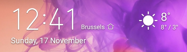
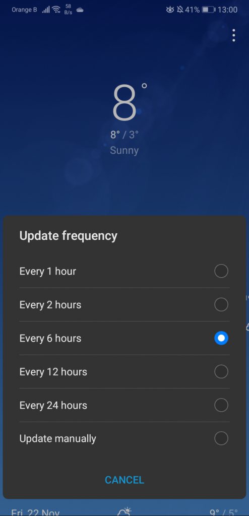
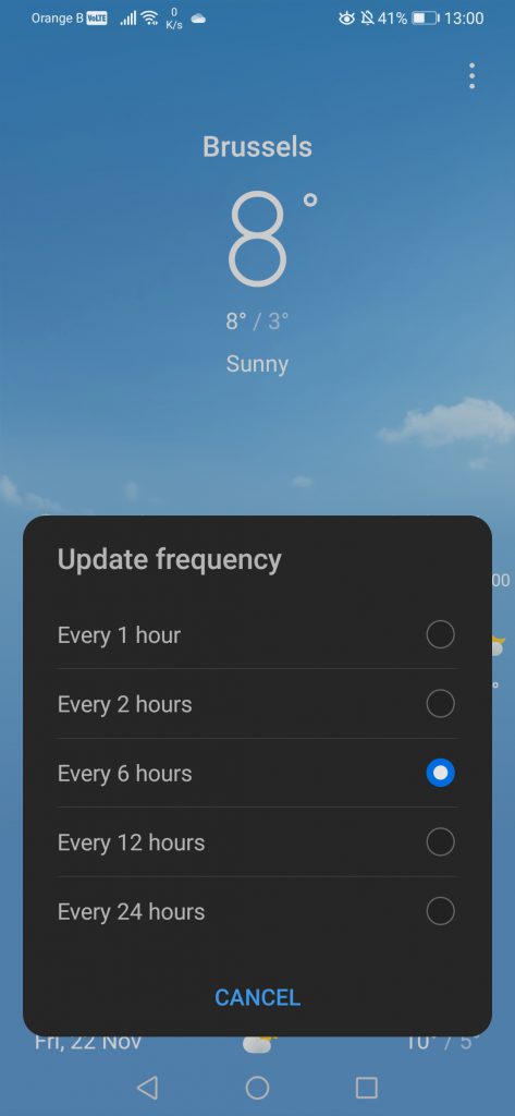
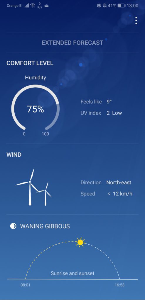
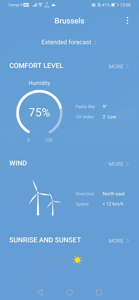
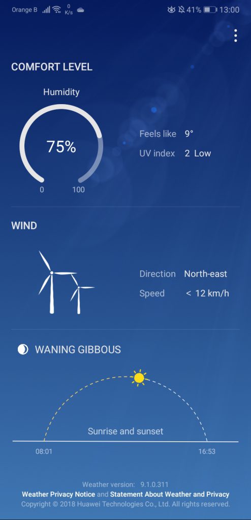
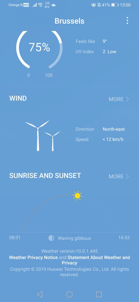
If we now move on to the Weather application, the one provided by Huawei, we can see a slight redesign. While the font remains overall the same, the house next to the city name is now filled, and the sun went from being white to being yellow. We’ve checked whether this is because our P20 Pro theme is a lot more colourful, but it seems this is not the case, with the sun remaining white regardless of the theme applied. Once again, top is EMUI9.1, bottom is EMUI10:

The application itself has been slightly redesigned too. While overall it looks and feels the same, some details have changed of place, such as the location. We can also see a lighter theme used overall in the app, but the animations remain the same:
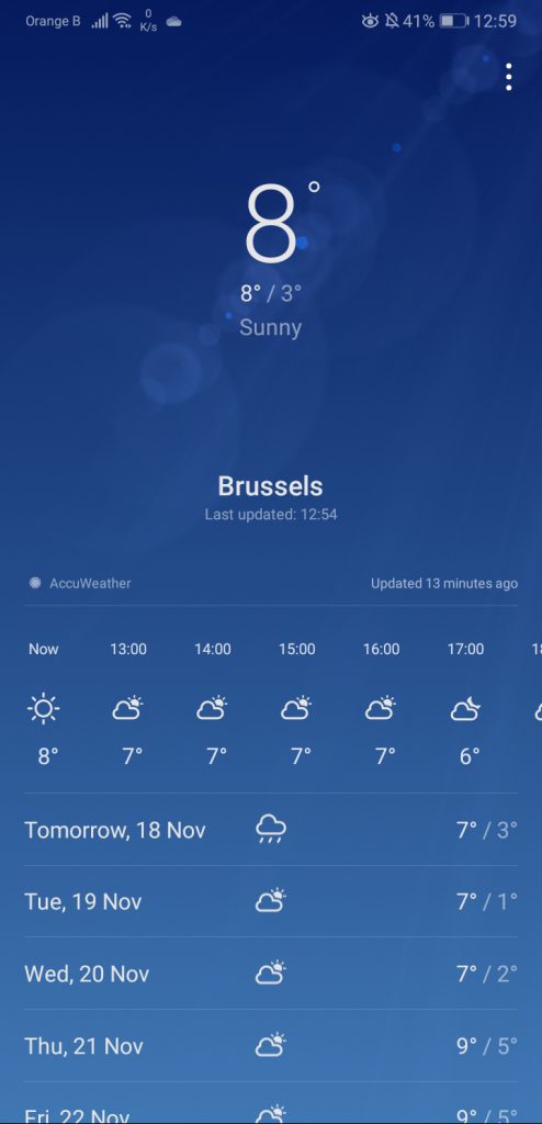
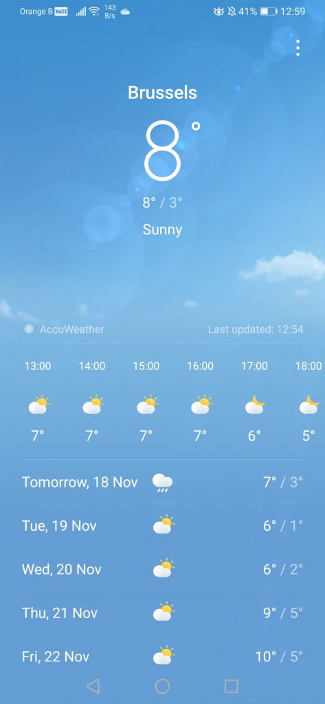

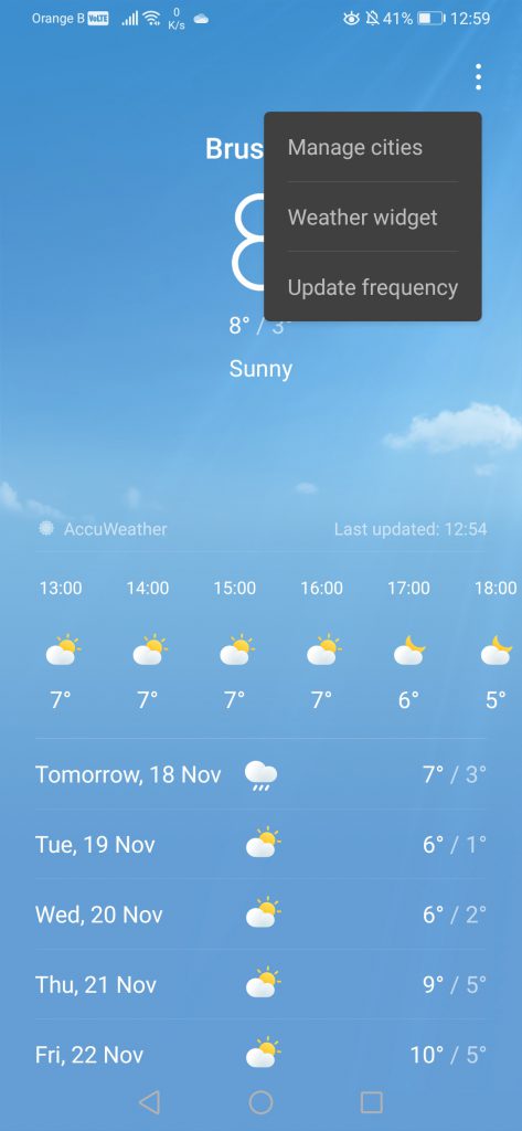

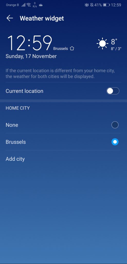
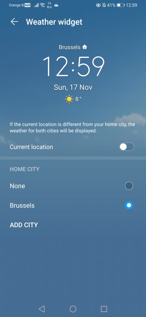
Other changes involve an easier access to the “Comfort level”, “Wind” and “Sunrise and sunset” features, linking directly to the sections of AccuWeather. While this is nothing impressive or revolutionary, it’s some extra comfort for the user. The application itself has also changed of version, going from 9.1.0.311 to 10.0.1.445.
This marks the ending of this first part of our look at EMUI10. While we are aware we’ve barely scratched the surface, we would rather cut it down in multiple parts to avoid having to load too many pictures and videos at once on a single page, as this eventually breaks it.
Here are the following sections:
More on this subject:
- Huawei P30 Pro receives Android 10 and EMUI10.0 (14/11/2019)
- Huawei P30 Pro receives update: September 2019 security patch (9/11/2019)
- Huawei launches EMUI10 beta for 8 more devices (30/10/2019)
- Various P30 series C431 Huawei users report being unable to join the EMUI10 beta (13/09/2019)
- Huawei opens P30 and P30 Pro EMUI10 beta in Europe (7/09/2019)