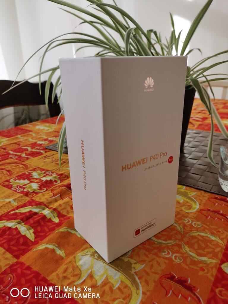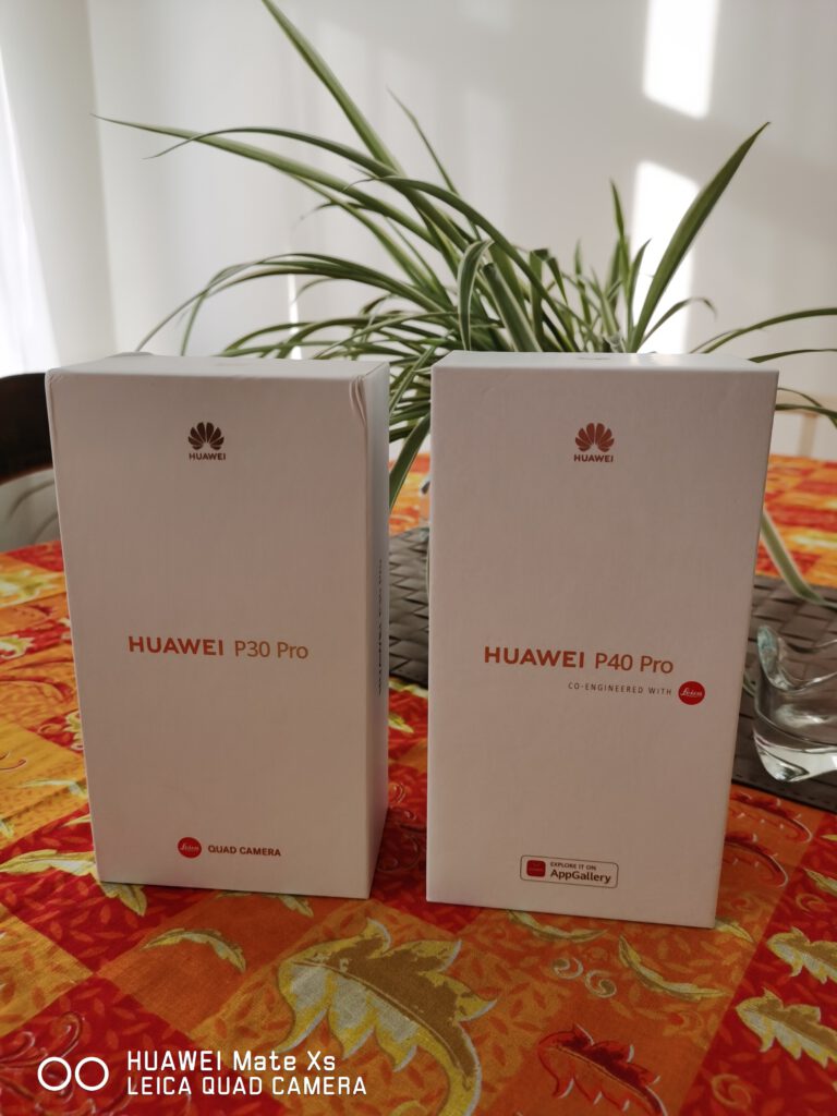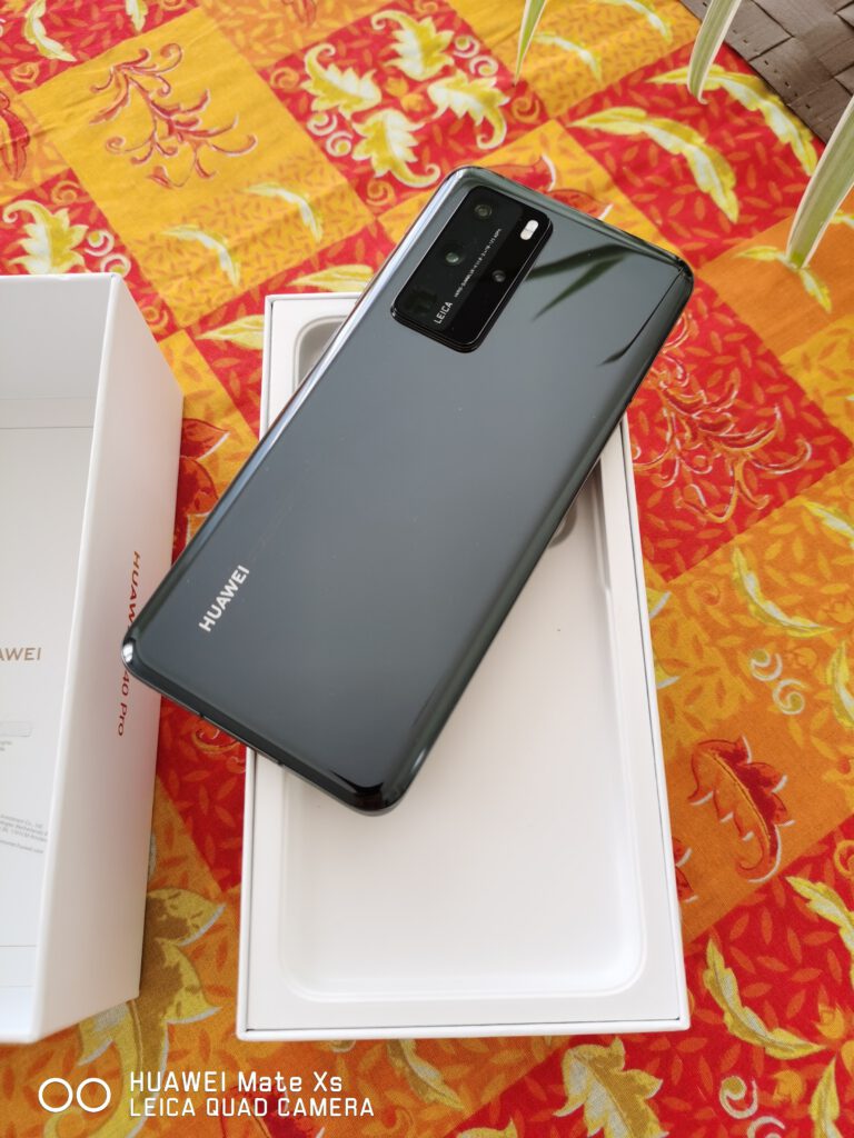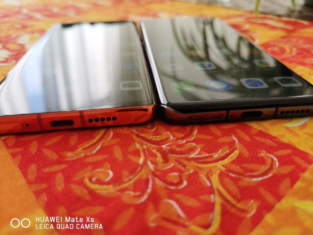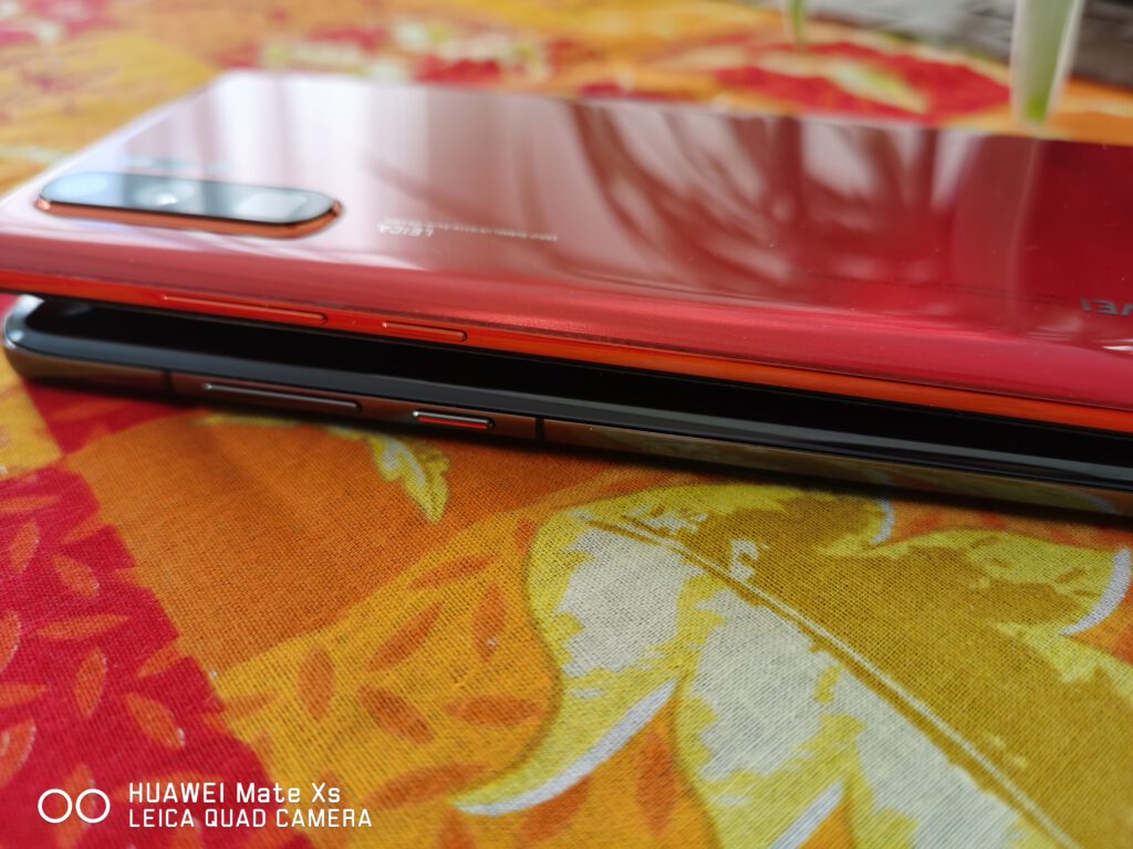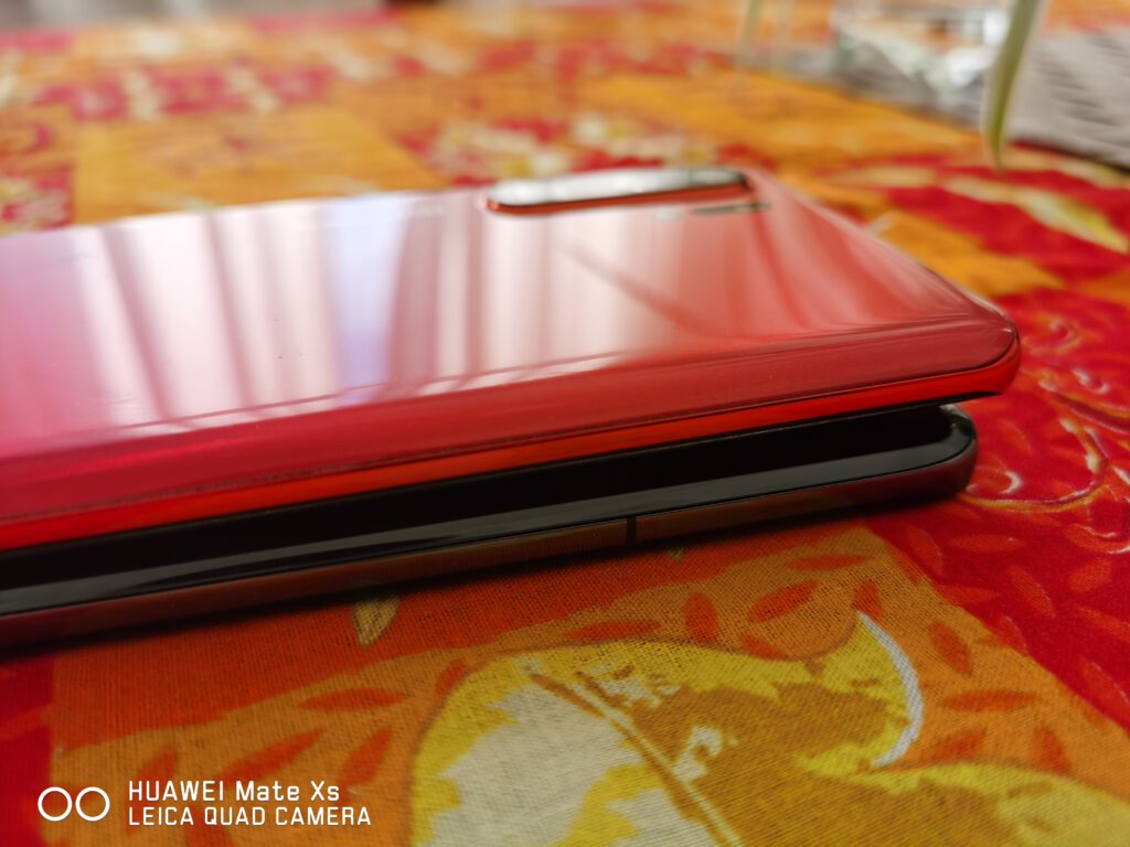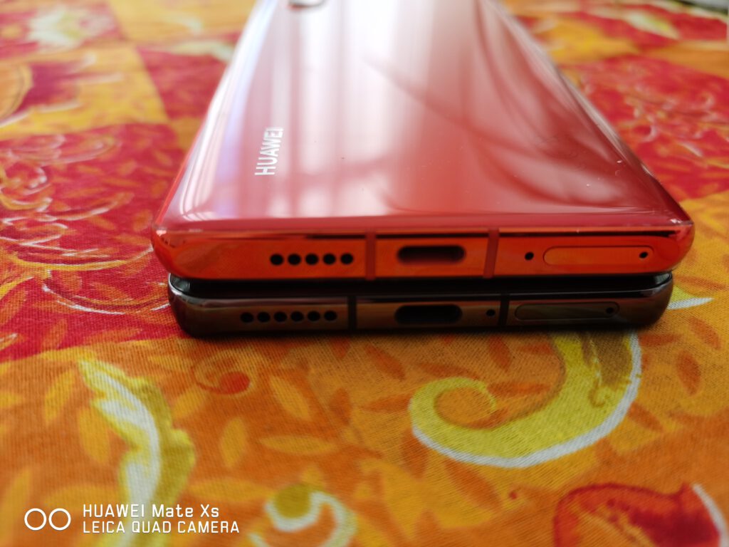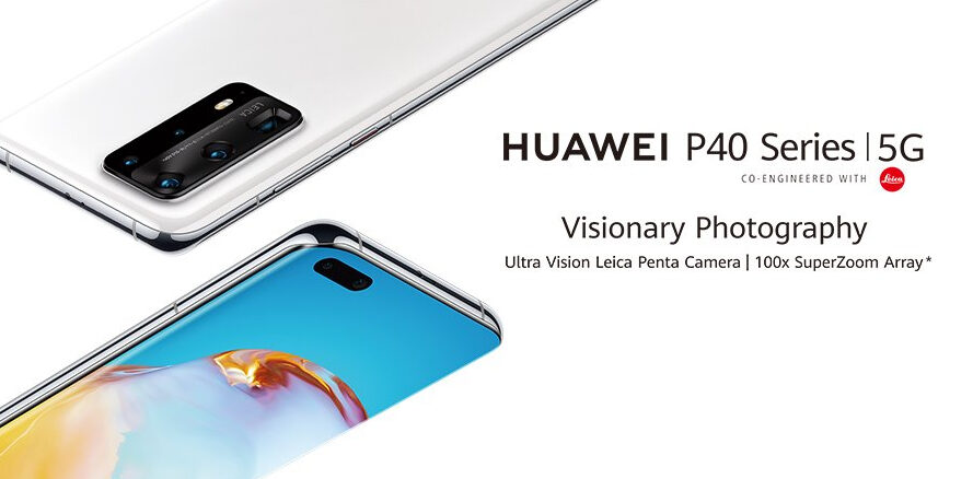
We’ve recently had the opportunity of trying Huawei’s latest flagship, the P40 Pro, and comparing it with previous devices from the manufacturer, such as the P30 series.
Artículo disponible en Español | Article disponible en Français
In March of this year, 2020, and despite the current events in the world, with the coronavirus pandemic having delayed the launch of some products, and the ongoing issues with the US administration, Huawei went ahead and revealed the P40 series. This time, the P40 series counts many more models than usual, with the release of the P40 Lite E, a “low-end” smartphone, the regular P40 Lite, the P40 Lite 5G, which launched recently in Europe, the regular P40, the P40 Pro and an even higher-end version, the P40 Pro+, which should be coming out at the end of June in Europe.
The P40 Pro improves on the P30 Pro released last year, but with some of the features introduced with the Mate 30 series, such as 27W wireless charging, and 27W reverse wireless charging. Size-wise, both the P30 Pro and P40 Pro have nearly the same body measurements, although, thanks to an even more bezel-less display, the P40 Pro comes with a 6.58” OLED display, instead of 6.47”, and the resolution has been bumped to 2640×1200, with 90Hz refresh rate. Ports-wise, we find a single type-C port for headphones and charging the device, a speaker at the bottom, as well as the option of putting either two SIM cards or a SIM card and a Nano Memory card. Interestingly enough, the device also supports eSIM cards, although this feature depends on the country, with carriers in some countries not having launched eSIMs yet.
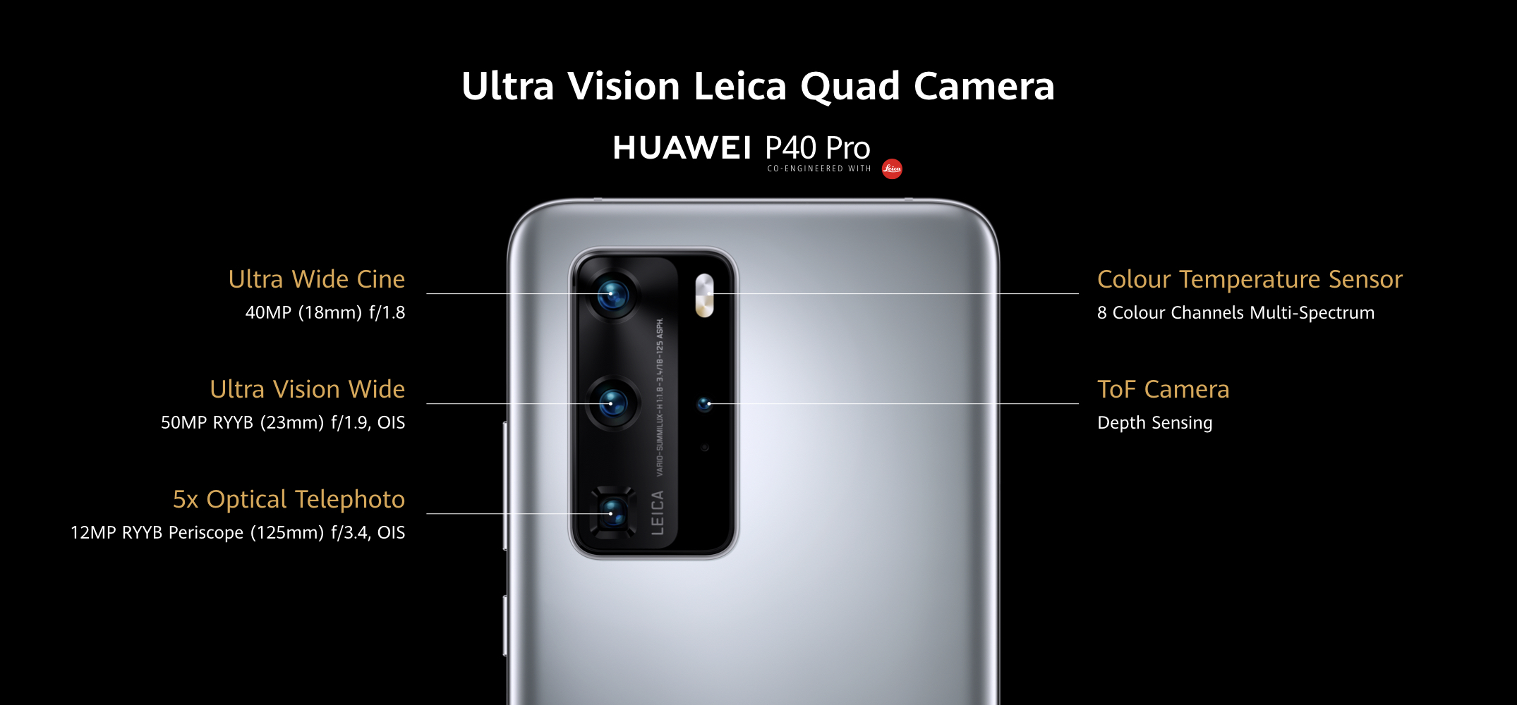
Battery-wise, the P40 Pro sticks to a 4200mAh battery, with the device being powered by the Kirin 990 5G, manufactured in a 7nm+ EUV process, and coupled to 8GB of RAM and, in the model we are reviewing, 256GB of internal storage. For the front camera, we find a 32MP camera coupled to an IR ToF 3D camera for safer and faster face recognition, with these two cameras hosted inside a pill-shaped punch-hole on the display, reducing quite a lot the space for notifications and others. Lastly, for the main camera, this one sticks to what Huawei introduced last year, but with some upgrades, such as a main 50MP camera sensor, a 12MP telephoto camera with x5 optical zoom, a 40MP ultra-wide-angle camera and a ToF camera.
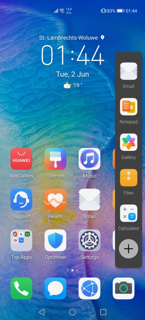
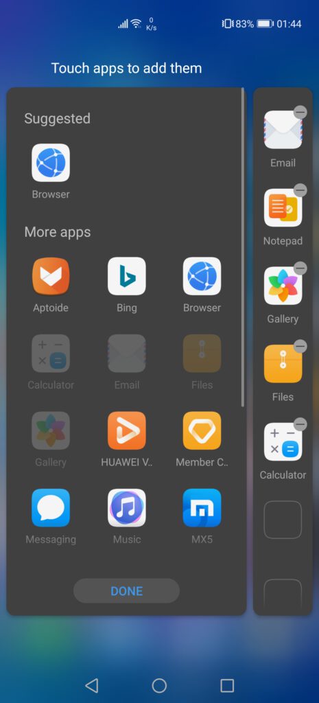
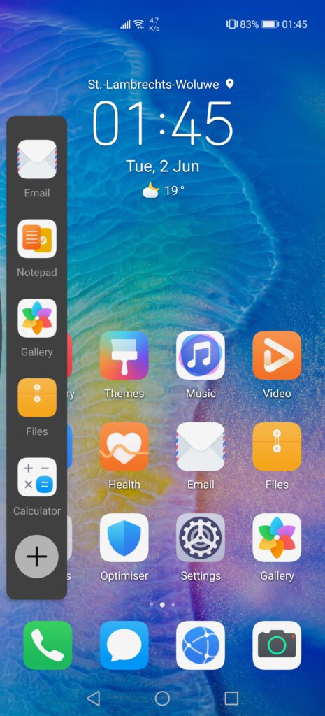
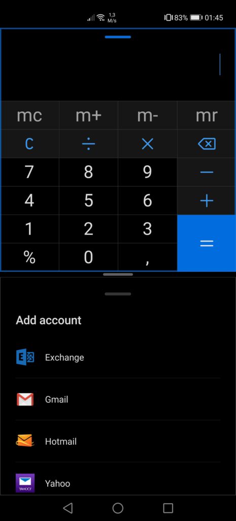
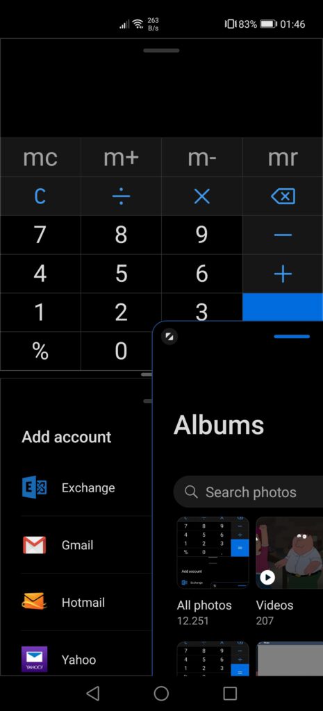
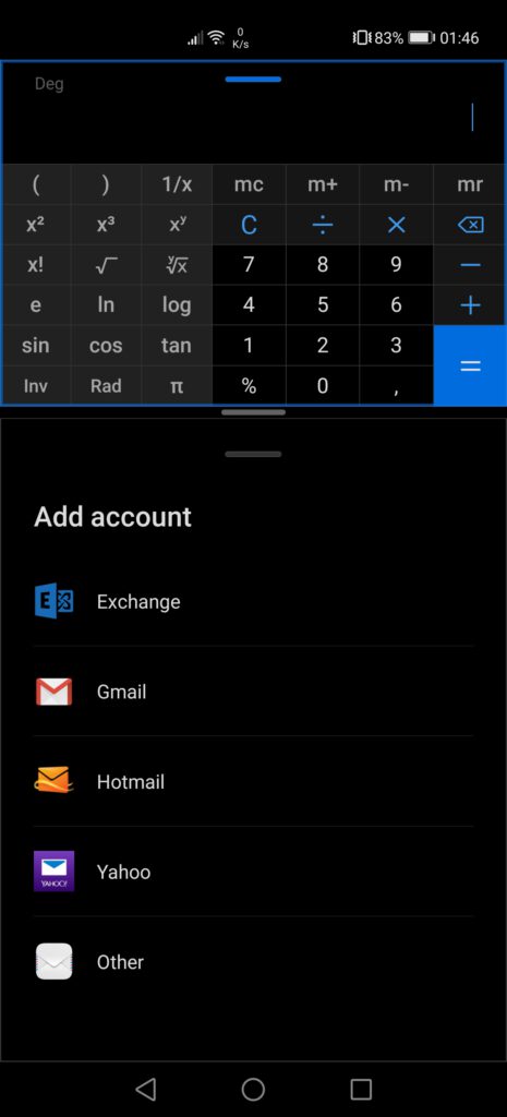
Huawei has also made quite a lot of improvements to the software, with the introduction of EMUI10.1 and various new features, such as the multi-window, which opens a bar on one side, allowing users to have two apps open at the same time, and even a third one floating, as we’ve been able to see on the Mate Xs. We also see the addition of Huawei’s own voice assistant, “Celia”, which intends to replace Google’s voice assistant.
Before going any further, let’s have a look at the overall specifications of this device:
- Kirin 990 5G (7nm+ EUV)
- 8GB of Ram
- 128/256/512GB of internal storage, expandable with Nano Memory cards, up to 256GB
- 6.58” OLED display, 2640×1200 pixels resolution, 60/90Hz refresh rate
- 158.2×72.6×8.95mm, 209 grams
- In-screen fingerprint reader, face recognition
- Quad-camera set-up on the back:
- 50MP, wide angle, f/1.9, OIS
- 40MP, ultra-wide-angle, f/1.8
- 12MP, telephoto, f/3.4, OIS
- ToF camera
- Supports 4K60fps video recording
- 32MP front camera, f/2.2+depth camera
- 4 200mAh battery, 40W wired SuperCharge, 27W wireless charging, 27W reverse wireless charging
- EMUI10.1/Android 10
- 5G, dual-SIM, eSIM, 802.11a/b/g/n/ac/ax, 2×2 MIMO, HE160, 1024 QAM, 8 Spatial-stream Sounding MU-MIMO, Bluetooth 5.1, USB Typce-C, USB 3.1 GEN1, GPS, AGPS, Glonass, BeiDou, Galileo, QZSS, NavIC
- Gesture sensor, gravity sensor, infrared sensor, fingerprint sensor, hall sensor, gyroscope, compass, ambient light sensor, proximity sensor, colour temperature sensor
- No headphone jack
- IP68
- NFC support
- Available in 5 colours: Silver Frost, Blush Gold, Deep Sea Blue, Ice White, Black
- The price is as follows:
- 8GB+256GB for 999€ (Europe)
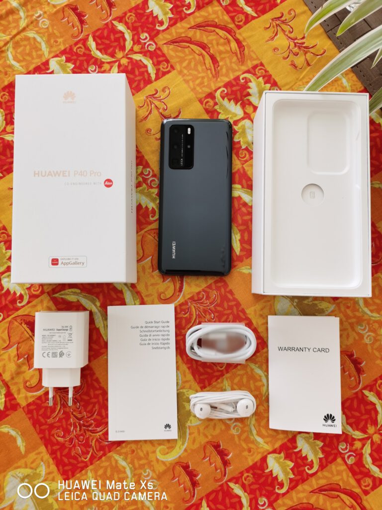
If we now focus on the unboxing of the device, the P40 Pro comes in the usual box Huawei now uses for most of their smartphones, such as the P30 series or even the Mate 30 series. However, we now find “Explore it on AppGallery” printed on the front, since these new devices do not come with Google Mobile Services, and instead come with Huawei Mobile Services. In our case, the product sticker also mentioned “5G”, although both the P40 and P40 Pro are only available in 5G, contrary to the Mate 30 series.
Opening the box, we find the P40 Pro sitting at the top, as per usual. Below, we find the warranty information and the quick start guide, as well as the tool to eject the SIM tray. At the bottom of the box, we find a 40W SuperCharge charger for European plugs, the cable going with it, as well as the usual headphones. In our retail unit, there was no protective case included. Overall, there aren’t any surprises, as the box contents are the same that are included with other Huawei devices.
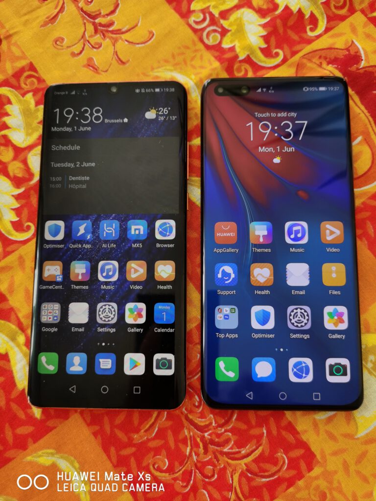
If we now have a closer look at the phone itself, the device this time is slightly thicker than the P30 Pro, with a bigger camera bump, likely to accommodate the bigger sensors. However, this bigger camera bump makes it relatively hard to use the device on a flat surface, such as a table, as the phone is constantly wobbling. Of course, we recommend users to buy a case at the same time, with various official designs available, such as a simple case to protect the back, or a flipcover case which protects both the back and the front of the device. With a case, the device becomes flat, making it easier to leave it on desks and others. Furthermore, the back, made of glass, is quite slippery, meaning one has to be relatively careful of where they put the phone, as this one might end up slipping and falling off the desk/table, possibly breaking, even if Huawei devices are relatively resistant.

The design of the device has also slightly changed. For instance, both the top and bottom are not flat anymore, with the industrial look Huawei used on both the P30 and Mate 30 series, and is now instead slightly curved. The P40 Pro also comes with various cuts on the frame, while on the P30 Pro, these were only found at the top and bottom. We are unsure of what these cuts are, and whether they are just for aesthetic purposes or if they are actually joints for the frame, with some saying these are phone antennas, but the symmetry on the left and right side is not respected, making the phone look weird. Of course, this lack of symmetry disappears when using a case, and can thus be ignored.
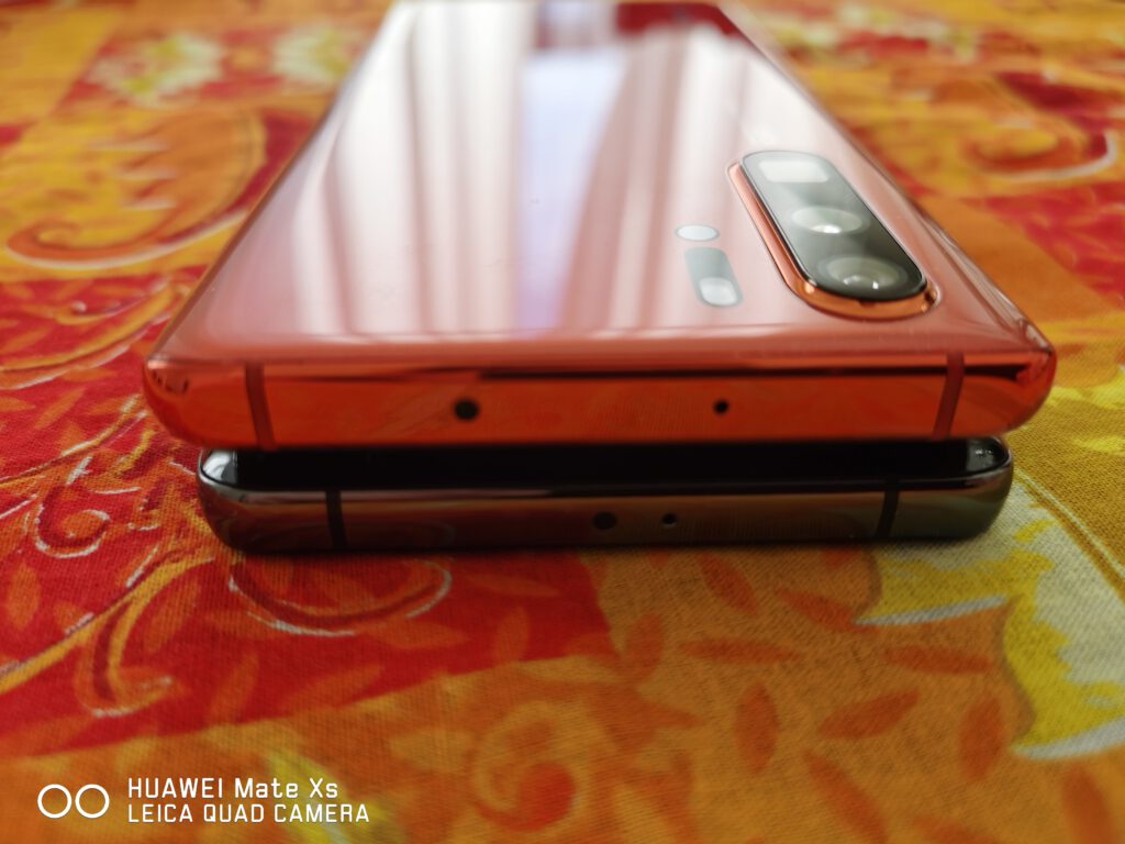
On the bottom, things have also slightly changed, with the SIM tray moved closer to the charging port, while the speaker has actually been moved away from it. This slight change in design is actually positive, as it was not usual to mistake the microphone hole at the bottom for the SIM tray eject hole, potentially damaging it. On the top of the device, we can also notice some changes, with the microphone and IR blaster moved closer to the centre, while on the P30 Pro they were quite far apart.
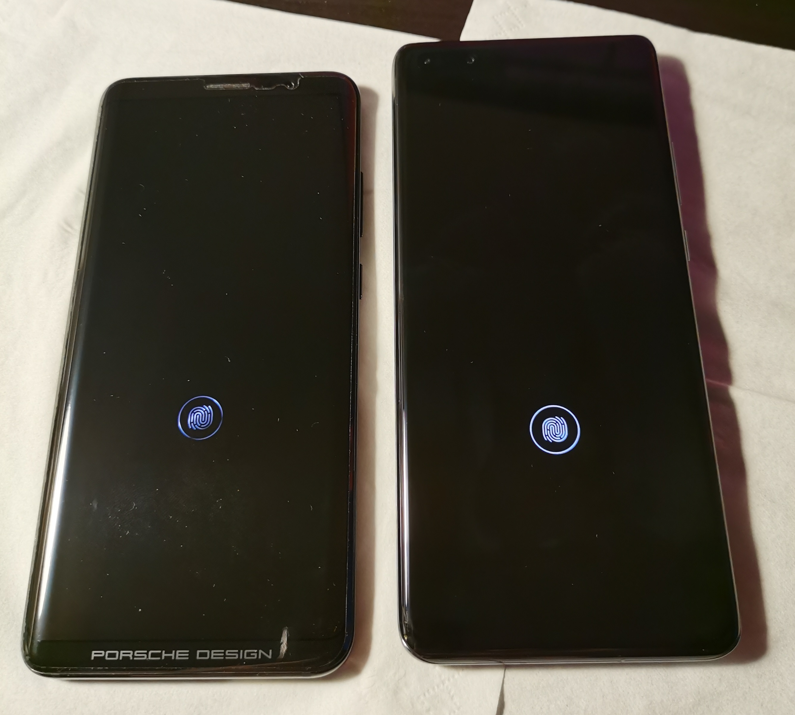
Lastly, the in-screen fingerprint reader has, once again, been moved. While on the P30 Pro this one was found close to the bottom of the screen, it has now been moved a bit higher, at a similar height as the Mate RS Porsche Design from early 2018. We believe this position is better, as it is not only more comfortable to unlock the device, but also easier to grip the phone, reducing the risk of dropping it, especially as the P30 Pro was relatively heavy on its top part, due to housing the mainboard and the camera.
Overall, the P40 Pro is very well built, with no visible gaps where the back cover and the frame join together, similar to what we could see on the P30 Pro. The device is also slightly heavier than its predecessor, at 209 grams instead of 192 grams, but this is barely noticeable. Taking it in hand is also relatively comfortable, once again, being a similar experience to the P30 Pro, with both devices essentially being the same, although the P40 Pro is slightly thicker. Then again, this is not really noticeable, being barely 0.6 millimetres more.
If we now look at the display, it is difficult to say which one is the brightest or the best in terms of colours, with both being, at first glance, extremely similar. If we had to choose, the P40 Pro appears to be slightly brighter, but not by much. Colours on the P40 Pro also appear to be better, although this is rather subjective. Then again, we are not experts on this matter.
If we now move on to the software experience, there are no real surprises here, as we have been using a Mate Xs for the past two months, without Google Mobile Services onboard, sticking to the AppGallery/Huawei Mobile Services experience and downloading whatever isn’t available on AppGallery from third-party stores such as Aptoide. Therefore, we are aware of what works and what doesn’t work. Before going any further into EMUI10.1 and the various new features and changes that can be seen on the P40 Pro, we would like to talk a bit more about the issues we’ve encountered due to the lack of GMS.
The longer one spends on an HMS-only device, the more we realize how the situation in the Western world has become dire, with dozens of key applications depending on a single company: Google. This dependency comes under different types, with most developers not using any of the services of the company, while others make full use of the services and APIs offered by the ad giant. It is difficult to fault Google for any of this mess, although we strongly believe the company has been pushing developers to use their services and stop them from looking or implementing alternatives, further securing their stronghold on the Android ecosystem, to such an extent where not using Google is next to impossible. While it is understandable why developers might prefer to use Google’s ready-made solutions instead of looking for alternatives, this has led to a dependency that should not be permitted, with applications often only having one logging method, one backup method, one payment method, one verification method, one notification method, and so on, all based on Google’s services and APIs, such as Google’s push services, which are used by the majority of developers to provide notifications. For payments, most stick with Google too, although a few developers also implement the possibility of paying with alternative services such as PayPal.
In our case, the lack of GMS has meant that we have been unable to install our bank application, Spain’s BBVA, as this one appears to rely on Safety Net. Many other applications also have no notifications, such as Twitter or Discord, as both rely on Google for push notifications. While for Twitter, this might not be really problematic, the same cannot be said about Discord, as, if somebody calls us, the application will not inform us about it. Other applications work perfectly fine, such as Microsoft’s Outlook, WhatsApp, Weibo, WeChat or AliExpress. This shows the developers behind these applications have implemented a different solution for notifications, either relying on Huawei’s HMS Core and Huawei Push services, or used a third-party option.
Regardless, it remains surprising how many applications will not even launch or fully work properly, being dependent on Google to some extent, while Chinese applications appear to work just fine, likely due to a different mentality, as the Chinese market does not have a single app store, and instead is divided between third-party app stores from major companies, such as Tencent, and the app stores of manufacturers, such as Huawei, Xiaomi, Oppo and so on. It would be nice if Western developers started thinking this way too, and would reduce their dependency on Google as much as possible, by implementing third-party solutions for some of the most basic functions, such as push notifications, or implement multiple payment solutions, such as credit card, PayPal, Google, Amazon Pay and so on, instead of sticking to Google only.
If we move on and start looking at the software on the device, this one comes with EMUI10.1, version 10.1.0.121(C432E8R4P1). We are aware there is a more recent version, although it would appear it is not yet available for our specific device, or maybe not yet available in Belgium.
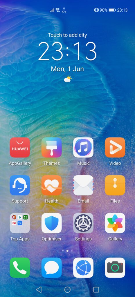
The phone comes with various applications pre-installed, as it is usual to see, although none of them are from Google, and are instead various applications that can be found on AppGallery. The first folder we see is called “Top Apps”, with apps such as Office, Bing or Microsoft’s Translator, and which recommends various other apps through Huawei’s AppAdvisor. Of course, all these applications can be uninstalled without any issues, and the folder will disappear if all apps are uninstalled.
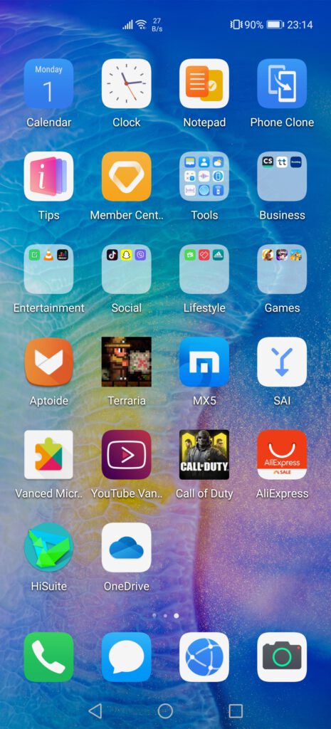
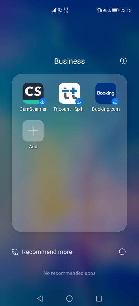
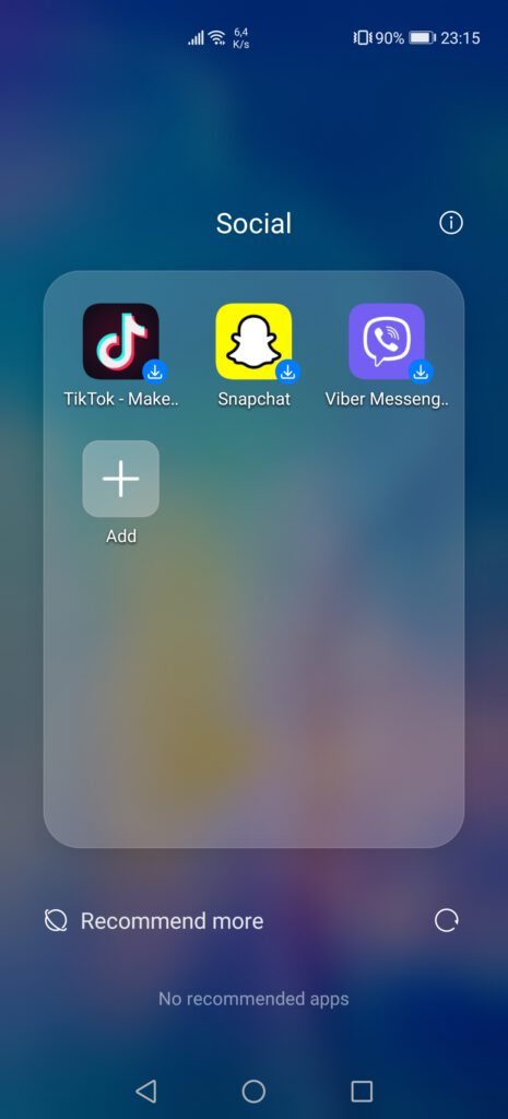
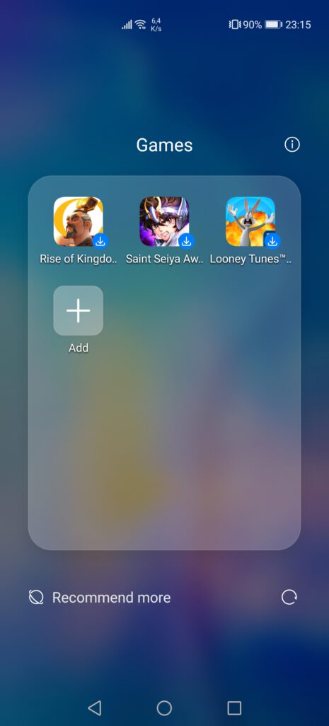
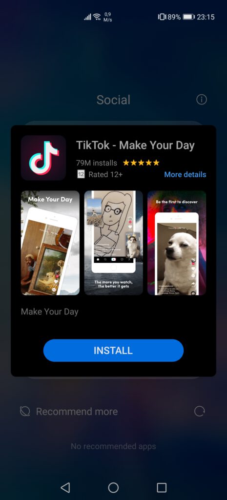
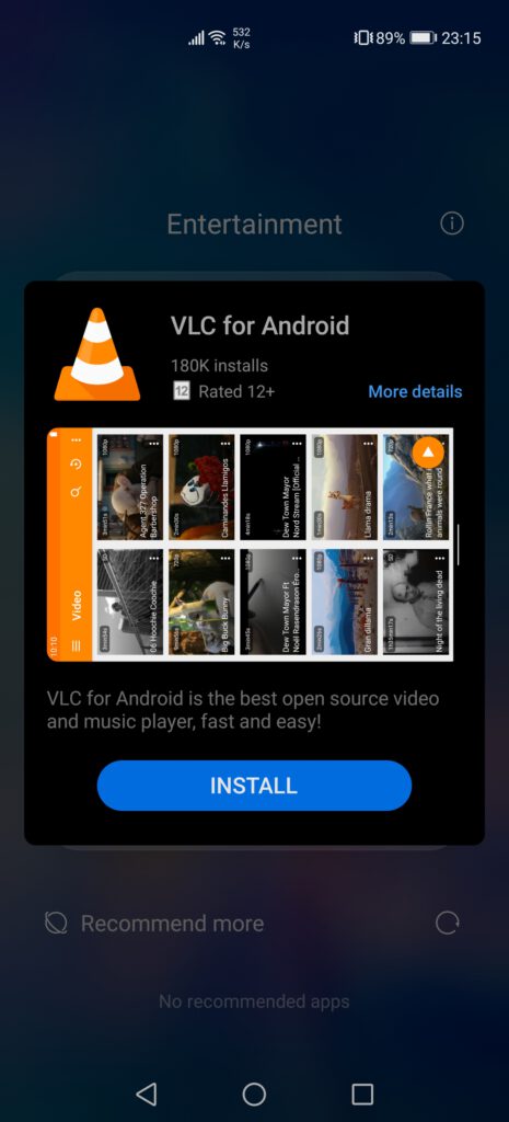
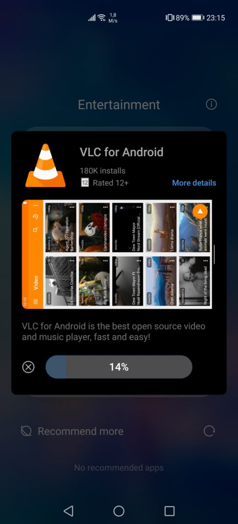
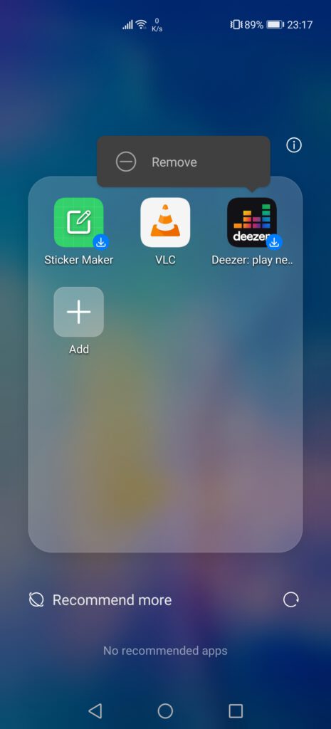
On the second screen, we also find various folders with multiple applications organized by categories, such as “Business”, “Entertainment”, “Social”, “Lifestyle” and “Games”. Each of these folders has various applications, although, interestingly enough, none of them are actually installed on the device, instead being some kind of link to download them from AppGallery, if the user is interested in them. By long-pressing on them, it is also possible to remove them, thus deleting the entire folder(s). These folders appear to be a new feature, as they were not present on our Mate Xs. Not having said applications pre-loaded is also a nice touch, not using storage space and giving consumers the choice on whether to keep them or delete them.
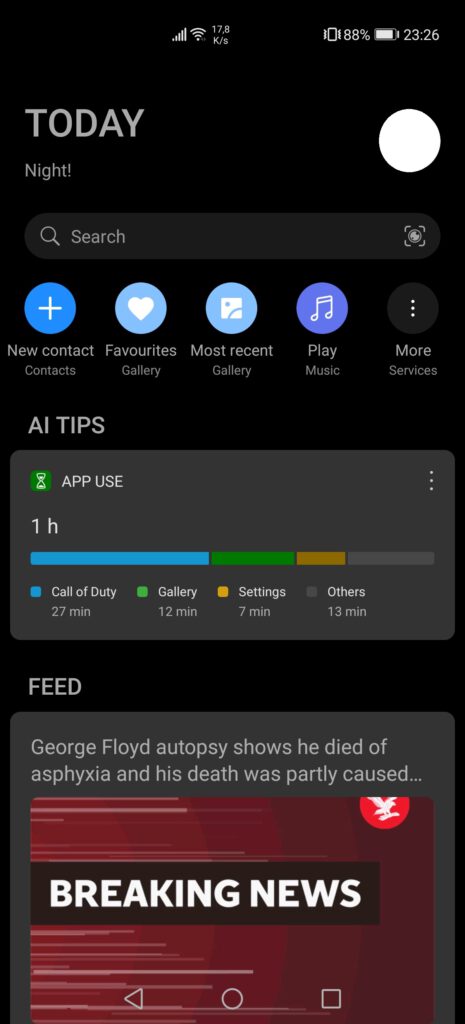
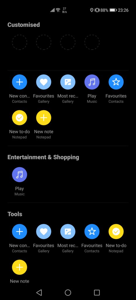
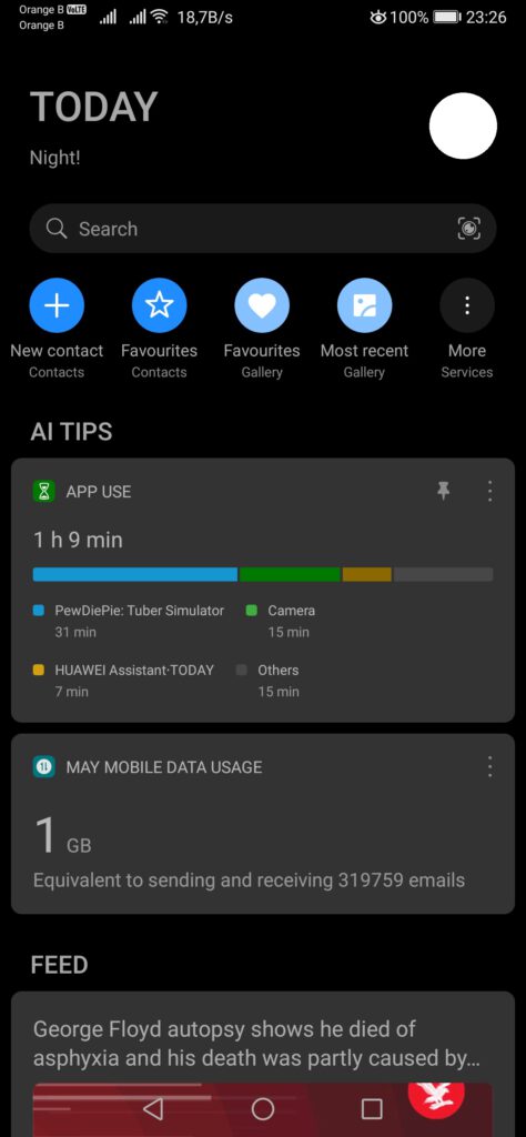
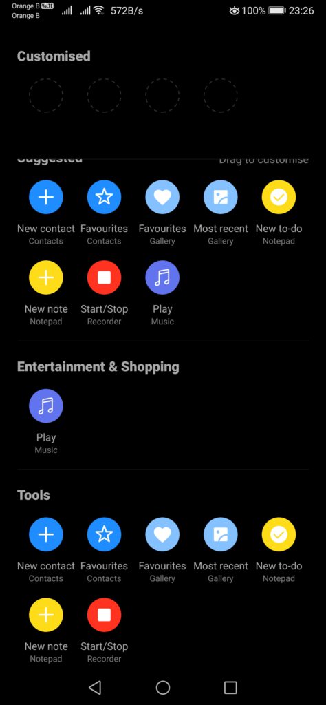
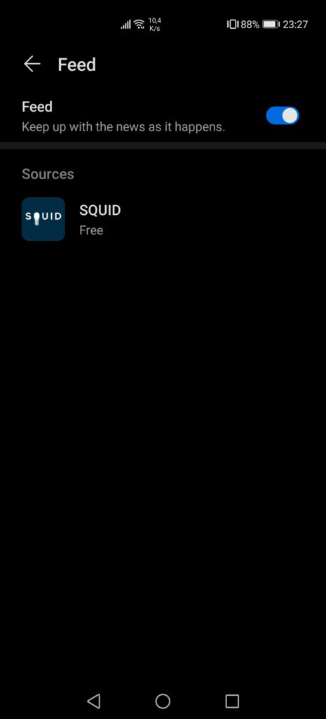
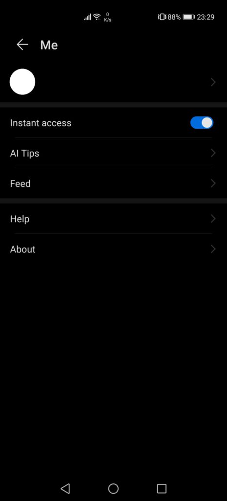
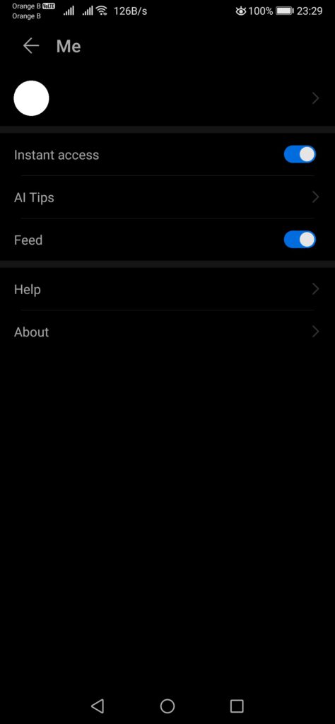
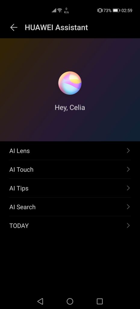
If we now move on to the Huawei Assistant (and not the voice assistant, Celia), also known as “Huawei Assistant – TODAY”, this one is slightly different from the assistant we can find on other models. While most of the features remain the same, with the AI Tips and the various quick access options, a new setting has appeared on the newsfeed, which appears to allow users to customize which service they want to use to provide the news. On the following screenshots, the top three come from the P40 Pro, while the three at the bottom come from the Mate Xs. P40 Pro screenshots can be easily recognized, thanks to the large empty space at the top left.
Right now, it is only possible to get news from the service “Squid”, although, if this setting is present, we can safely guess that the manufacturer will eventually add other sources, or even allow users to customize their feed with news sources they are interested in, by using some kind of RSS reader. This extra setting is hidden under a new menu, “Feed”, which previously only allowed us to enable or disable it. With this, the Huawei Assistant has changed version from 20.1.8.302 to 21.0.2.303.
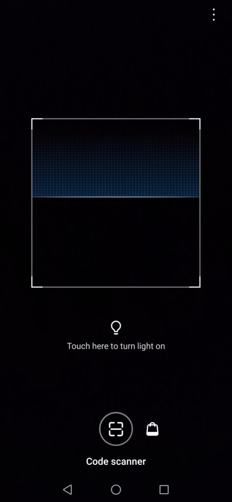
Another curious change can be found in the HiVision feature, which, on the Mate Xs, only features a QR code reader and the shopping assistant. However, on the P40 Pro, we get access to all the features, being the QR code reader, the instant translation, shopping, calories and identification functions. These features are also present on the P30 Pro or even the Mate 30 Pro, which makes the downgrade on the Mate Xs even more curious, with us initially thinking we wouldn’t see these options anymore due to the issues with the US government, as most of these services are provided by third-party companies.
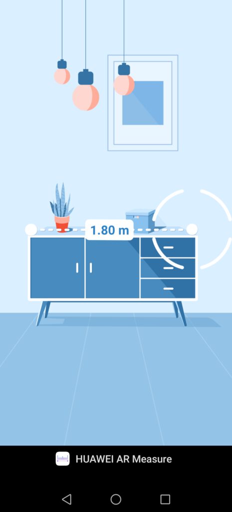
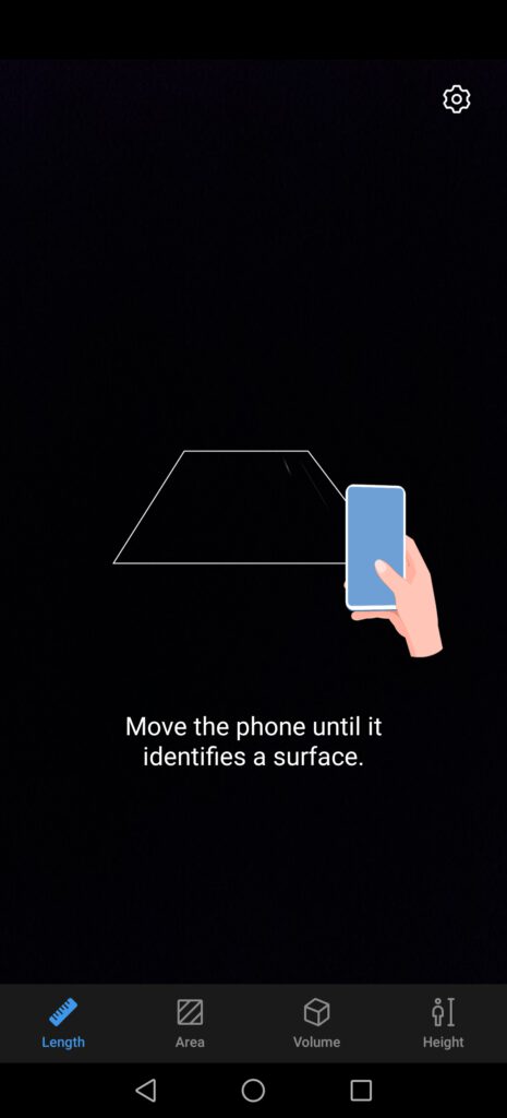
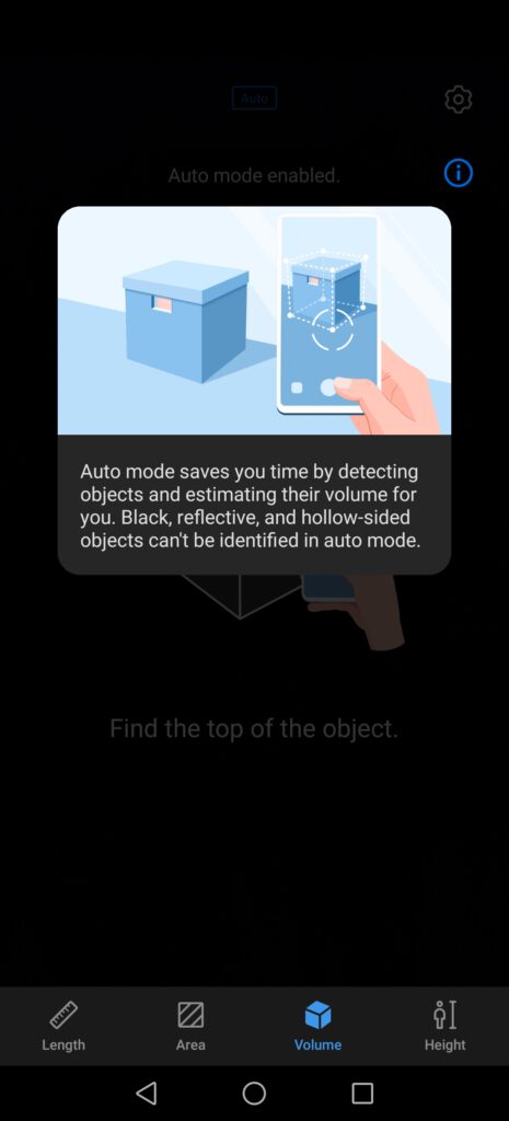
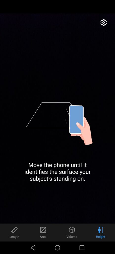
The P40 Pro also features AR Measure, which was first released on the P30 Pro and can also be found on the Mate Xs. All the functions for AR Measure are available, being length, areas, volume and height. AR Measure also works relatively well, which, for once, is a nice change, with other “gadget” applications from the manufacturer having gone nowhere, such as the 3D scan on the Mate 20 Pro, which was even supposed to come to the P30 Pro but seems to have been abandoned, at least for now.
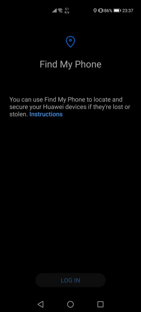
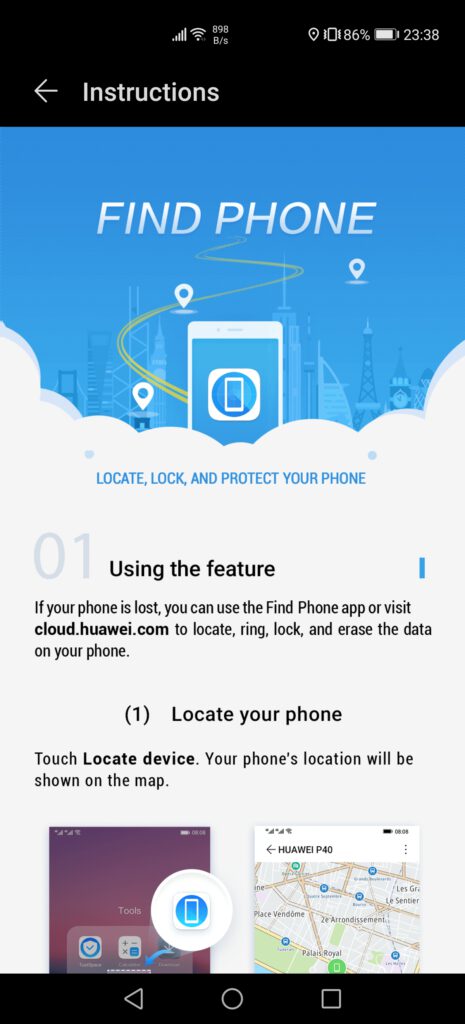
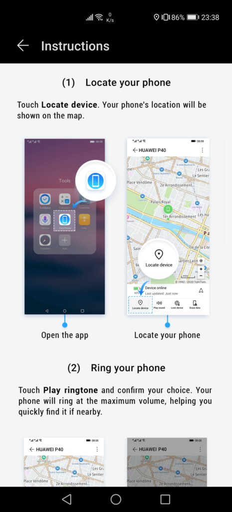
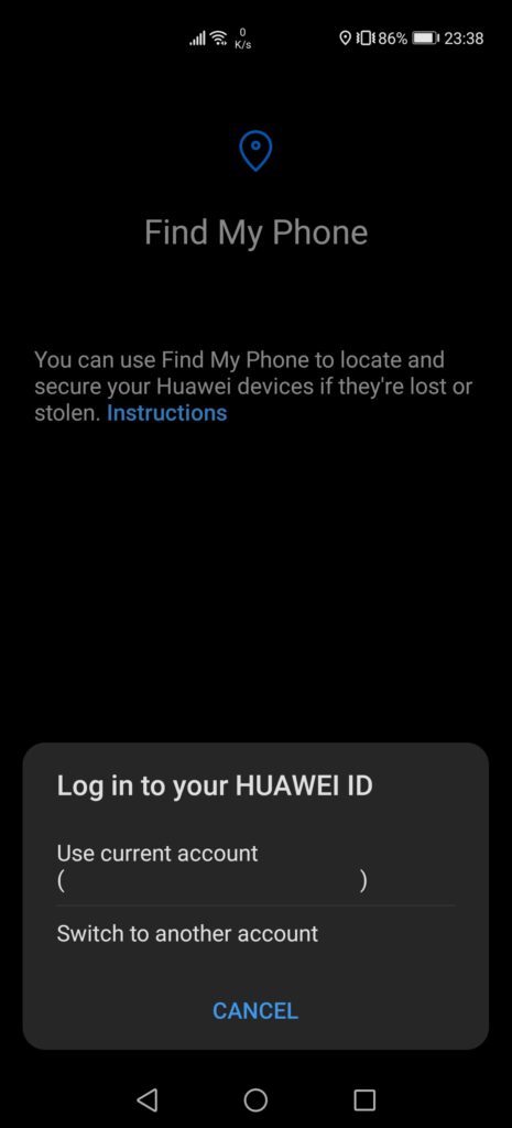
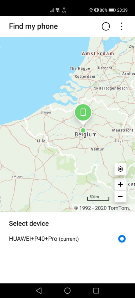
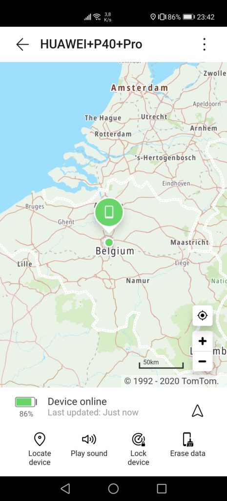
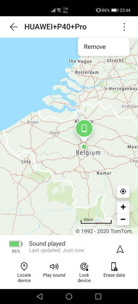
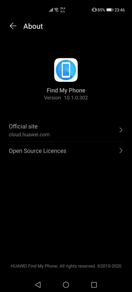
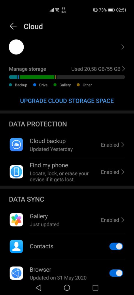
A rather useful addition that is also present on some other HMS devices is “Find my phone”, as users cannot rely on Google anymore to locate their phone if stolen or lost. Once enabled, Huawei will precisely locate the selected device on the map, with maps provided by TomTom. This option is only present on our P40 Pro, with the Mate Xs not having it, but it appears that, if enabled across multiple devices, one could locate each of their devices. Accuracy is also impressively high. We’ve decided not to show this to avoid doxing ourselves, but the GPS managed to locate the phone at the right address, with barely a few metres of error.
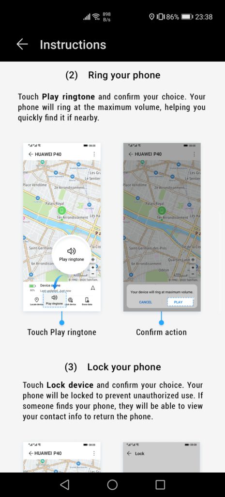
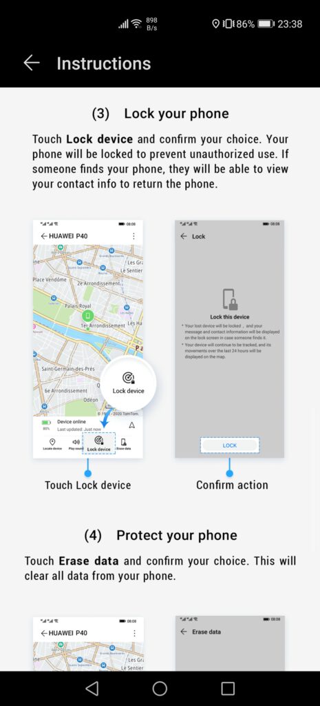
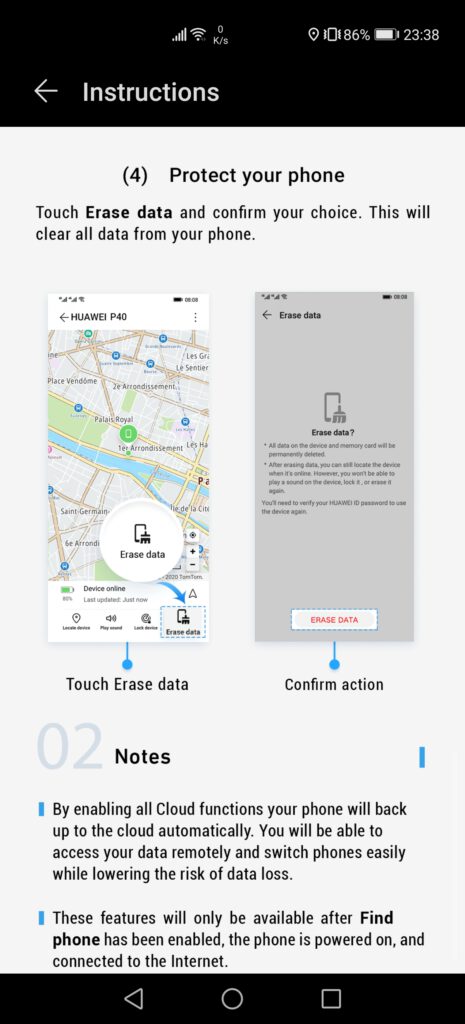
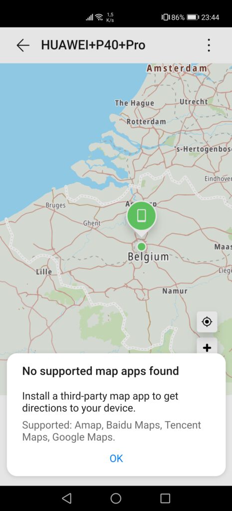
In this application, we also get various options, such as locating said device, playing a loud sound to find it if we lost it at home or work, locking the device, or even erasing the data, in case the phone has been stolen. We can also see the battery level, as well as the last action we’ve done on the application, such as playing a sound or locking the device. Ironically, to be able to get directions to our device, in case we’ve lost it in a city we are not familiar with, one needs to download a third-party map, such as Amap, Baidu Maps or Tencent Maps, all Chinese and useless outside of China, or… Google Maps. We can only hope that in the future, Huawei will be adding other options such as HERE WeGO, which is available on AppGallery, even if Google Maps actually works on HMS devices, as it does not rely on GMS.
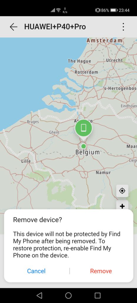
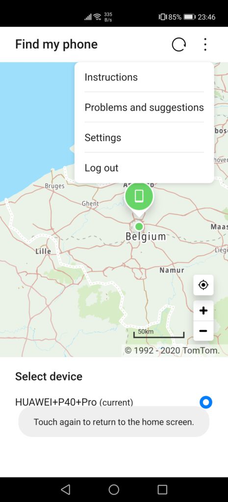
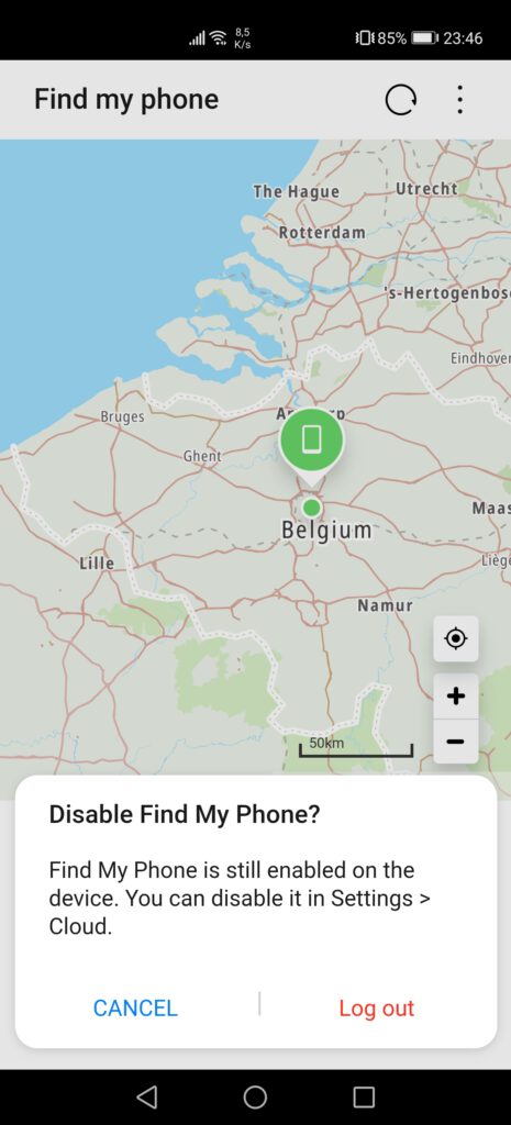
Lastly, we are also able to delete the device from the list, or log out from “Find My Phone” entirely, although this will disable the service. Overall, this new feature is quite interesting, and we hope that the manufacturer will bring it to older models with Google Mobile Services, such as the P30 series, or models such as the Mate Xs, which, for whatever reason, doesn’t have this service.
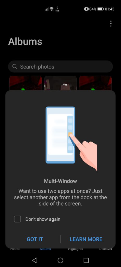
Earlier, we mentioned the multi-window mode, which brings a bar on the side of the phone, allowing users to easily open multiple apps at the same time. This feature is mostly interesting on large screens, such as on the Mate Xs or the MatePad Pro, but is also usable on smaller devices such as the P40 Pro. However, it replaces the split-screen mode available on older models, as this new mode is more customizable. On top of being able to have two applications open at the same time, this new mode allows us to have a third application open, floating, although this makes the device difficult to use, due to how cluttered the screen becomes.
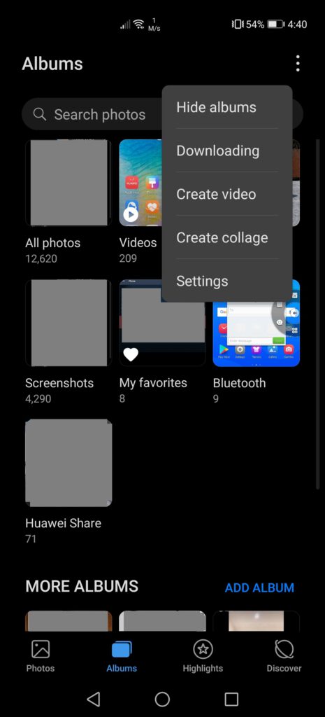
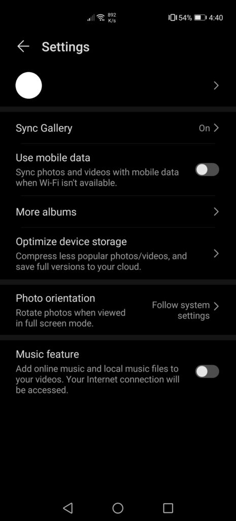
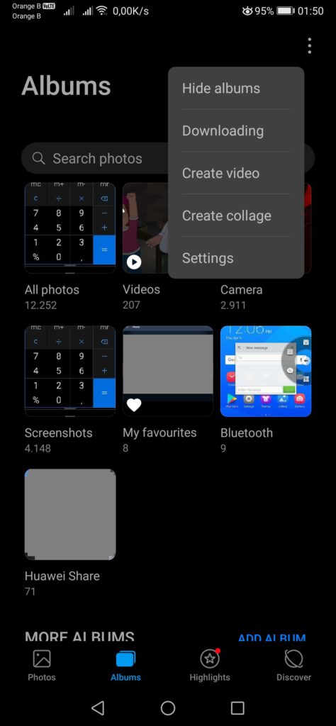
If we now have a look at the Gallery, some things have changed here too. The overall presentation remains the same, with options such as hiding albums, downloading content that we’ve stored on the Huawei Mobile Cloud, creating a video or collage, or accessing the settings of the application, settings which allow us to choose whether we want to sync the gallery or not, which albums we want to see, free up storage space by compressing the content, and so on.
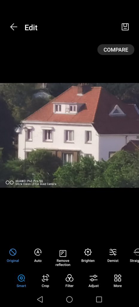
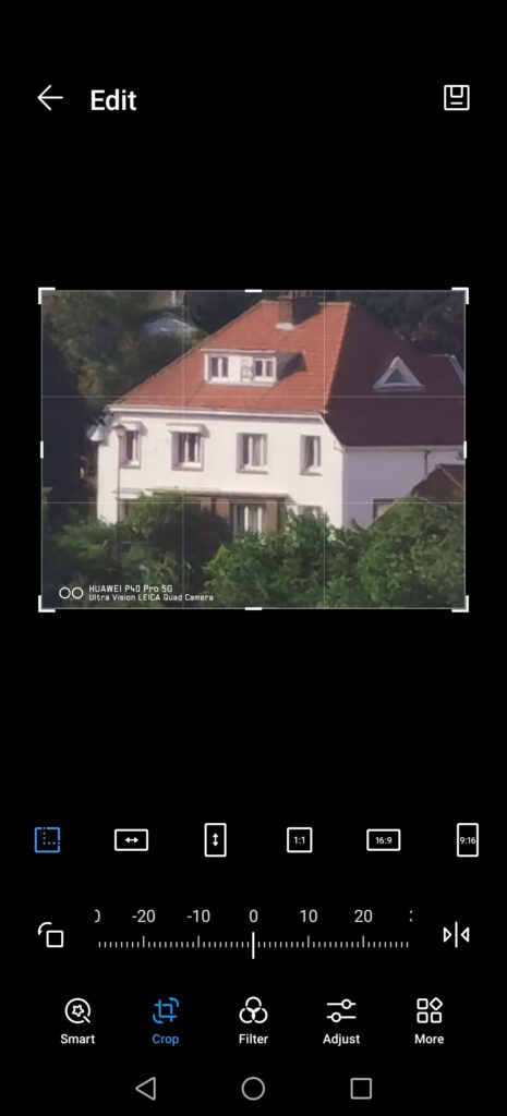
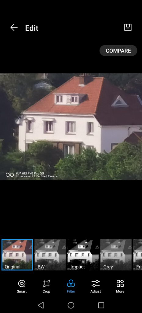
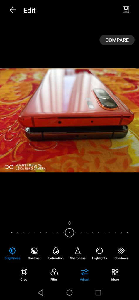
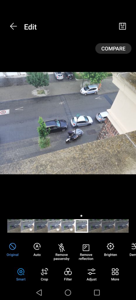
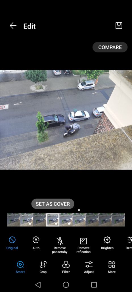
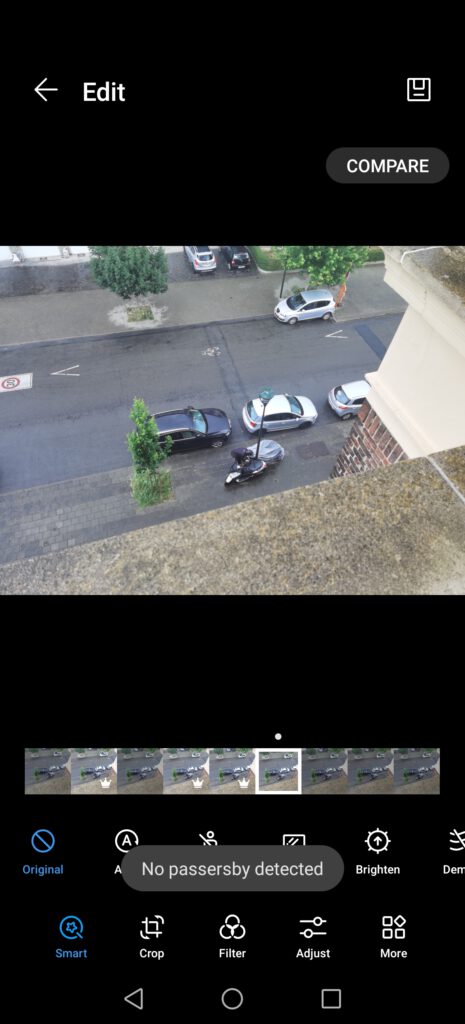
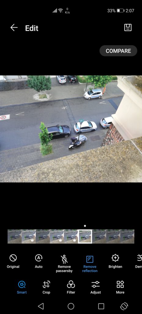
Still in the Gallery, the options to edit pictures have changed, with the addition of various new tools. While in the past, the default selected tool was “Crop”, we now find a “Smart” tool, which offers various automatic improvements for the pictures, such as removing reflections, brighten it or adjust the image. This is, currently, the only change in the tools, with the various other tools, such as cropping, filters and adjusting still being the same.
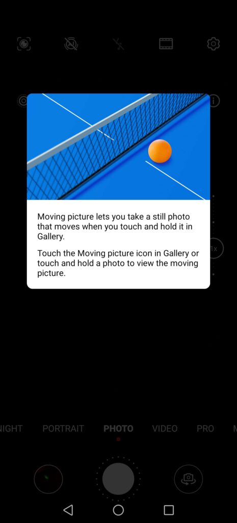
Other, new tools are also available, but depend on the picture, such as AI Golden Snap or the AI passer-by removal tool, which are only usable when taking a “Moving picture”, which is a short clip of roughly 1.5 seconds. With this “clip”, the device will select various pictures, recommending which one to keep out of the various pictures taken. Furthermore, if there are passers-by, the AI will offer removing them, although we’ve noticed that the definition of “passer-by” for the AI and for us differs from time to time. Lastly, it is also possible to remove reflections, with this new suit of tools being overall quite impressive, especially taking in account that this is stock software and not an additional, third-party application.
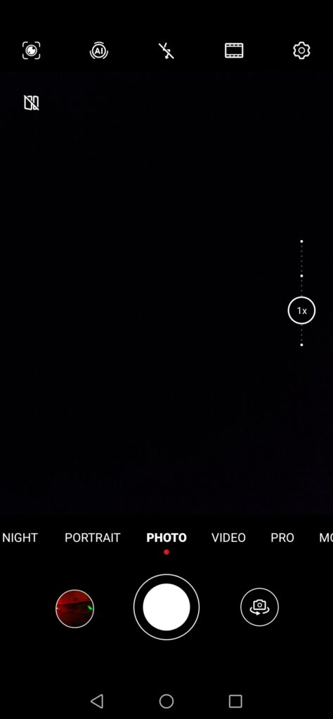
Camera-wise, Huawei has made some changes to the software, moving settings around and adding various new options to make full use of the new quad-camera, such as a “High-res” mode, which takes pictures with the full 50MP camera, instead of using pixel binning. For RAWs, users have to use the “Pro” mode to be able to get pictures in RAW format, with the option disabled in the regular camera mode. However, this change is not new, having been present on most Huawei devices for a while now. The same can be said about using the 50MP, with users now having to either use the “Pro” mode or the “High-res” mode. It appears the automatic photo mode uses pixel binning by default, with no real possibility of customizing this one, with the resolution settings removed. The rest of the camera features remain the same as what can be found on other Huawei devices, with an automatic photo mode, portrait, night mode, video, a pro mode and an aperture mode. Each of these modes has its own settings, allowing for quite a lot of customization.
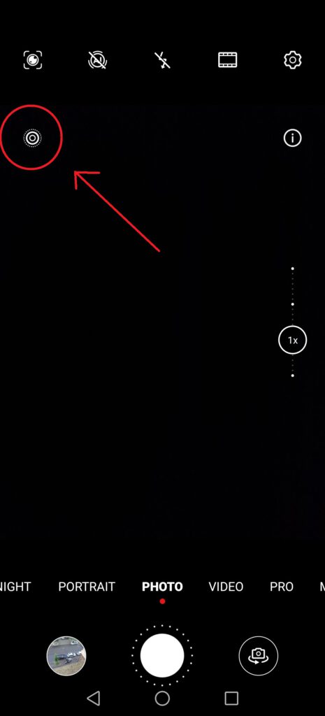
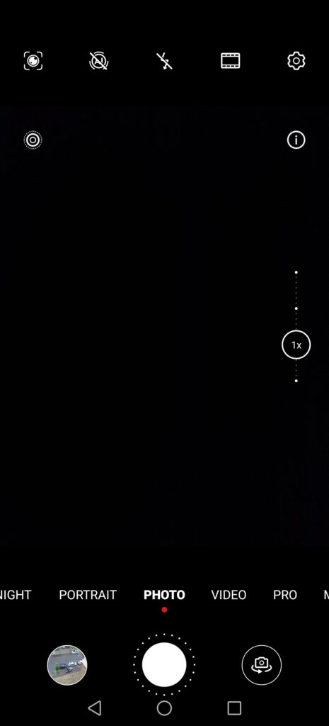
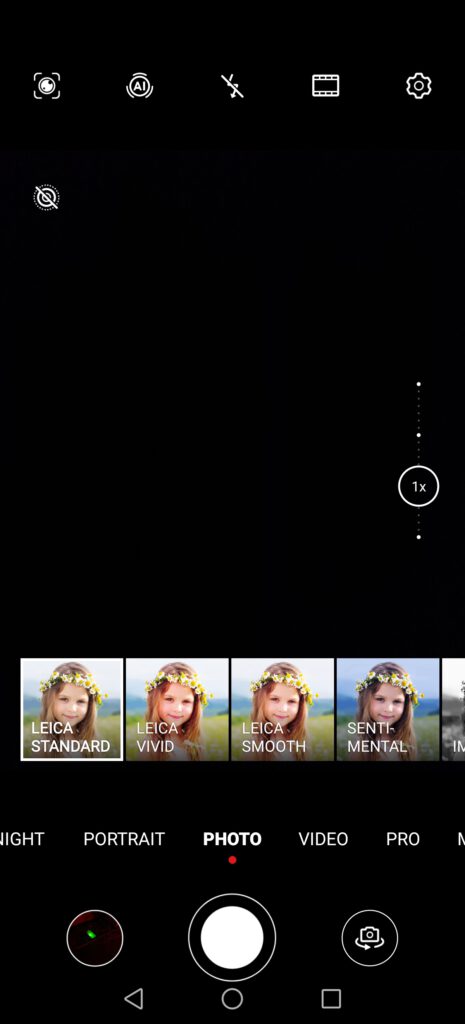
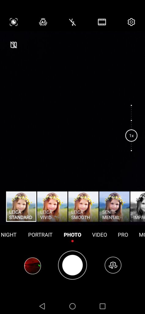
Looking at the default photo mode, this one gives us the possibility of taking “Moving pictures”, which are, in a few words, some kind of gifs or mini-videos. Previously, we mentioned how these “Moving pictures” are required to access the new editing features such as AI Golden Snap or removing passers-by. The rest remains the same, with the possibility of accessing the QR code reader directly from the camera, the button to enable and disable MasterAI, as well as the flash and the colour settings. By default, the device uses the “Leica standard” colour mode, but there are multiple other colour modes available, with each of these slightly tuning the colours and giving a special touch to each picture.
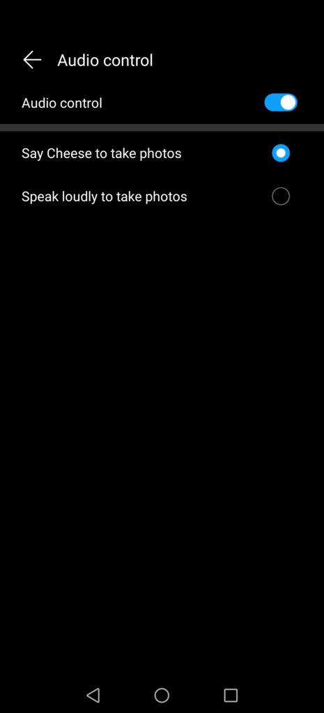
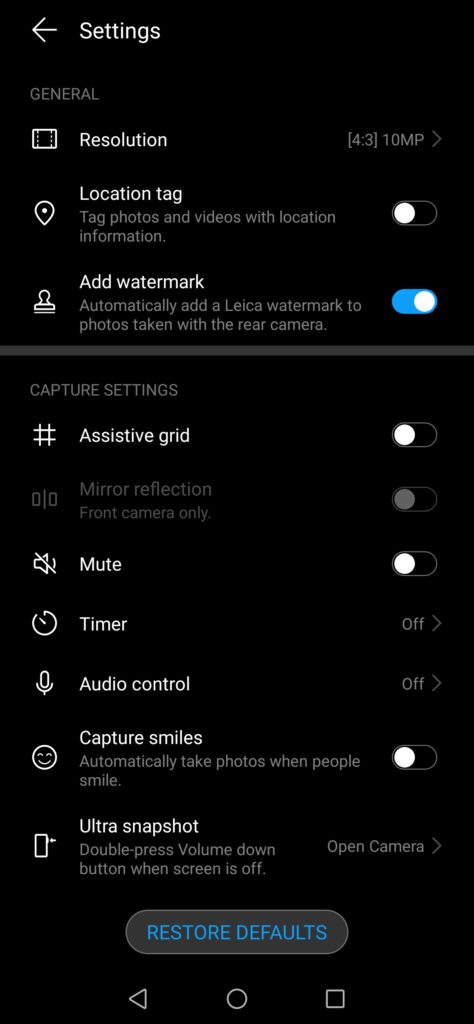
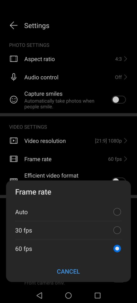
If we now look at the settings of the camera itself, we can see the resolution setting is gone, instead leaving an aspect ratio one, with three options: 4:3, being the default, 1:1 and Full screen. We also find “Audio control”, which takes pictures when saying specific keywords, as well as the option of taking photos automatically when people smile. These settings were previously in a different section, but have now been moved together.
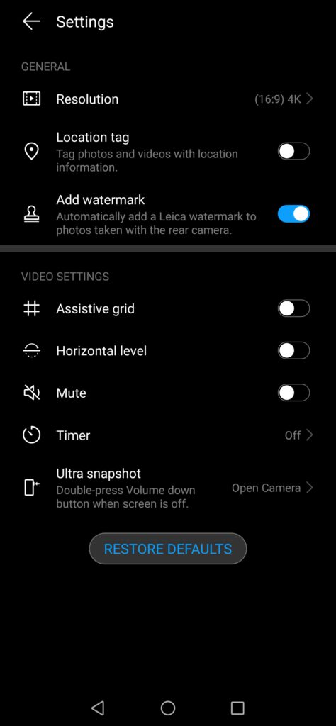
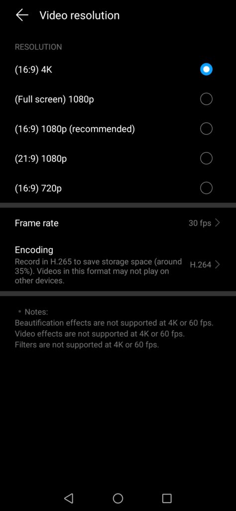
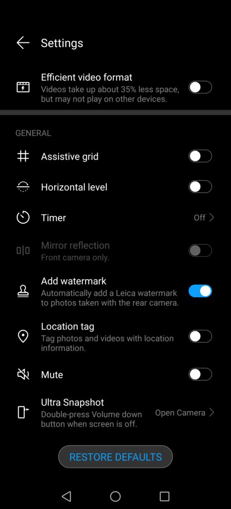
Huawei has also moved the video settings together with the rest, while these were previously separate, only available when using the video mode. We also have the possibility of choosing between various video resolutions, such as 16:9 4K, full screen 1080p, 16:9 1080p, 21:9 1080p or 16:9 720p. The rest of the video settings have also been bundled under the same section, with the possibility of picking between auto, 30fps or 60fps for the framerate, meaning this camera can take videos in 4K60fps, and pick between using H.264 or H.265 for video encoding, with H.265 being more efficient and thus saving around 35% of storage space.
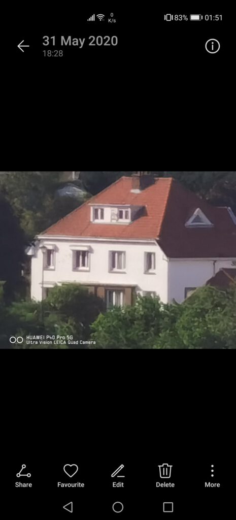
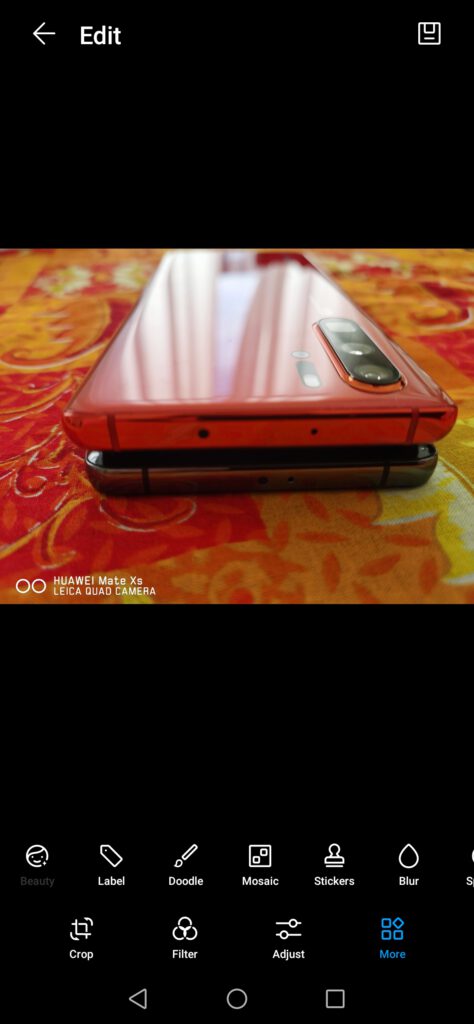
All the other settings available on previous models are still present, such as assistive grid, horizontal level, timer or watermark. The watermark feature is particularly interesting. This one comes disabled by default, but, once enabled, all pictures taken by the device will have a watermark mentioning the model of the smartphone, making it easier to organize pictures when using multiple different devices, such as whenever we compare the cameras of two or three different Huawei smartphones.
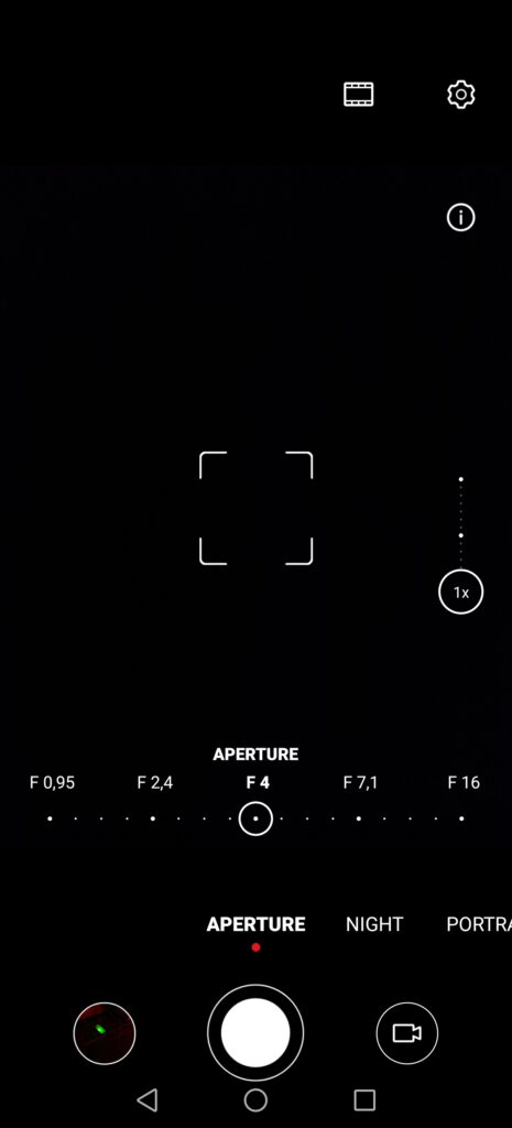
The aperture mode is particularly interesting for taking pictures that focus on a specific subject, while simultaneously blurring the area around and behind it, with the software allowing us to pick the aperture.
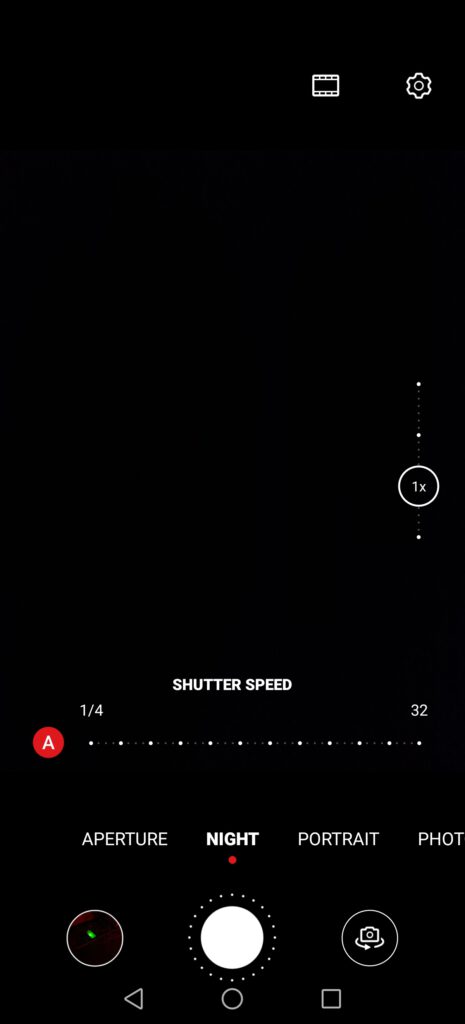
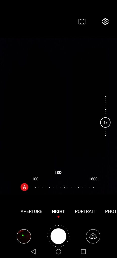
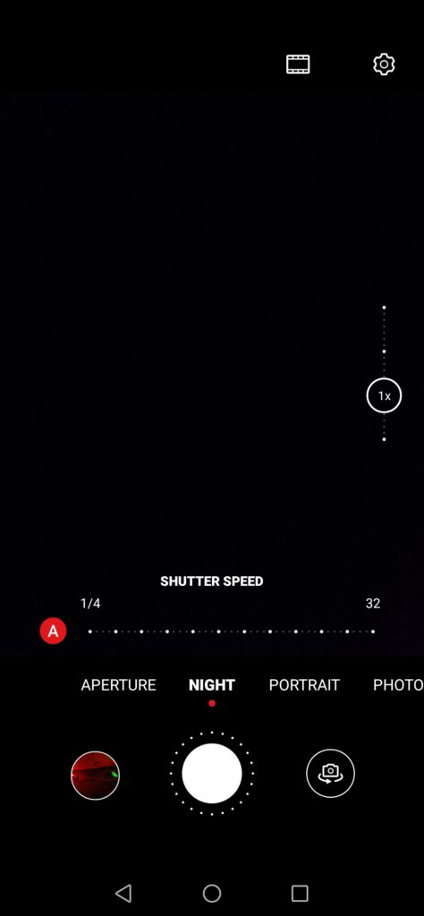
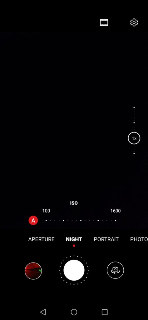
One of the key selling points of recent Huawei smartphones, starting with the P20 series, is the manufacturer’s impressive night mode, being one of the best in the smartphone industry. Here, users can adjust both the shutter speed and the ISO, with the camera having a default mode which works great in most cases.
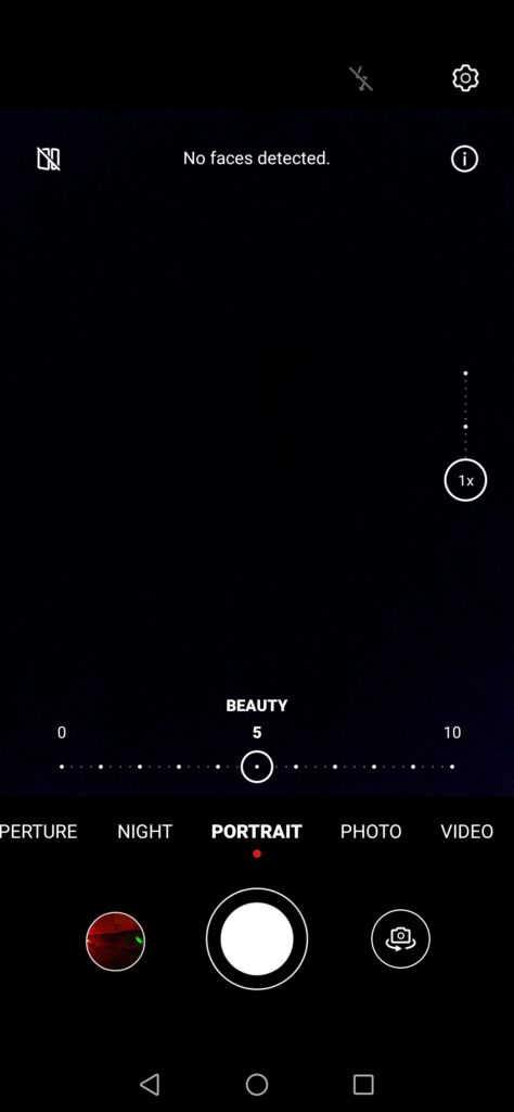
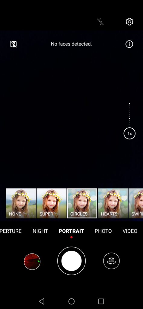
For portrait mode, the name is self-explanatory, with this mode geared towards taking portrait pictures. Here, users can “enhance” the beauty of the model, which removes imperfections on the skin, going as far as making people look younger in some cases, if pushed to the maximum. It is also possible to modify the background, getting various different effects, such as Bokeh, or a dark background. This can be useful when taking pictures aimed at being used on social media websites, for example.
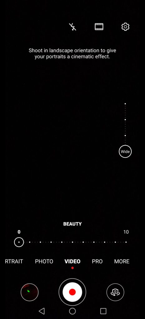
In the video mode, on top of being able to select the resolution, up to 4K60fps, as previously seen, it is also possible to keep the beauty mode on, which might be useful when filming family scenes and such. We’ve not tested the camera for filming, although, on the Mate Xs, the overall stabilisation is quite impressive, being nearly stable when filming while walking. We are guessing things are similar with the P40 Pro, taking in account Huawei has had quite a lot of time to improve their artificial intelligence stabilisation, which also relies on the optical stabilisation of the camera.
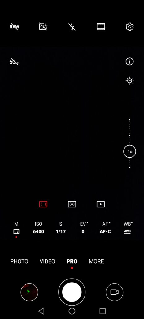
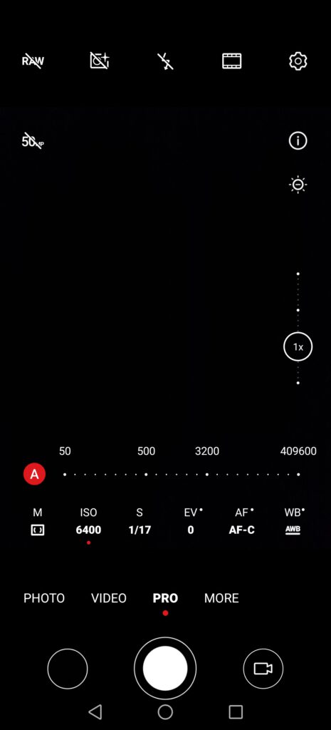
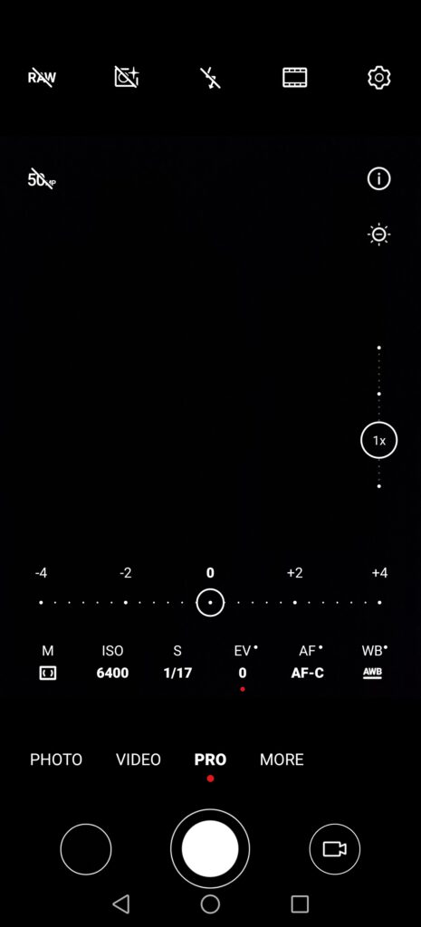
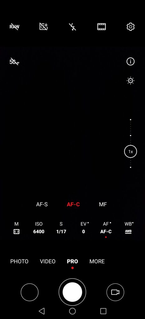
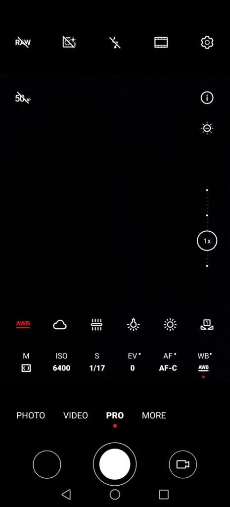
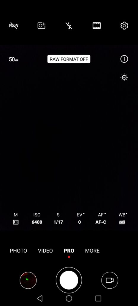
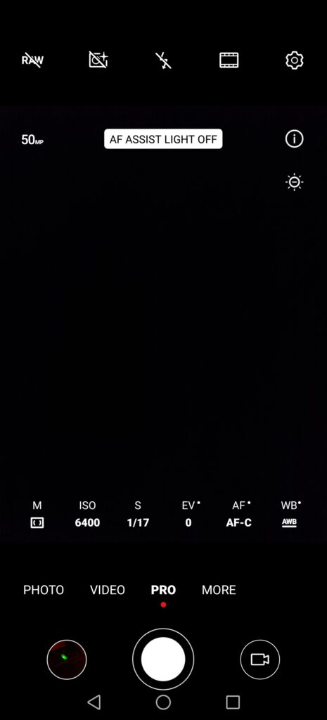
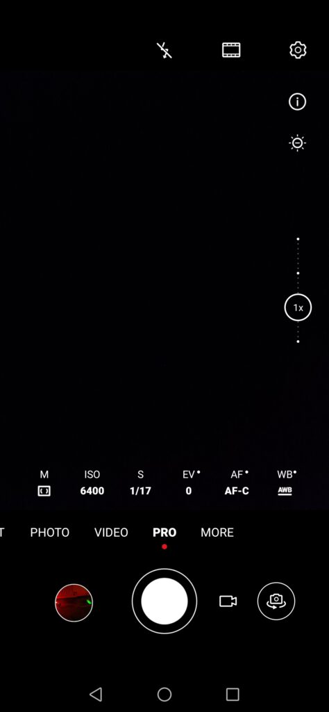
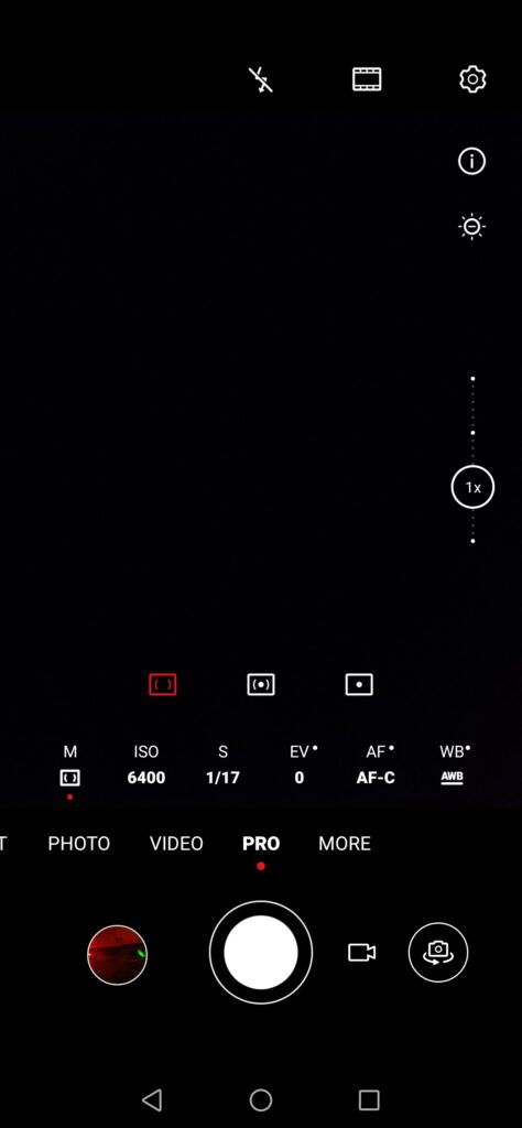
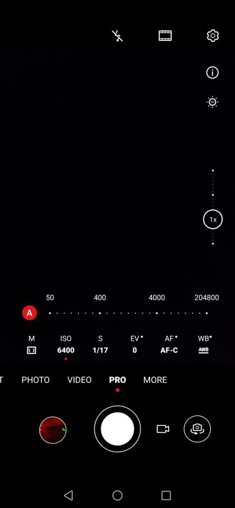
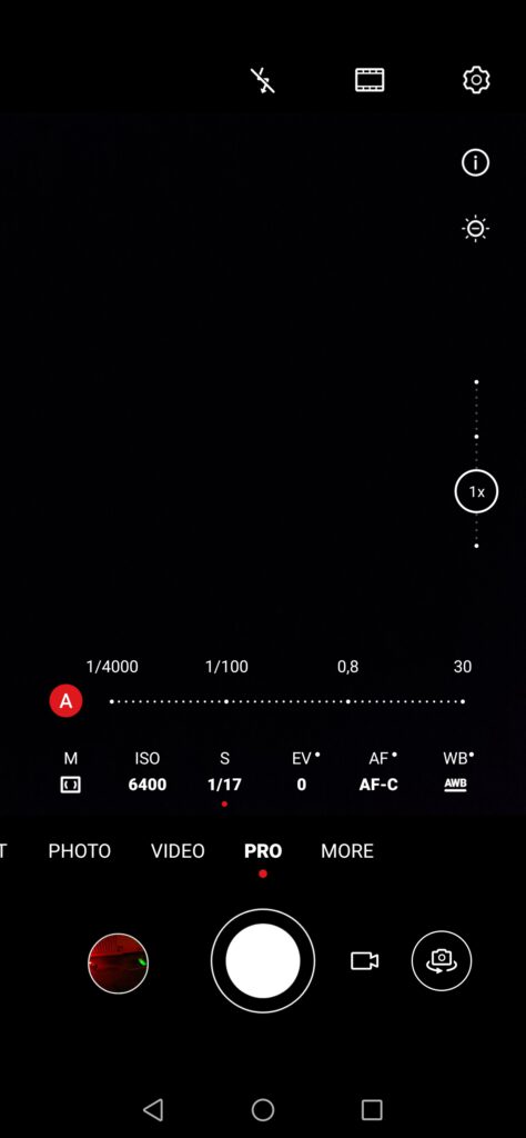
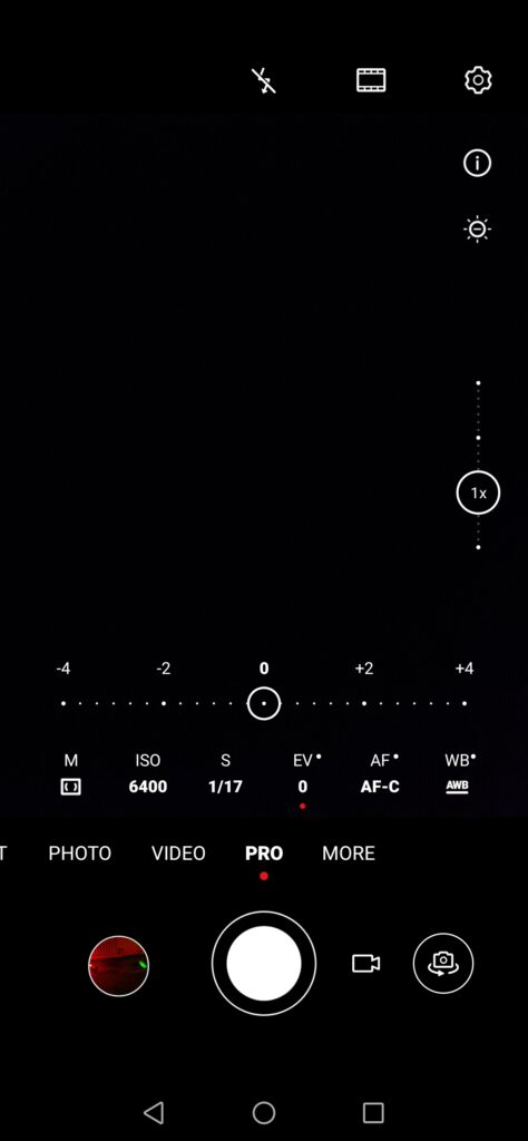
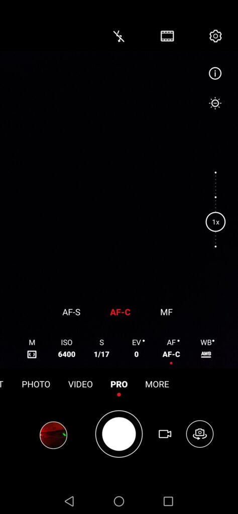
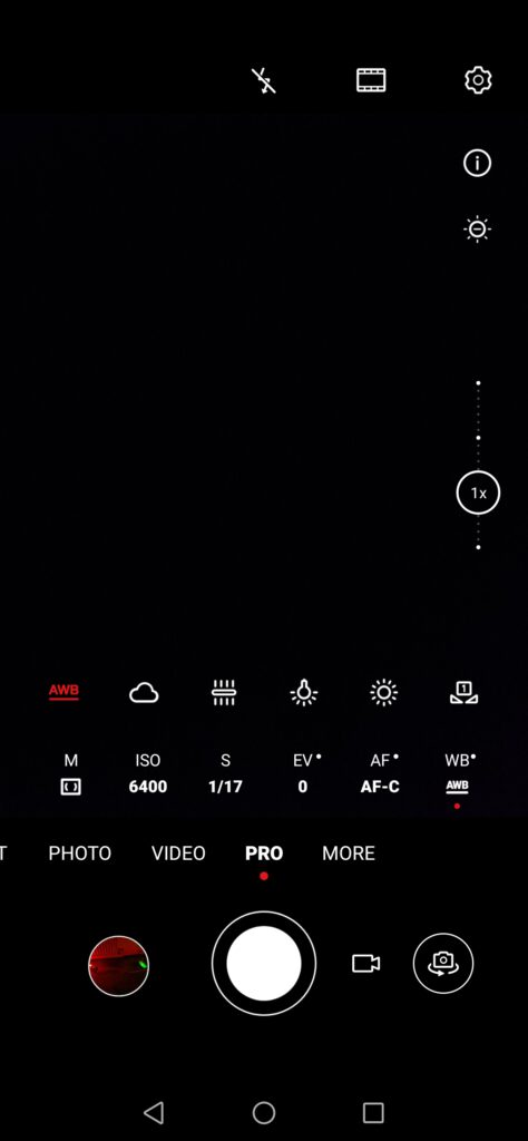
For many users, the “Pro” mode is one of the most important parts of the camera software, allowing them to control all the settings of the camera. For instance, if we want to be able to use the full 50MP of the main camera, we are now forced to use either the Pro mode or the dedicated mode in the “More” section. Furthermore, the “Pro” mode is now the only option for taking pictures in RAW format. While the overall UI might appear difficult to use, it is possible to stick to the default settings and still get access to both the RAW and 50MP features. Otherwise, it is possible to tweak everything, such as the picture colour, the flash, enable or disable the “AF Assist light”, or adjust the other options, such as metering, ISO, shutter speed, exposure compensation, focus and white balance.
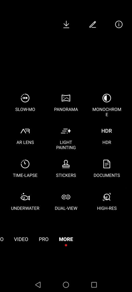
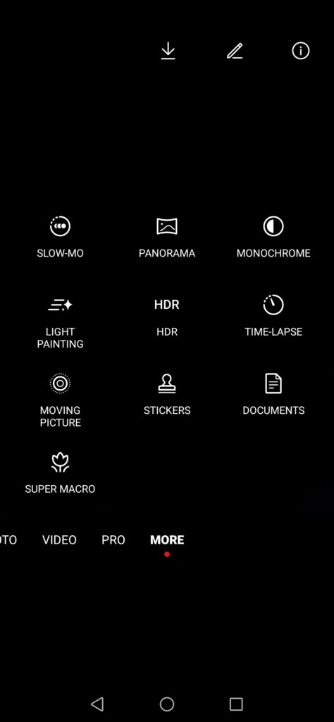
Lastly, in the “More” section, we can find various features, such as slow motion, panorama, monochrome, AR lens, light painting, HDR, time-lapses, stickers, scanning documents, underwater mode (to be used with a compatible scuba/snorkel case), dual-view video mode, which was introduced on the P30 Pro at the beginning of summer 2019, or high-res pictures, as we’ve already mentioned a few times. We’ll note the lack of a super macro mode, which has been removed on the P40 Pro, something that the community has not appreciated, with many users voicing their disappointment. However, it would appear the manufacturer is working on something similar to the super macro mode. Sadly, this alternative was not yet present during the time we had the P40 Pro, so we were unable to test it.
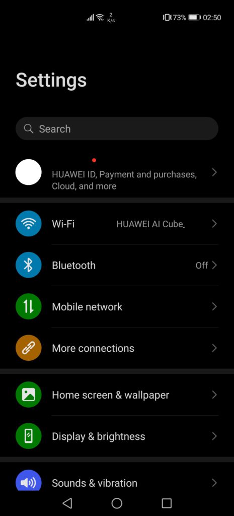
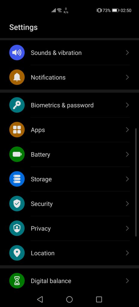
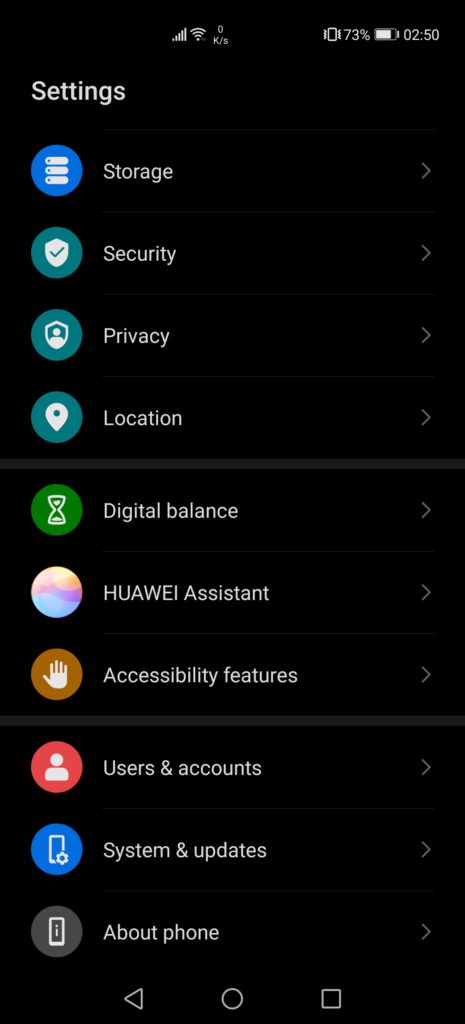
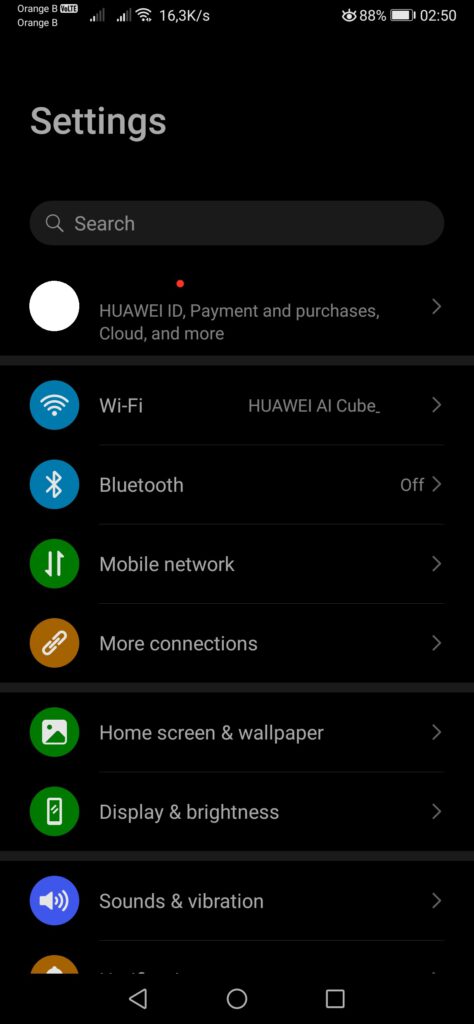
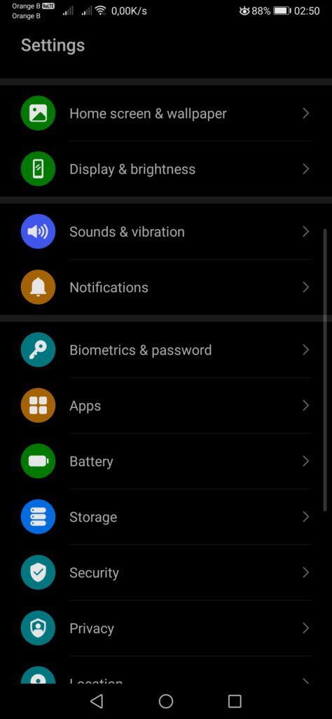
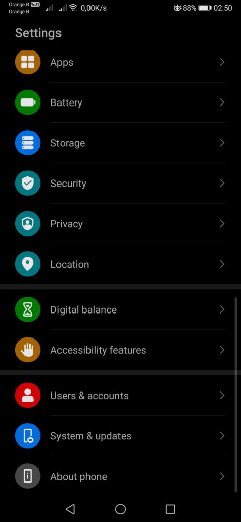
Moving on to the phone settings, these remain mostly the same, with no major differences, if not for the addition of a few new features, such as Huawei’s voice assistant, Celia, under the “Huawei Assistant” section.
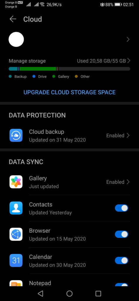
We can also find changes in the “Cloud” section of the Huawei ID, with the addition of “Find my phone”, as we’ve covered previously.
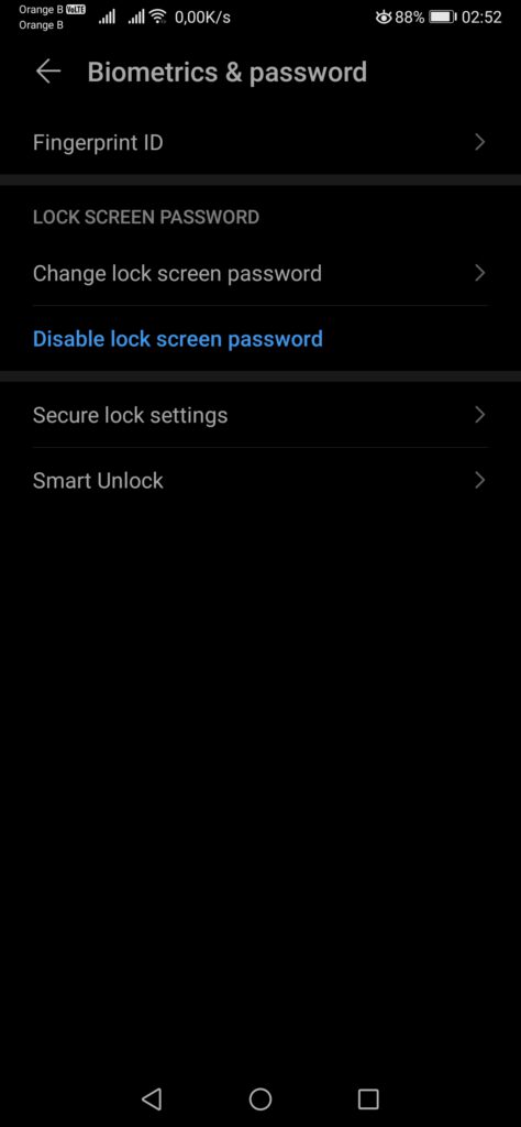
Contrary to the Mate Xs, the P40 Pro comes with an in-screen fingerprint reader, as well as a front camera with face recognition, which can all be set-up in the “Biometrics & password” section. From our testing, the new face recognition works impressively well, being extremely fast, with high accuracy, and working even in situations with poor lighting or in the complete dark.
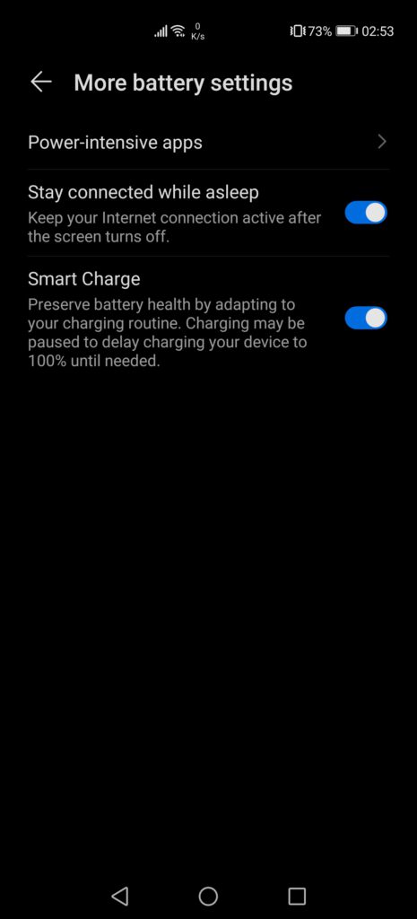
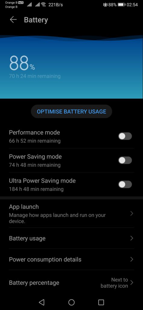
The battery settings remain almost the same, if not for the addition of the new “Smart charge” feature, which, according to Huawei, aims at preserving the health of the battery, by learning from the usage habits of users and adapting the charging. One of the examples provided by the manufacturer is users who charge their devices overnight, leaving it plugged in the entire night. With this new feature, the device will charge to 80% and then stop, before resuming before the user wakes up, with the device being fully charged by then. This feature is also expected to be rolled out to more devices at a later stage, with the arrival of EMUI10.1 on other models.
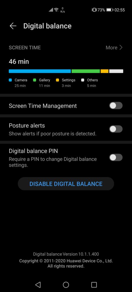
The “Digital balance” feature is a relatively annoying one, as, if not properly configured, it will give warnings of how long we’ve used the device. However, it is interesting for children, as it is possible to specify how long we want to let them use the device before this one is locked. Otherwise, this section is also interesting to keep an eye on how much time we spend on each app, how much time we spend on the phone in a span of 7 days, and how many times a day we unlock the device. This provides a clear insight into our usage habits, and allows us to correct them if, for example, we unlock the phone too often.
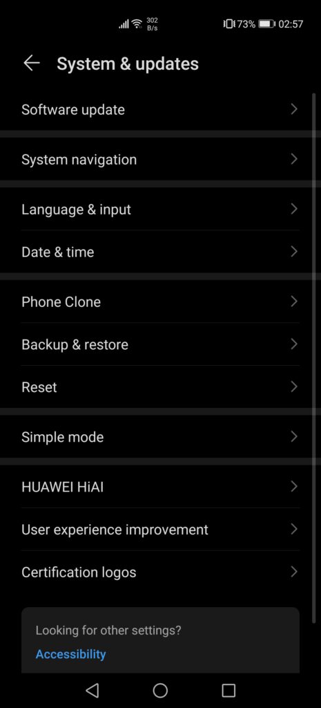
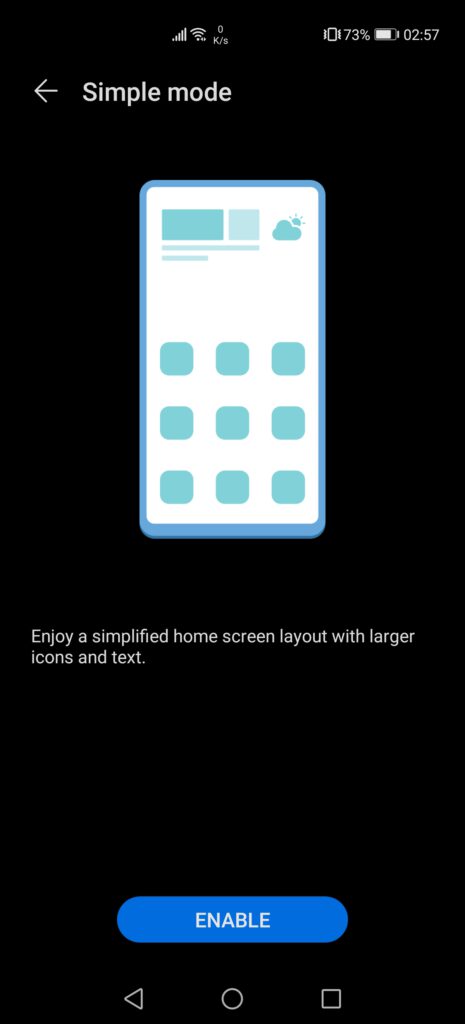
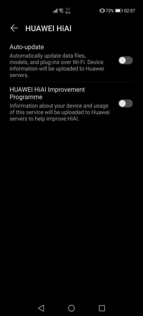
In the “System & updates” section, we find two new options, “Simple mode” and “Huawei HiAI”, with the later only allowing us to automatically update this one or share information with the manufacturer to improve their software. These options are turned off by default, which is a nice touch, if compared to Google, who usually turns on all the data collection options without informing users. The “Simple mode” appears to be geared towards both children and older people, as it simplifies the home screen layout, with larger icons and text, thus being easier to read and use.
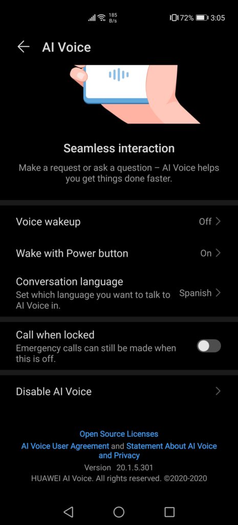
Before ending this first software overview of the P40 Pro, we have to mention Huawei’s new voice assistant, Celia. This one is currently limited to a few regions, being the UK, France, Spain, Chile, Mexico and Colombia, and, as some might have guessed, only works in English, French and Spanish. Huawei has also tied the voice assistant to these specific countries, meaning that, to be able to use it, one has to change the phone region to one of the supported countries, before being able to customize and use Celia. More regions should be coming in the future, but even the functions in the three covered languages are rather limited. The voice assistant can be set-up to be activated when holding the power button, just as Huawei did previously on the P30 Pro and the Google Assistant. It is also possible to just stick to the “Hey Celia” wakeup phrase, although, from our testing, the assistant doesn’t always react, which is rather annoying.
Right now, Celia’s functions are very limited, only being able to perform basic tasks such as opening phone apps, play music, call or text contacts, or perform basic online searches. At the same time, this is just the beginning, so it is difficult to say how far Huawei intends to take their voice assistant, or if it will remain as a replacement for Google’s and Amazon’s voice assistants until the manufacturer is able to use these American alternatives. Taking in account how long this article already is, we plan on writing a separate article about Celia later on.
Overall, the P40 Pro is very similar to the P30 Pro, especially in terms of size and handling, but with a faster SoC and an even more impressive camera, improving on last year’s model. However, for many users, the lack of GMS will be a major turn-off, making it rather difficult to sell here in the West, although, with a small effort, it is possible to have a very good experience with an HMS device. Furthermore, despite the lack of GMS, this remains a Huawei smartphone, with the manufacturer being one of the best, if not the best, smartphone maker in the world, with excellent and unchallenged flagship phones. Huawei also appears to be eager to make concessions on the price, having launched the P40 Pro at 999€ but constantly being offered with gifts, such as the Watch GT2, the FreeBuds 3 or some other accessory, making the pricing much more attractive.
More on this subject:
