WordPress 5.3 is now here, making some terrible, illogical and idiotic changes to the already useless WordPress editor.
Artículo disponible en Español | Article disponible en Français
WordPress doesn’t need an introduction. It is one of the most popular solutions for building a website, being used by roughly one third of the websites worldwide, thanks to some powerful tools allowing users to build themes from the ground-up, customize existing themes or stick with existing templates. WordPress is also divided in two different variants, WordPress.com, which does both the editor and the hosting, and WordPress.org, which is essentially just the editor, requiring users to find their own hosting elsewhere. Or, as most people do now, just get a subscription plan from one of the many hosting companies offering server space+WordPress.org already installed.
As with many projects, WordPress.org is open source, allowing “any” user to make changes or submit bug fixes, although, as we’ll see in this article, things aren’t as perfect as they appear to be. For instance, WordPress.org likes to release an update every now and then, which generally includes bug fixes and “improvements”, these improvements being making the editor even more difficult to use and taking away options some people might need.
The latest version of WordPress, WordPress 5.3, which the developers have named “Kirk”, “in honour of jazz multi-instrumentalist Rahsaan Roland Kirk” (which we’ve never heard of until now) and have the audacity to claim this is “the latest and greatest version of WordPress”. Well, yes, it is indeed the latest version available, and it is indeed the greatest… failure version of WordPress… so far. Who knows what the management of this project has in stock for us next time?
Ironically, the team also claims this is their “most refined user experience”, with “improved block editor” that is, once again, riddled with bugs so flagrant one wonders whether they bother to test their releases before shipping them. Well, of course, we have the answer to this question: no, they don’t test their own software, or even use it, otherwise they would have come across the issues we’ve experienced.
Now, let’s stop beating around the bush and be blunt about the issue: is the management of this project run by monkeys or actual stupid people? Or both? Do they actually have a clue of what they are doing, or are they just making changes for fun, in a bid to torture their userbase until this one leaves?
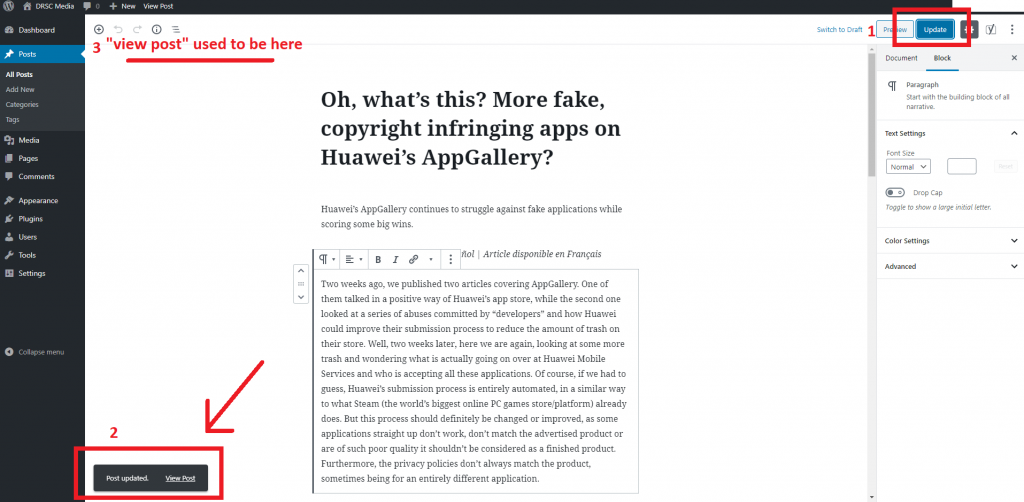
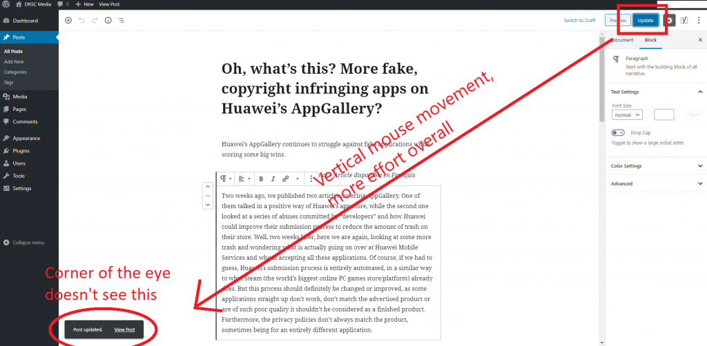
If we look at some of the changes they’ve made in 5.3, with the claims of “refined user experience” and “accessibility”, we can see them failing at both. For instance, the first, most blatant change, if we ignore some slight redesign of the dashboard, making it look uglier than it already is, is the move of the “View Post” button that appears after updating a post. This button has been moved from the top to the bottom of the page, which is an illogical choice as on the top, when hitting the Update/Publish button, one could see the notification out of the corner of their eye, and, with a single horizontal mouse move, click on said button. Now users have to Update/Publish and have the reflex to look to the bottom left, moving their head, as well as having to move their hand and mouse in a vertical move to click on the “View Post”. Here are some screenshots detailing our reasoning, as we are aware some people might dislike being called “monkeys” over their choices without a proper justification:
This leads to two options, with users wanting to maintain high quality standards having to make a bigger effort to actually check their content quality, or essentially not bothering anymore and lowering even more the bar for content quality, which, seeing the average content online in 2019, is ridiculous. After all, what’s left after typo-riddle, incomprehensible gibberish written by native English speakers who haven’t even bothered checking whether their sentence is properly structured? Sure, we might be exaggerating, but, as they say, “Time is money”. Every second saved is a second gained that can be used for a different purpose, such as actually writing content.
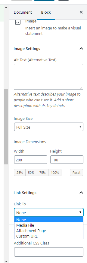
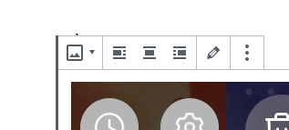
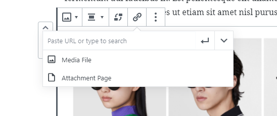
Moving on to the second issue with “Kirk” is the already terrible image viewer function of “Link to Media File”, what we call “Click to expand”, as WordPress doesn’t really have a proper “Click to expand” feature (unless one bothers installing another plugin for that specifically). For some reason, the developers thought it would be a great idea to move it from the right settings bar to a hidden secondary settings bar on the picture directly, meaning those wanting to make multiple settings changes to a picture will now have to click in two different places to get it done.
Ironically, in what looks like an attempt to prove us how dumb the people working on the WordPress backend really are, when images are uploaded to a gallery, the settings to link to the media file are still present on the right side bar, as they were on 5.2.4:
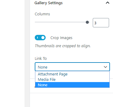
This makes it even more frustrating, with these morons claiming that “Kirk” focuses on “accessibility” and being “intuitive”, yet now users need to go to one specific place for a setting and a different place for the same setting but under a different condition. Of course, we are aware that once they realize this mistake, they’ll make sure to remove the option altogether, screwing us even harder than they are already doing.
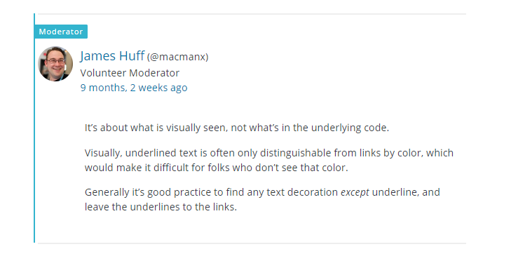
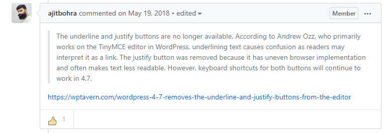
These stupid changes are clearly made by people that have no clue of what they are doing, on top of not using the tools they develop. For example, in a previous version, this group of morons already removed the underline option, claiming that people would confuse underlines with links, thinking this is actually 1999 for some reason. To avoid accusations of inventing excuses, here’s the link to these claims, as well as a screenshot of the full page. And here’s the two comments in question:
Well, yes, it can lead to confusion, but underlining remains interesting, and, ultimately, the tools should let users do whatever they want. If suddenly we wanted to underline all the goddam text, we should be allowed to, without having to spend hours looking for a plugin that will re-enable the underlining tool, plugin that will inevitable stop working after one or two updates, either because the WordPress team thinks no text should be underlined except links or because the plugin dev ended up giving up.
The way their excuse is phrased could be understood as “some people having troubles might try to click an underlined text thinking it is a link… and keep clicking on it forever”. Well, who knows, maybe they are right?
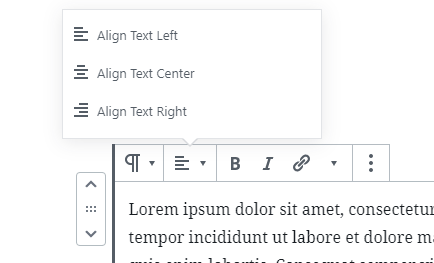
Another weird change is how they moved the text alignment tools under a supplementary menu, for whatever reason. While we cannot deny these tools are useless, as there’s no justify tool, it is worrying they are being hidden.
Maybe these are the next victims in a future update, which wouldn’t be surprising. For the removal of the text justify button, the dev team claims this is due to it not always working well across all browsers. Sure, it is possible to justify text manually by adding extra CSS code, but, once again, “time is money”, we cannot justify (ahah, get it?) spending various minutes per post copy-pasting some CSS code to get something that should be there by default. Here’s, once again, the justification used by the developers:
For our next and last complaint, we’ll ask who and why they touched the Gallery feature. While this one already had issues since a long time, with images being cut on both sides in some cases, the latest update introduced a bug of a new type, shifting the Gallery to the right, even if in the editor, nothing appears to have changed/be wrong:
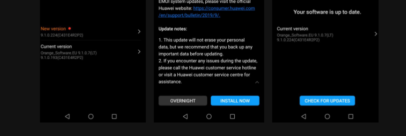
On 5.2.4. Images are cut on both sides of the Gallery. 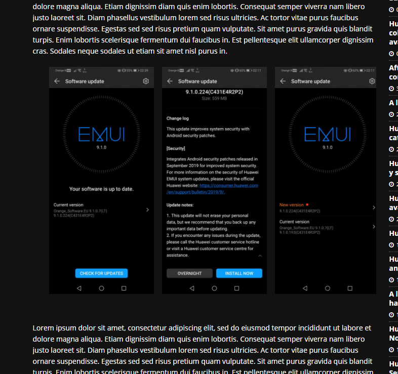
The Gallery is suddenly aligned to the right, even if nothing has changed in the editor. 
We actually spent a long timer testing multiple different options, such as checking the image properties, uploading new ones, testing different ones, trying to align the Gallery left, right, centre, and nothing fixed this issue, with the Gallery appearing aligned to the right all the time. Ironically, while this bug doesn’t seem to be fixable on our end, it also affects some regular “Image” blocks, although the fix in this case is quite easy: setting the “Image Size” to “Full Size” fixes it.
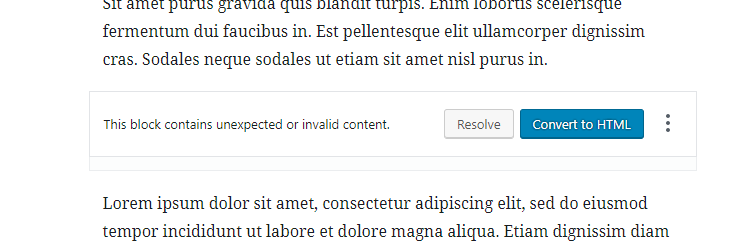
We ended up deciding to downgrade from WordPress 5.3 to 5.2.4, with the Gallery we had inserted on 5.3 claiming it contained “unexpected or invalid content”, confirming our suspicions that the developers had meddled with its code:
Tech companies and developers should start understanding that if something works fine, it shouldn’t be changed or touched. At the same time, this age of software always in beta should end, as users such as us end up getting tired of having to test for free (actually, in most cases, we are paying for it) their buggy releases, just so they can save a few bucks on testers. It also represents an impressive waste of time on our side, forcing users to figure out whether they are doing something wrong, before deciding to downgrade to a previous version that worked just fine. In our case, we spent 20 minutes trying to fix the picture/gallery issue, before deciding to downgrade from 5.3 to 5.2.4.
Instead of attempting to modify everything and nothing, companies should spend longer fixing their releases, in order to make it as stable as possible, on top of adding useful features. For instance, the WordPress team should look into making the editor more secure, with the inclusion of 2FA (Multi-factor authentication) to log in, create a powerful built-in analytics tool so users don’t have to rely on Google Analytics or some other plugin, a better way to handle cookies, following EU laws for instance, instead of letting users figure out every single detail, a proper image viewer and not the crappy option of linking to the archive, and other changes that modern websites should have by default, instead of forcing us to rely on multiple plugins for basic features. And, ironically, installing dozens of plugins is recommended against, due to possible conflicts between them and the possibility that one of them will have a bug allowing attackers to take control of the website.
Some might say, “Don’t update them”. Well, we wish we could, but this is not possible, as the update keeps being pushed. If it isn’t pushed by WordPress, it will be the host updating it automatically. And if it isn’t the host, we’ll have to deal with the plugins begging to update WordPress to the latest version, or else they’ll stop working.
It is surprising to see that WordPress have the popularity they do, seeing that we at this point consider ourselves prisoners of this garbage building tool, left to the will of its completely useless and moronic team of developers who serve copy-paste excuses to legitimate grievances or complaints from users.
In any case, for those interested in checking out WordPress 5.3 “Bugfest Kirk”, here’s their blog post.
More on this subject:

