We’ve just passed the 900 free articles mark, a new achievement for the company.
Artículo disponible en Español | Article disponible en Français
Today, we’ve just passed the 900 free articles mark, which combines articles published by DRSC Media and accessible for free, and articles published by DRSC Pro that eventually went free to read. Overall, this 900 articles mark includes 829 DRSC Media articles, as well as an impressive 71 DRSC Pro articles, although this remains a small part of the massive 700+ paying articles the company is still holding on to.
If we now focus on the statistics and compare them to our last article about this subject, here are the differences:
- 900 total articles, up by 12.5% (was 14.29%)
- 652 articles in English, up by 15.40% (was 20.73%)
- 126 articles in Spanish, up by 5% (was 0%)
- 122 articles in French, up by 6.09% (was 2.68%)
- 345 107 total words published, up by 21.01% (was 21.09%)
- 383.45 words/article on average, up by 7.70% (was 5.82%)
- 25 months since we started, back in October 2017
As it can be seen, while the total amount of words published remained mostly the same, experiencing a small decrease of 0.08%, the global average length of our articles increased by 7.70%, compared to a previous growth rate of 5.82%. This is mostly due to the increase in DRSC Pro articles going free to read, with DRSC Pro articles being on average 49% longer than regular DRSC Media articles (551.04/article and 369.10/article respectively).
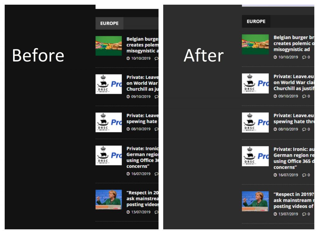
We’ve also continued improving the design of our website. While we had previously switched to an overall dark theme, we’ve decided to make this one clearer, picking a grey along the lines of what other websites with dark themes use. Our reasoning for this change is that a very dark theme (black in this case) might be good if every other website the user accesses also has a dark theme variant. The reality is that we form part of the minority in this case, making visiting our website rather annoying, especially for those coming or going to a different website with a white/light theme. Thus, we’ve opted for an option midway through white and black, picking a light grey that doesn’t instantly burn the readers’ eyes, but is still soft enough to not be a shock when going to a clearer site. Here’s a comparison:

As per usual, we thank you for your continued support,
DRSC Media
A division of DRSC Publishers Ltd.
Report written with the support of DRSC Pro.
