EMUI10 has finally landed on the P30 Pro, redesigning entire parts that were left untouched between EMUI8 and EMUI9.
Artículo disponible en Español | Article disponible en Français
In the third part of this EMUI10 overview, we checked out Huawei’s e-mail application and the Gallery. We’ll now be checking out the calling application and the file manager.
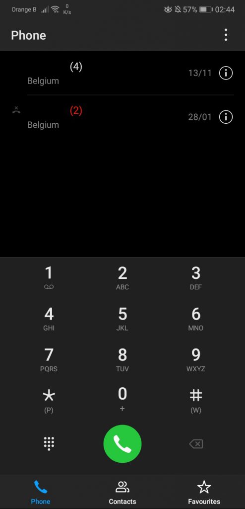
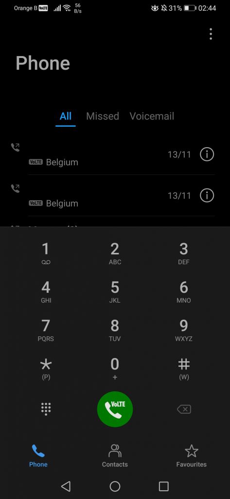
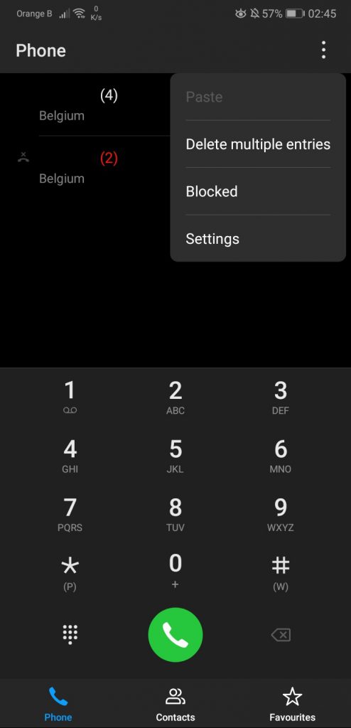
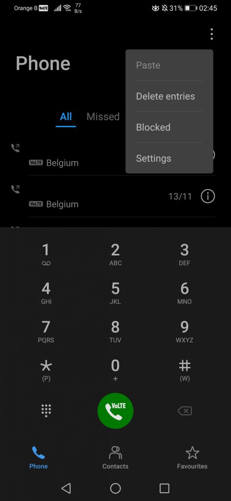
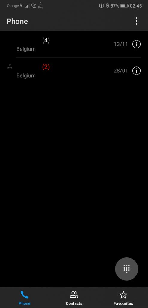
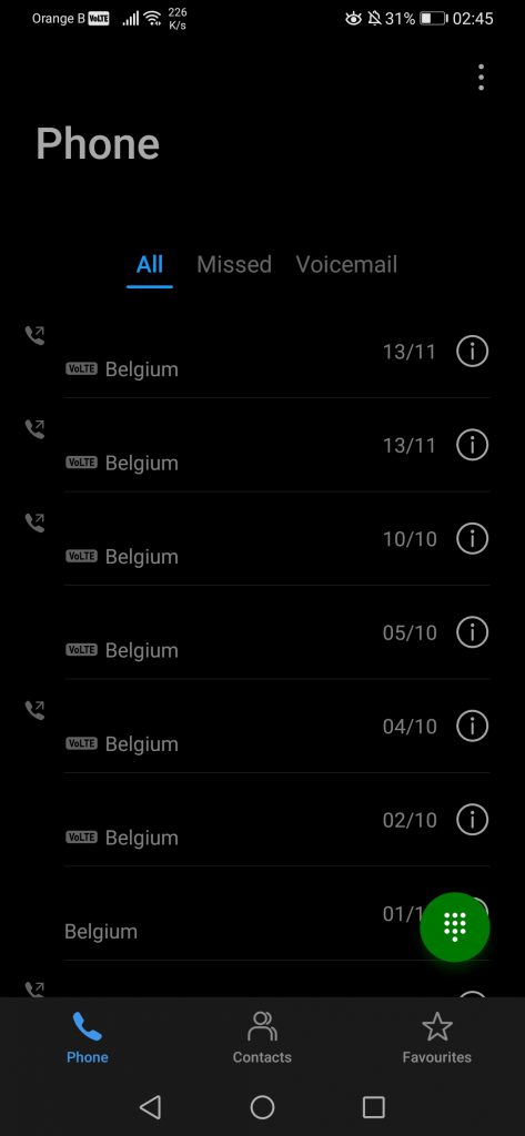
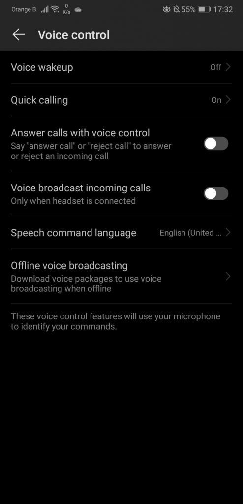
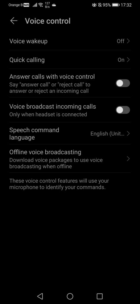
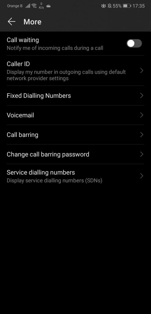
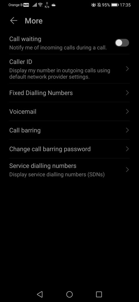
The “Call” app has also slightly changed, although it remains what it is, an application made to call. We’ll specifically focus on the call function and leave the “Contacts” tab for right after. Overall, the new design matches, once again, the overall new design of EMUI10. Settings-wise, we find the same options as in EMUI9.1, with the option to delete specific records or checking blocked numbers, which links back to the “Optimizer” application to manage blocked numbers there. We also see the addition of a “Missed” calls section, as well as a section for voicemail. We also see the keypad changing of colour, going from grey to a glowing green, a change we’ve seen on other parts of the system. As per usual, the left side is EMUI9.1, the right side is EMUI10:
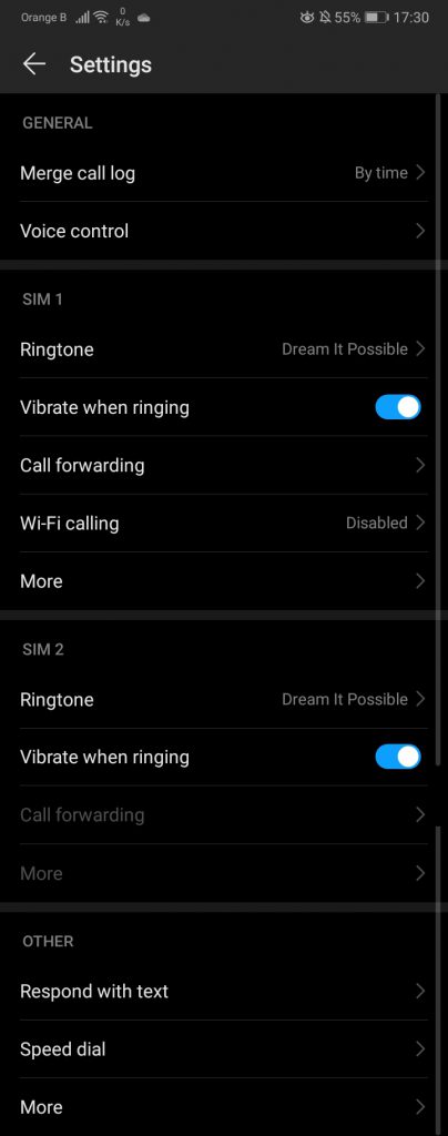
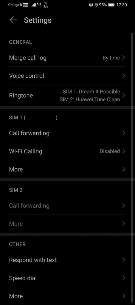
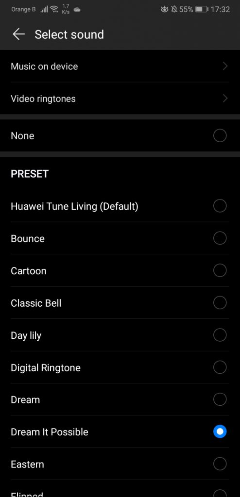
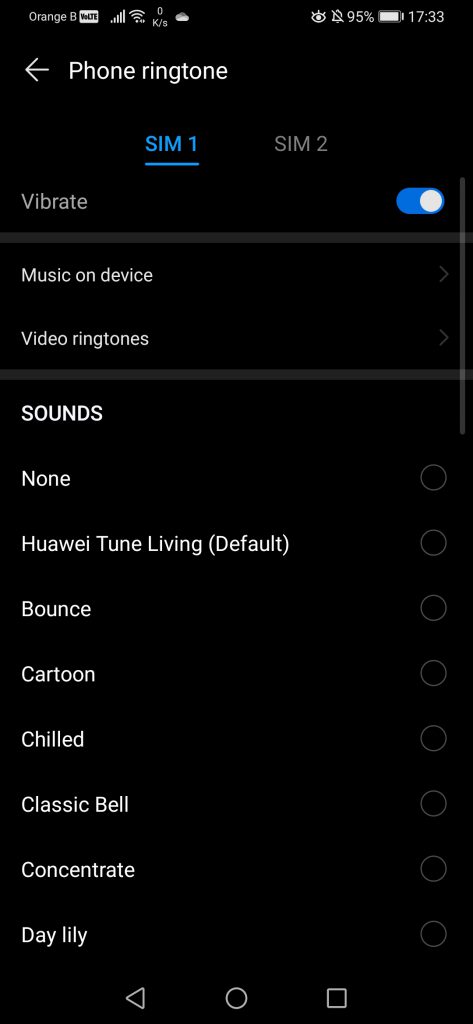
Inside the settings, some things have been moved around, such as the ringtone setting. The phone number is now displayed for each SIM too, making it easier to figure out what “SIM 1” refers to, for those that might be using two different SIM cards:
Going through the many settings available in this section, not much appears to have changed. The ringtone sound change is now lightly more intuitive than before, putting the dual-SIM ringtone sound setting under the same menu. We see the removal of the “Vibrate when ringing” setting, which has been moved elsewhere in the settings, although it made little sense to have it there originally:
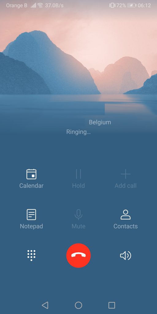
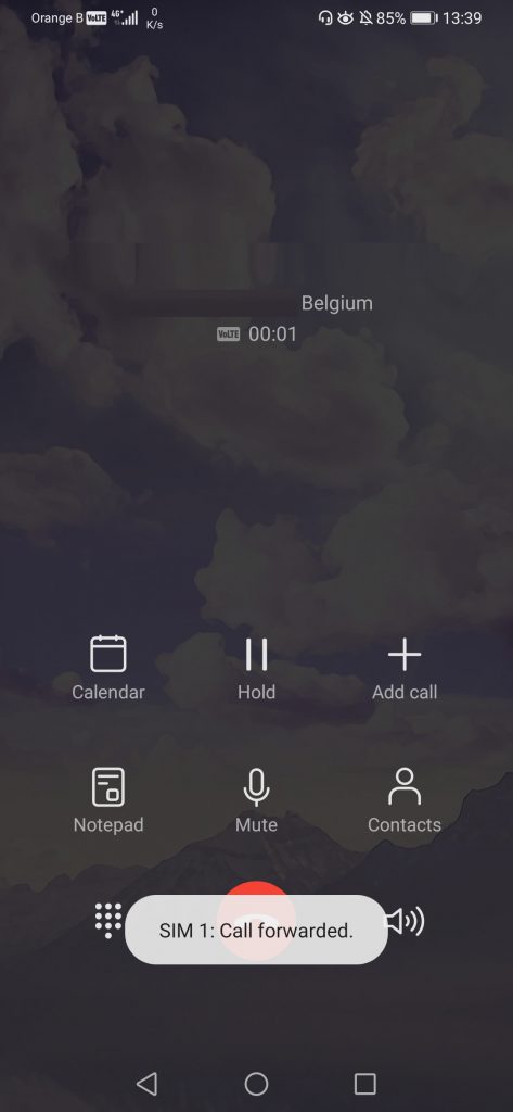
For the calls, we see a new background has been added. While in the past, the background would match the profile picture of the contacts, we now have a cloudy sky:
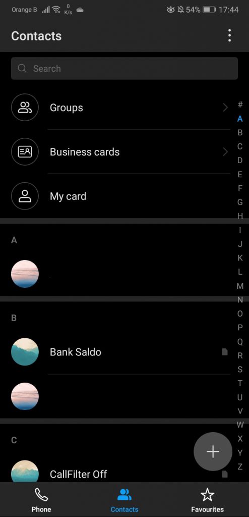
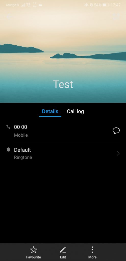
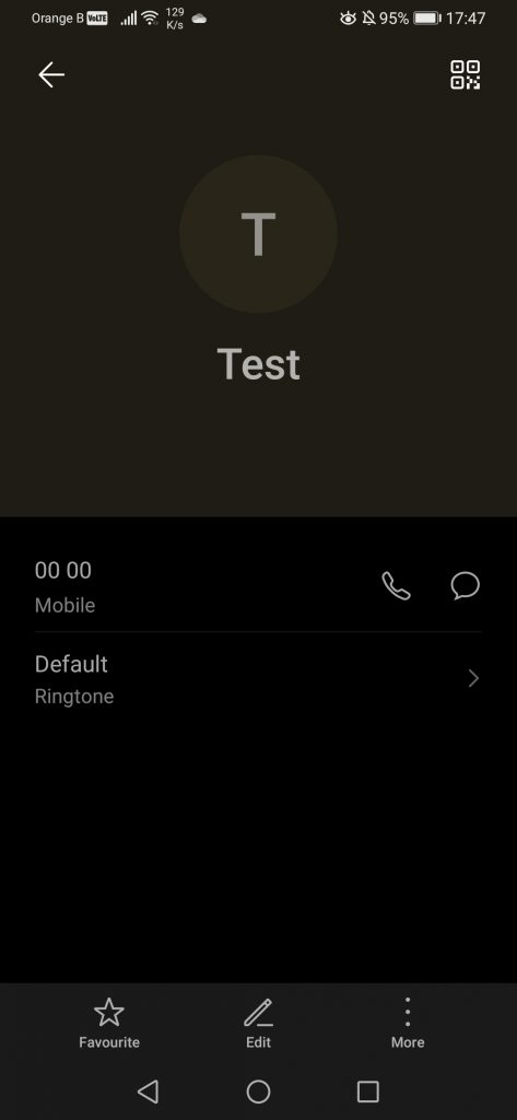
The rest of the options haven’t changed, so it doesn’t make sense for us to go any further than this. As mentioned, we’ll now move on to the Contacts application, which sees an interesting change: contacts do not have a default picture of mountains/hills anymore. Ironically, we had seen some complaints from users about this, claiming that the default pictures were depressing. Either the company took this complaint seriously, or they had already decided to remove those default pictures, but, either way, we now find ourselves with profile “pictures” that are essentially the first letter of the contact’s name:
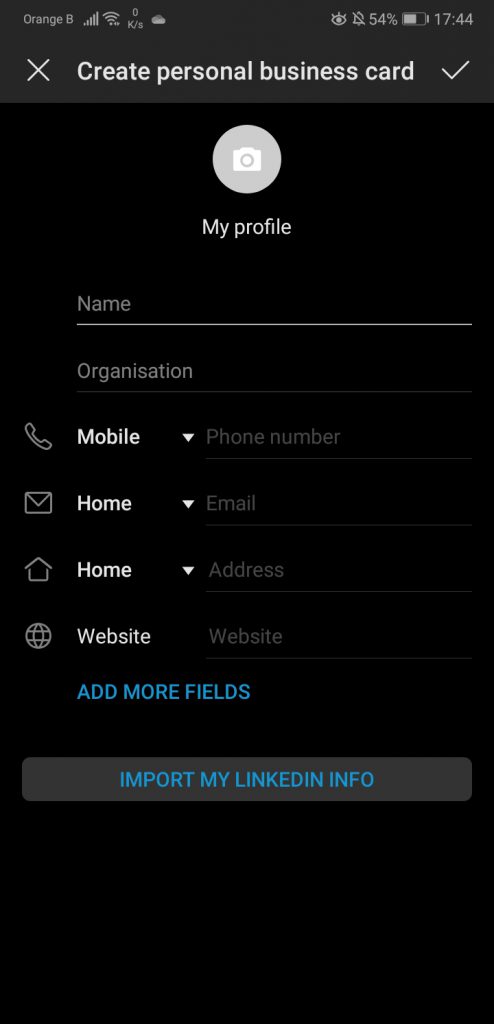
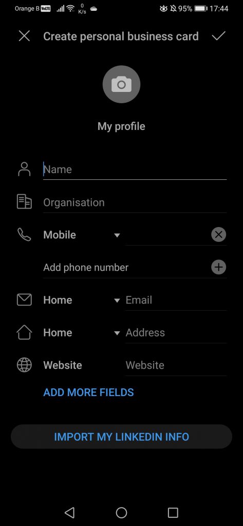
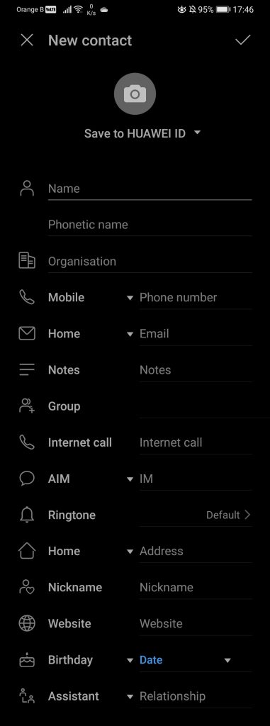
Some of the options offered are, for example, the creation of a “card”, which people can easily scan with their phone to add your personal information (such as name or phone number) to their contact list, making it easier, rather than having to dictate/copy and type the number in. These “cards” essentially have the same layout as the “New contact” feature:
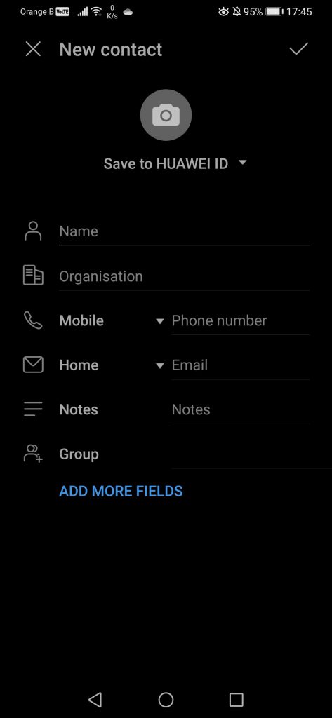
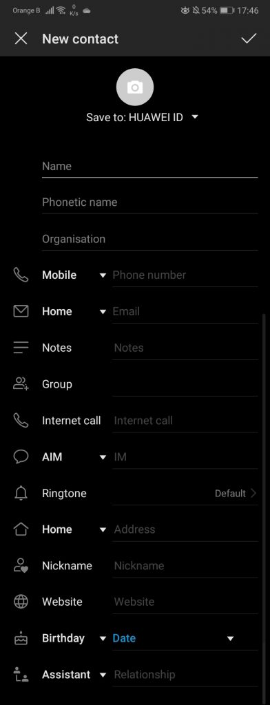
If we expand the “New contact” page, we can complete quite a lot of fields, as well as pick under which account we want the contact information to be saved on:
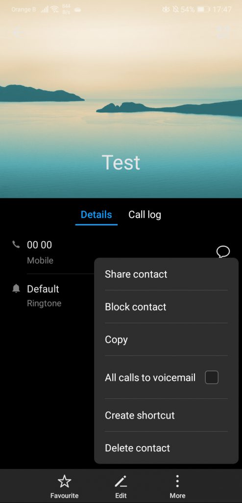
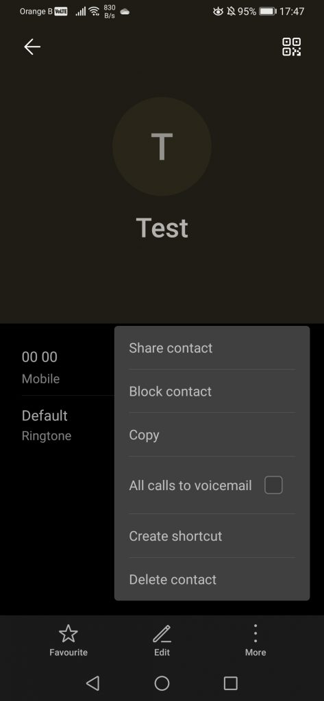
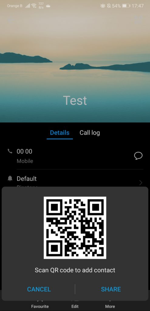
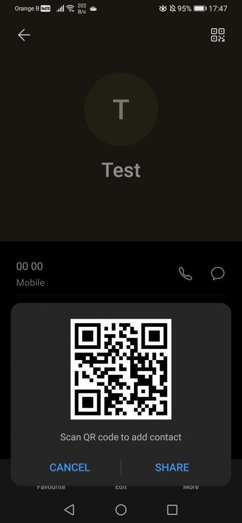
If we now look at the new “Contact” layout, we can see the removal of the stock picture, as mentioned earlier. We’ve created a “Test” contact to be able to show most of the features without having to hide a lot of information, although under each contact, users can also see their WhatsApp account (and other accounts), as well as a detailed call log, which includes the date and hour of the call, as well as the length of said call. Under the “More” setting, we can share, block, copy, delete or create a shortcut for each contact, a set of quite basic options overall. Finally, we are also able to produce a QR code to scan it with our smartphone, making it easier to share contact information, as we’ve already mentioned:
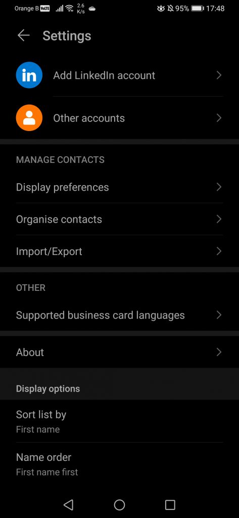
To end this part, under the “Contacts” settings, we have the option of linking to our LinkedIn profile or other accounts, such as Google, Huawei ID, etc. We can choose which contacts to see, picking between all or just the contacts saved under a Huawei ID, Google account or the SIM card. The device, by default, will merge contacts that appear multiple times, making it easier for us overall. We also have the option to import or export contacts, with the export feature allowing us to save a copy of the contacts on the storage or the SIM card. Keep in mind that contacts saved on the SIM will not display a customized profile picture, if the user puts one. For that, users have to pick a different view of the contacts, ignoring the SIM ones:
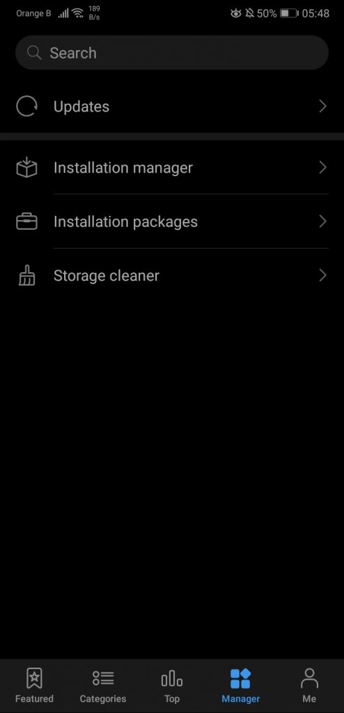
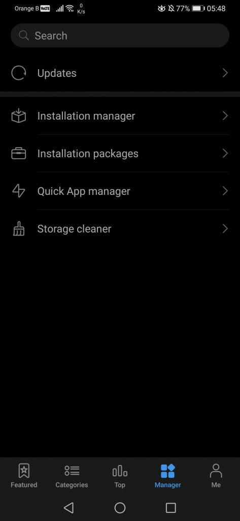
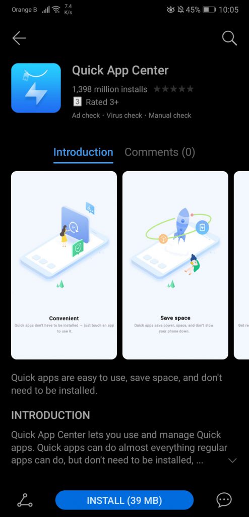
We will not be covering the SMS application, as this one is essentially Google’s “Messages”, and not Huawei’s anymore. As previously mentioned, we will be leaving the “Camera” application for later too, just as the settings. This leads us to “AppGallery”. While we could say quite a lot of things about Huawei’s app store, we’ve already published a number of articles talking in detail about AppGallery. Furthermore, the application receives regular updates, fixing bugs left and right and adding new features. The only real change EMUI10 brought to AppGallery is the addition of the “Quick App manager”, which installed itself on the device. We don’t have much to say about this “Quick App” manager feature, as we’ll be covering it in detail on a separate article, available here. One thing worth noting is that the “Quick App Center” can be manually installed through AppGallery, so those interested in checking it out but are still under EMUI9.1 or earlier, can do so if they wish:
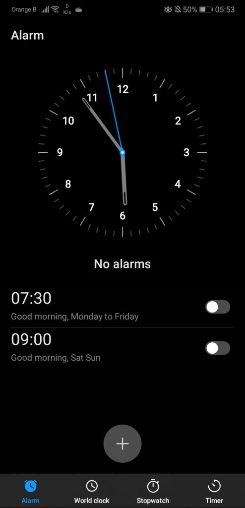
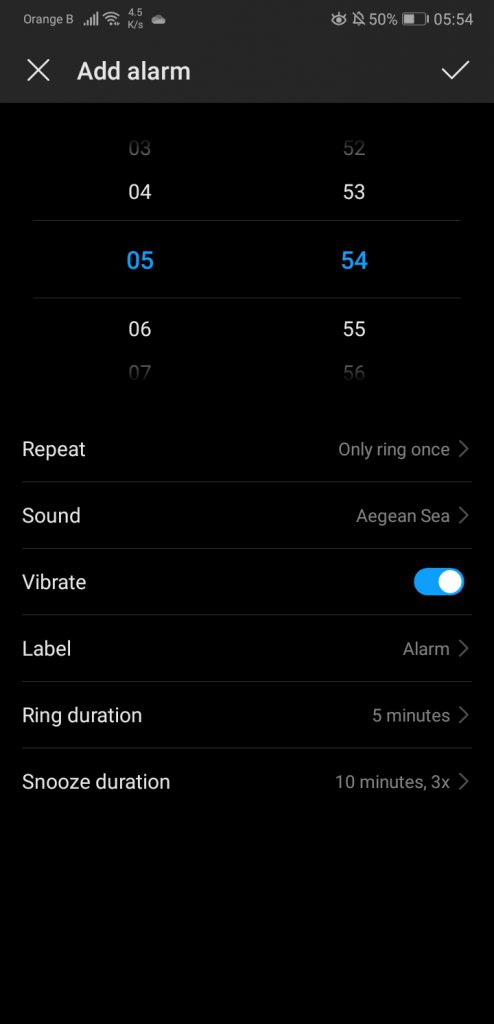
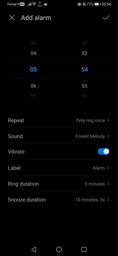
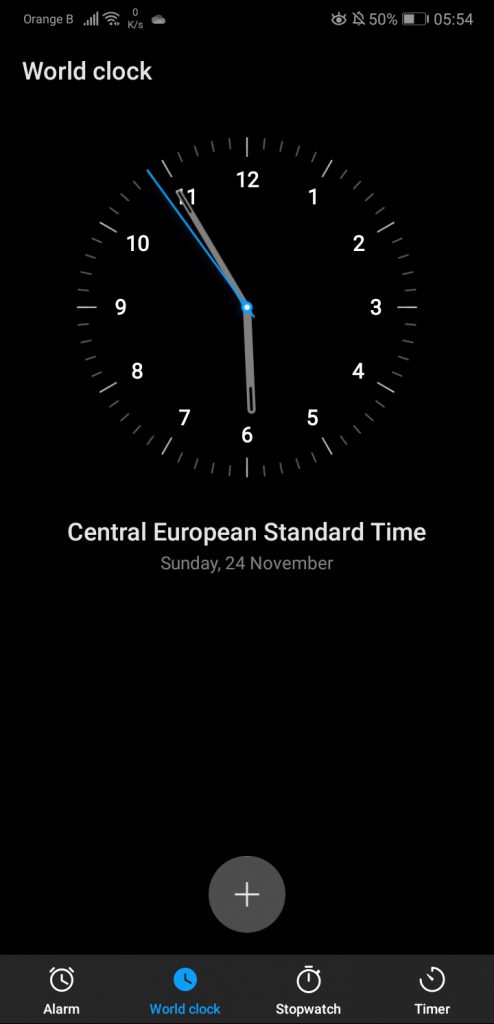
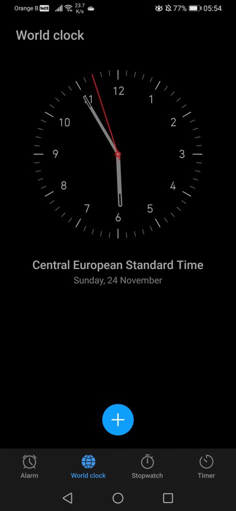
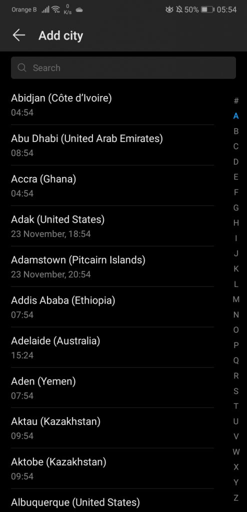
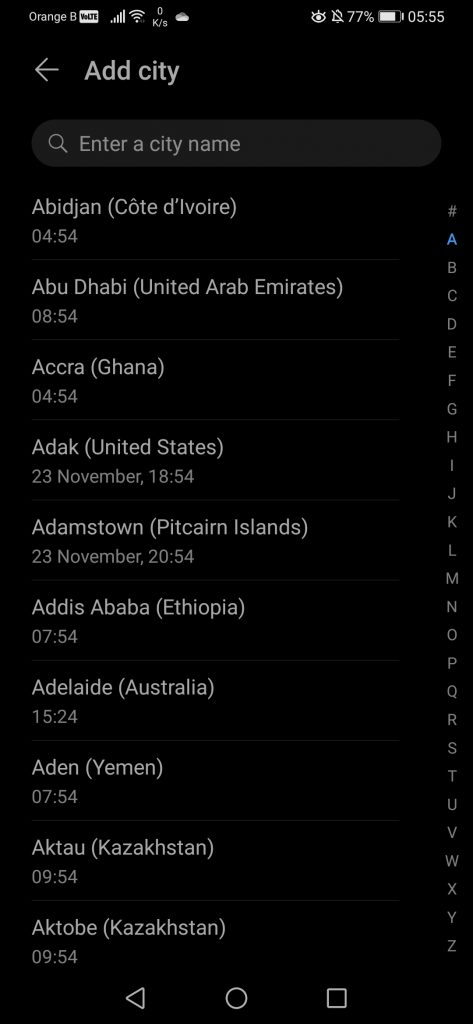
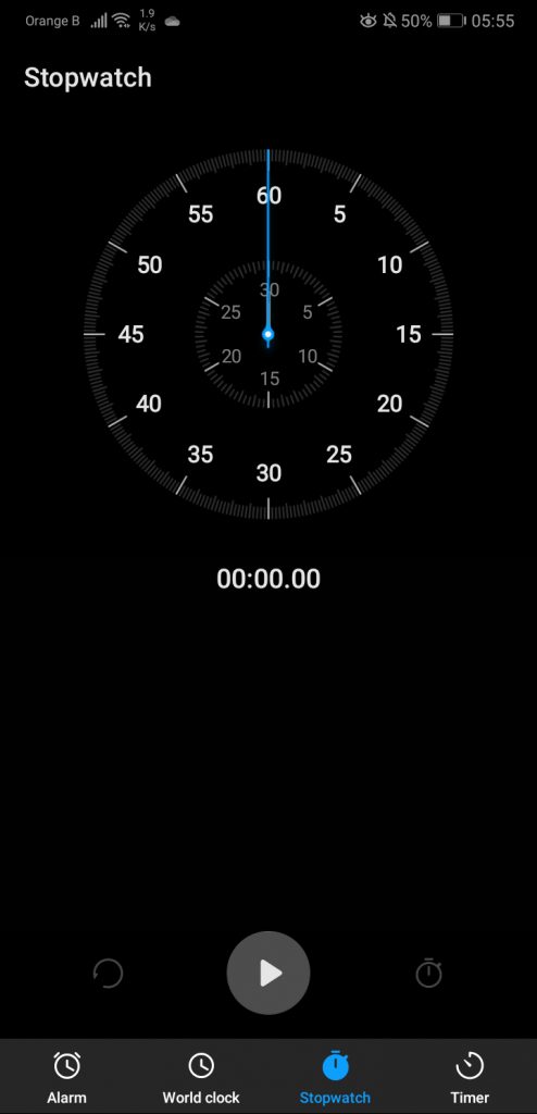
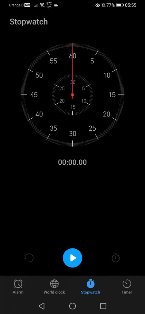
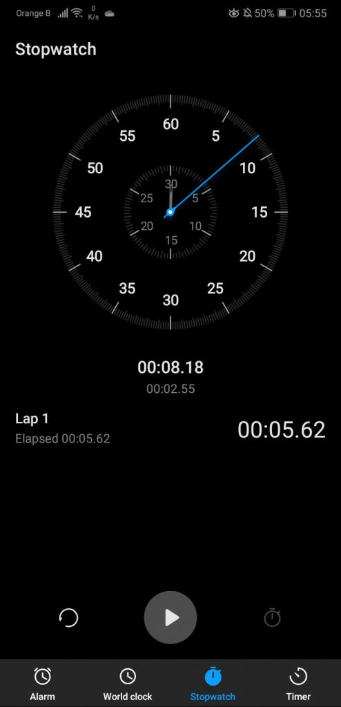
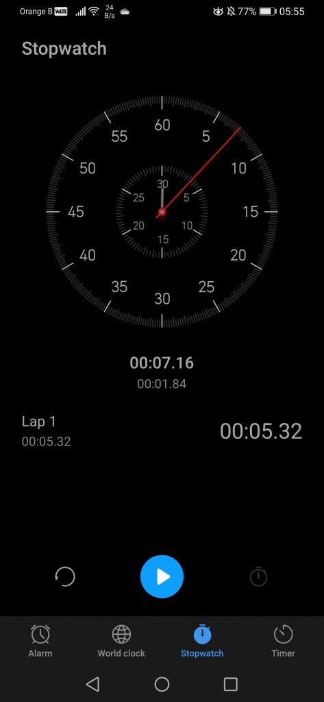
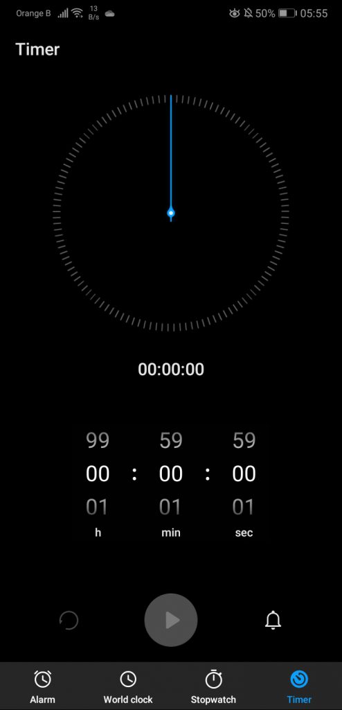
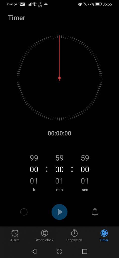
We’ll now have a look at the few other applications included by default on a Huawei smartphone, such as, yes, the “Clock” app. This one hasn’t changed at all, if not for some colours that have been switched. Overall, the default clock app allows users to set up a series of alarms, follow the hour in different countries/regions, and includes a stopwatch and a timer. It is also possible to customize the alarms and such, by using either the default sounds or music/sounds stored on the device:
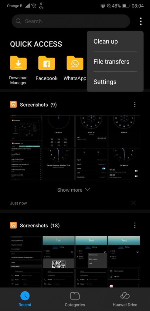
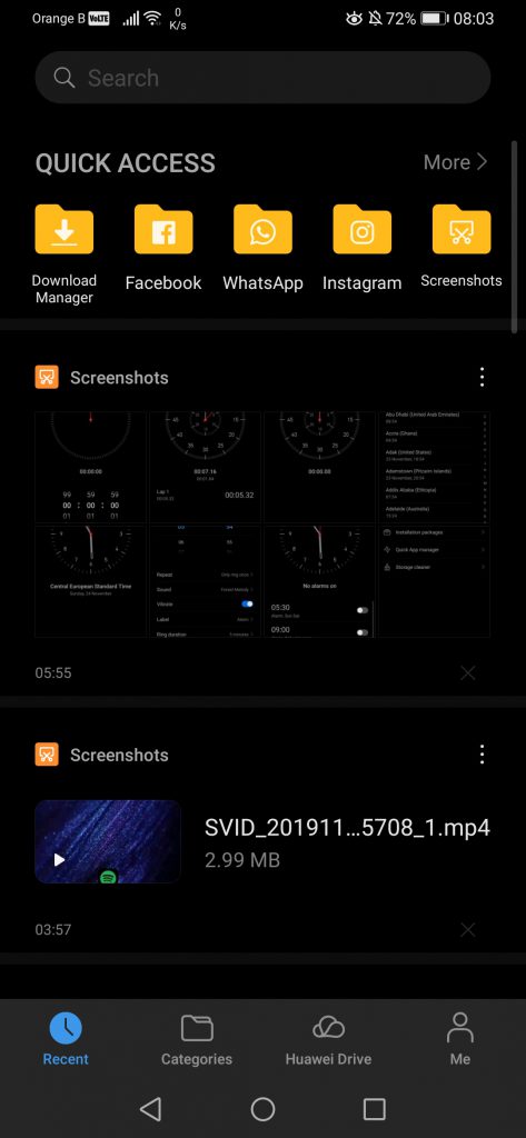
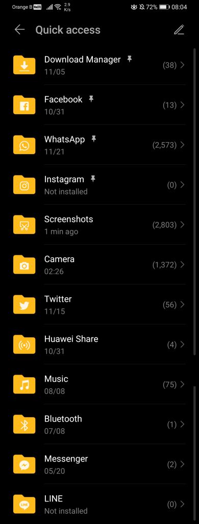
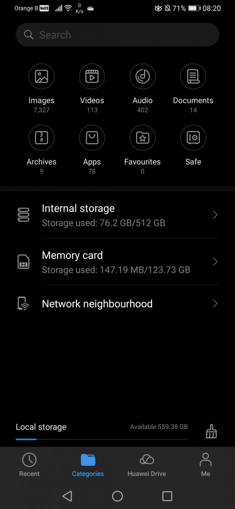
For the application version, this one has changed from 9.10.0.342 to 10.0.0.441. This ends the “Clock” overview and leads us to another big and important application: the “Files”. A lot has changed here, with a few things removed and others added. Please keep in mind that the P30 Pro supports Huawei’s Nano Memory cards, while the P20 Pro doesn’t, meaning there’s an extra setting for these external memory cards. If we start by the “Recent” section in the Files app, the first thing we see is a search bar. While on the older version of the file manager there’s a menu with a quick access to “Clean up”, file transfers and supplementary settings, this one has been moved to the “Me” section on the new version. We also have a list of quick accesses, allowing us to view all content from a specific application. Interestingly enough, it would appear some of these quick accesses are hardcoded into the app, as we’ve never installed LINE on our devices, yet it is listed. The new version of “Files” also lists a few more apps, such as Music or Bluetooth:
This “Recent” section essentially lists all the content on our device, organized from the most recent to the older. Each “block” of content can also be shared to the usual places, such as social media, or uploaded to Huawei Drive and then viewed on a PC:
If we now head to the “Categories” section, here we can already notice a change, with the indicator of overall local storage and cloud storage having been removed. Instead, the local storage is now listed at the bottom and includes both the device’s internal storage plus the external memory card (if one is being used), while the cloud storage indication has been moved to the “Me” tab:
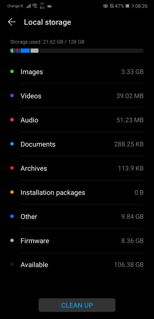
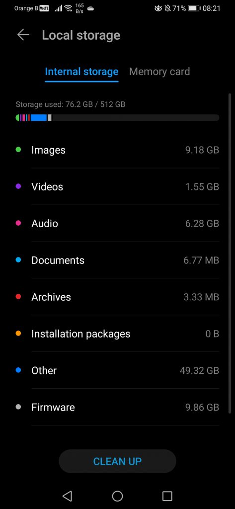
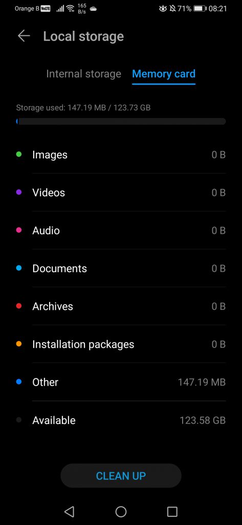
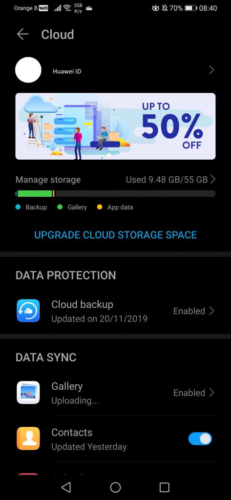
If we tap on “Local storage”, this sends us to the settings section for the phone storage. The same happens if we tap on the “Local storage” at the bottom of the new version. Meanwhile, the “Cloud storage” option just redirects to the Huawei Cloud settings inside the Huawei ID section:
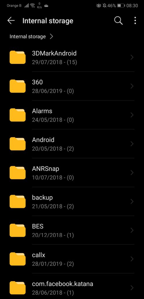
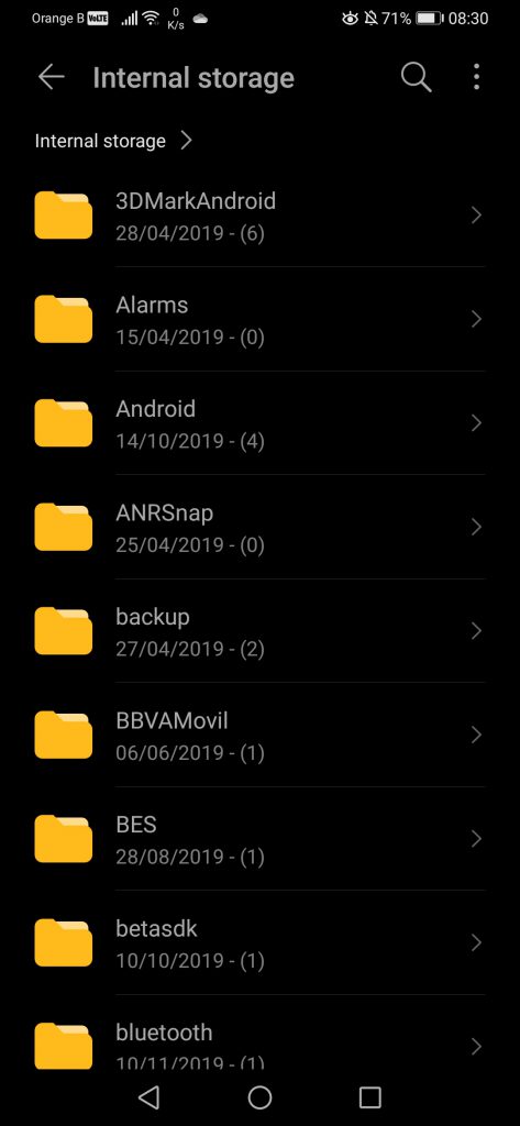
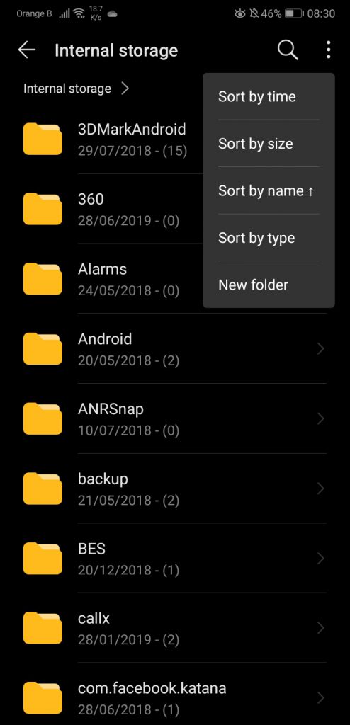
Now, the device classifies content in different categories, such as images, videos, audio, documents, etc. This is what the various sections are. If we want to see in which folders said content is stored, one has to go to the internal storage option, and deal with the mess that Android folders are, as applications like to randomly create a folder for themselves. Of course, we have the usual settings to sort out said folders, but nevertheless, they remain annoying:
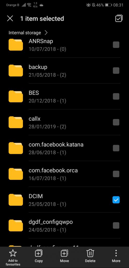
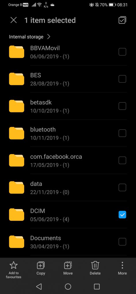
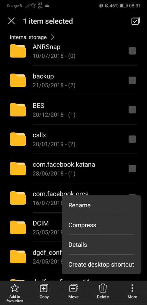
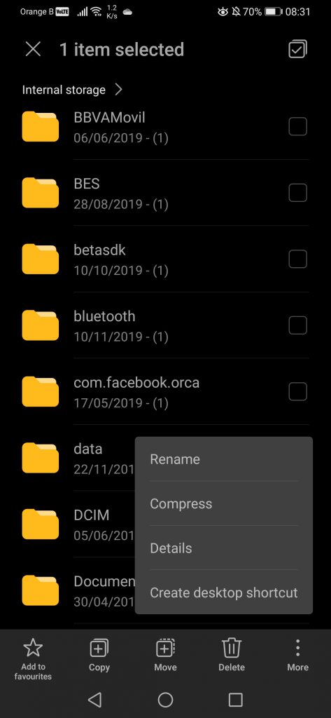
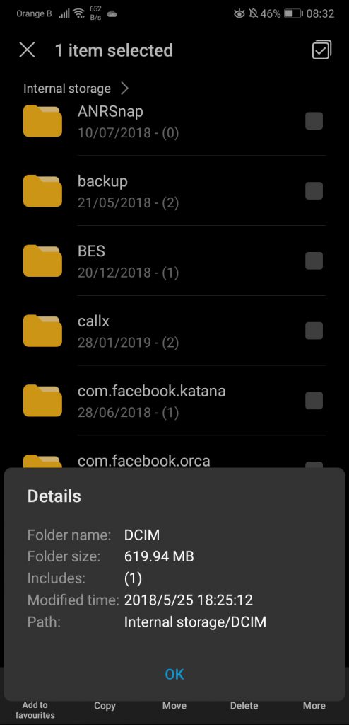
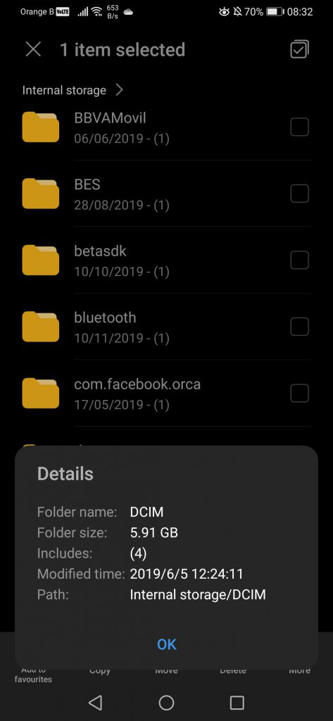
Selecting a folder will display a number of options, such as copying said folder, moving it, or provide more details such as the size of said folder:
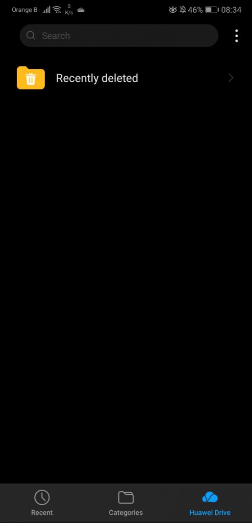
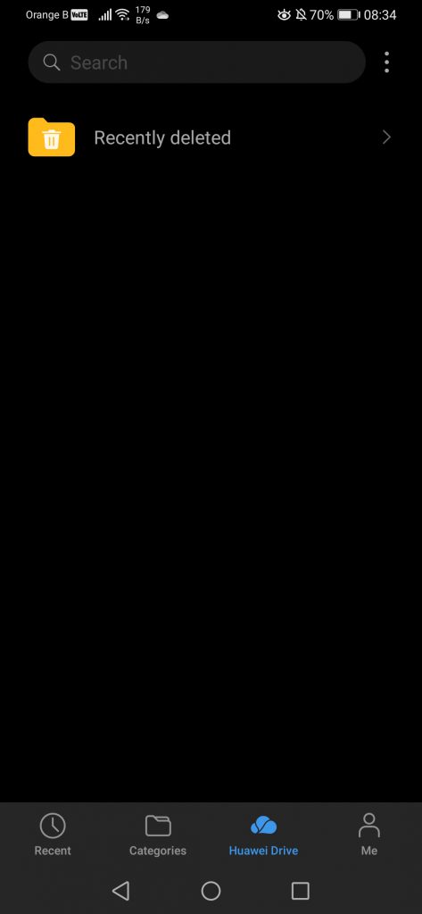
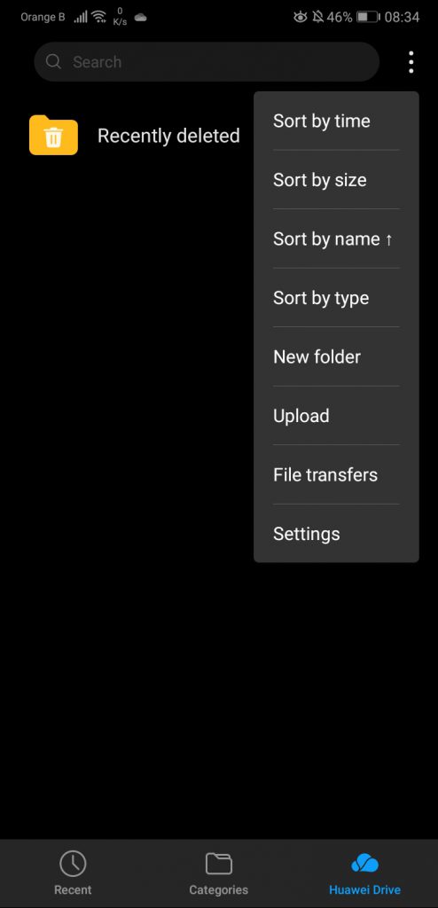
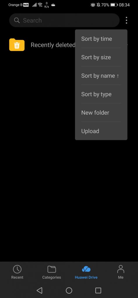
The last common section is the “Huawei Drive”. The Huawei Drive is linked to Huawei’s Mobile Cloud and allows users to save files and access them via the browser on a PC. Sadly, it is quite uncomfortable to move files to this folder, then logging on the Huawei Mobile Cloud on PC and fetch said files. It is far easier to just use something such as OneDrive that, when it works (because we all know OneDrive is down so often it’s not even funny anymore), the content can be shared and synched across multiple devices with ease. It would be great if Huawei created a desktop application for their Huawei Mobile Cloud and Huawei Drive, app that would sync automatically our content without us having to interact directly with it:
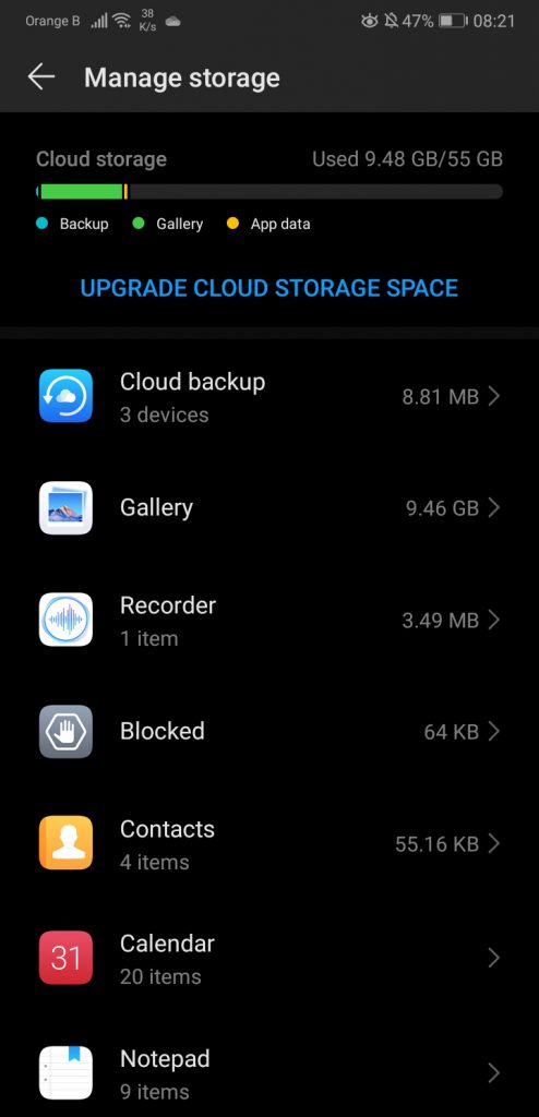
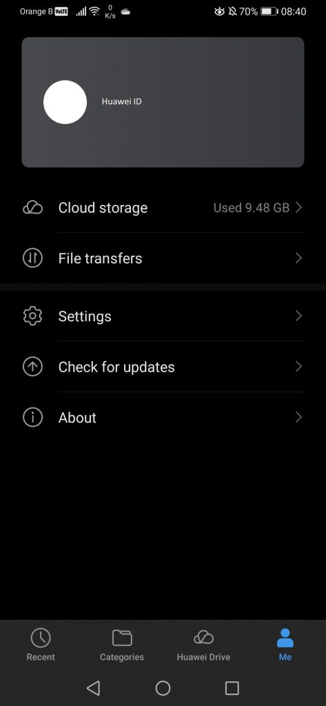
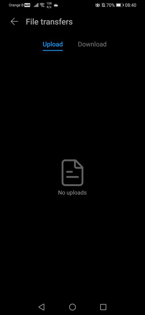
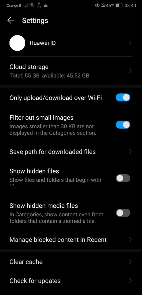
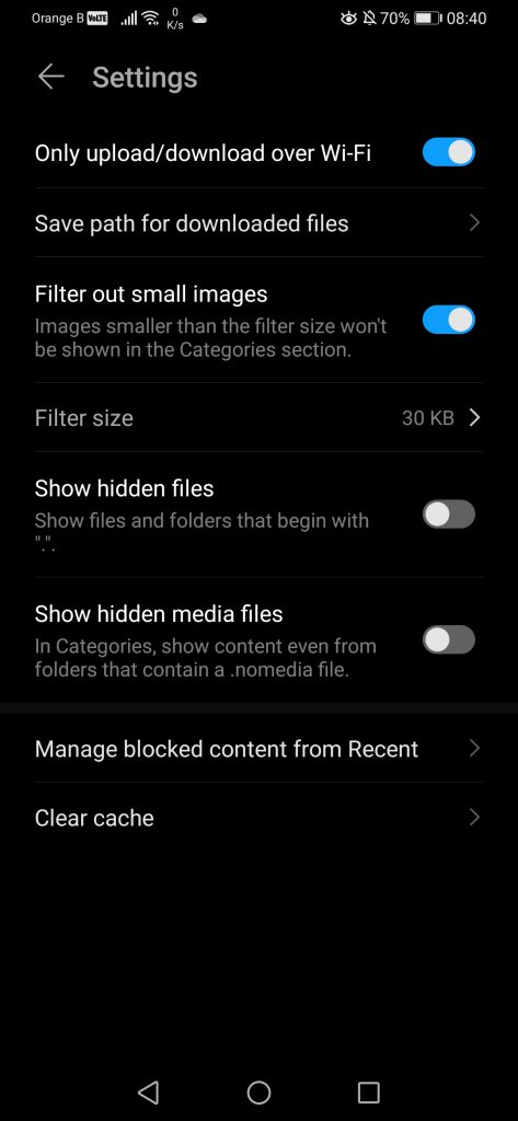
The last tab, “Me”, which has been added on the newest version of “Files”, fetches some information from the Huawei ID, such as the profile picture and the username, and tells us how much Cloud storage we are using. We can also access this one directly or check the “File transfers”. We also have a series of settings to filter out content or view/hide specific files:
The “Files” version changed from 10.5.0.310 to 10.5.1.312. This marks the end of this fourth part of our EMUI10 overview, with the past and following sections listed here:
- An overly detailed look at EMUI10: Part I
- An overly detailed look at EMUI10: Part II
- An overly detailed look at EMUI10: Part III
- An overly detailed look at EMUI10: Part V
More on this subject:
- An overly detailed look at EMUI10: Part III (5/12/2019)
- What exactly are “Huawei” Quick Apps? Well, the answer is surprising (30/11/2019)
- An overly detailed look at EMUI10: Part II (25/11/2019)
- An overly detailed look at EMUI10: Part I (17/11/2019)
- Huawei P30 Pro receives Android 10 and EMUI10.0 (14/11/2019)
