EMUI10 has finally landed on the P30 Pro, redesigning entire parts that were left untouched between EMUI8 and EMUI9.
Artículo disponible en Español | Article disponible en Français
In the first part of this overly detailed look at EMUI10, we had a look at some of the animations of the system, as well as the new design of said notifications. We also checked out the notifications panel and finished with the Weather application. In this second part of this EMUI10 overview, we’ll be looking at the Calendar, Optimiser and Music applications.
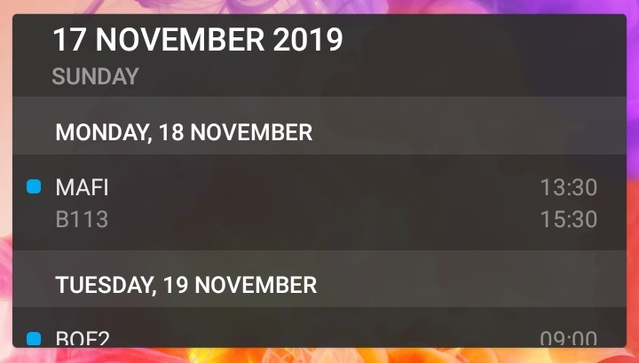
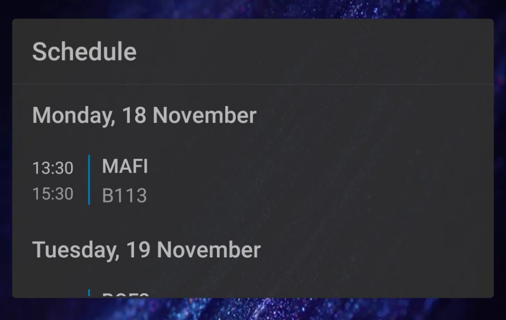
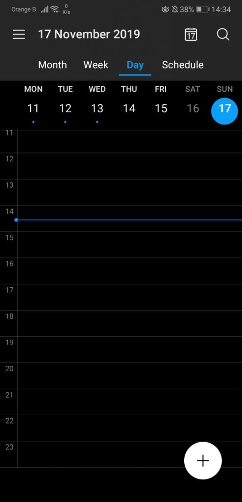
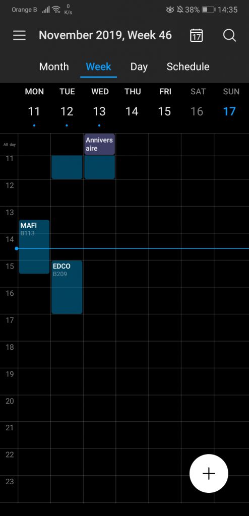
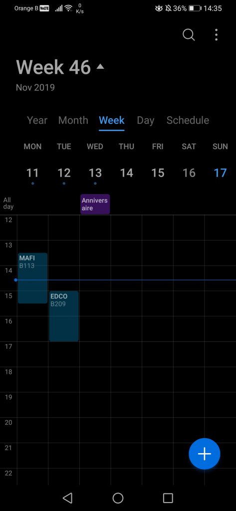
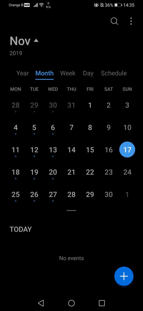
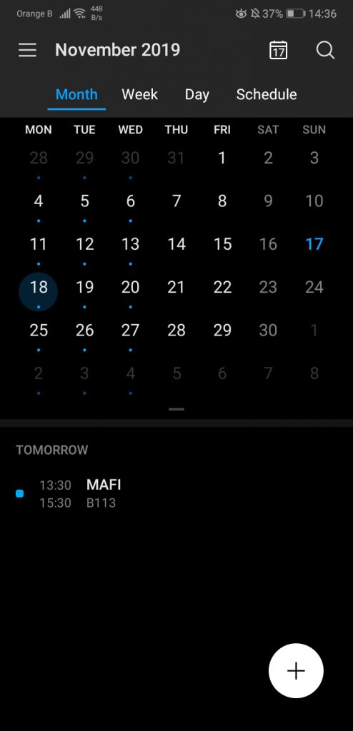
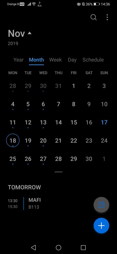
Starting with the Calendar application, from the outside, one could think it has been entirely redesigned. Well, yes and no. While the outside widget looks very different, the overall app remains the same. First, this is how the widget looks from the outside. Just as in the first part of this overview, the left side is EMUI9.1, the right side is EMUI10:
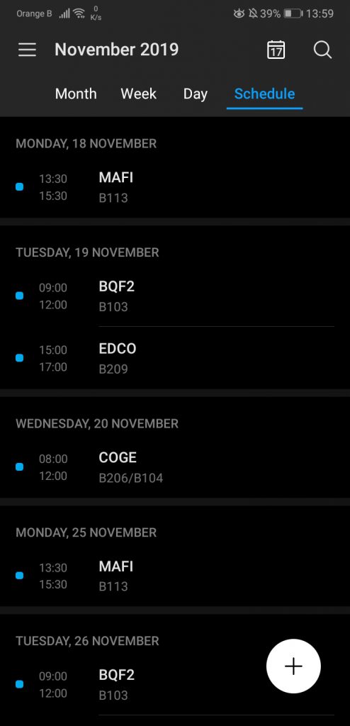
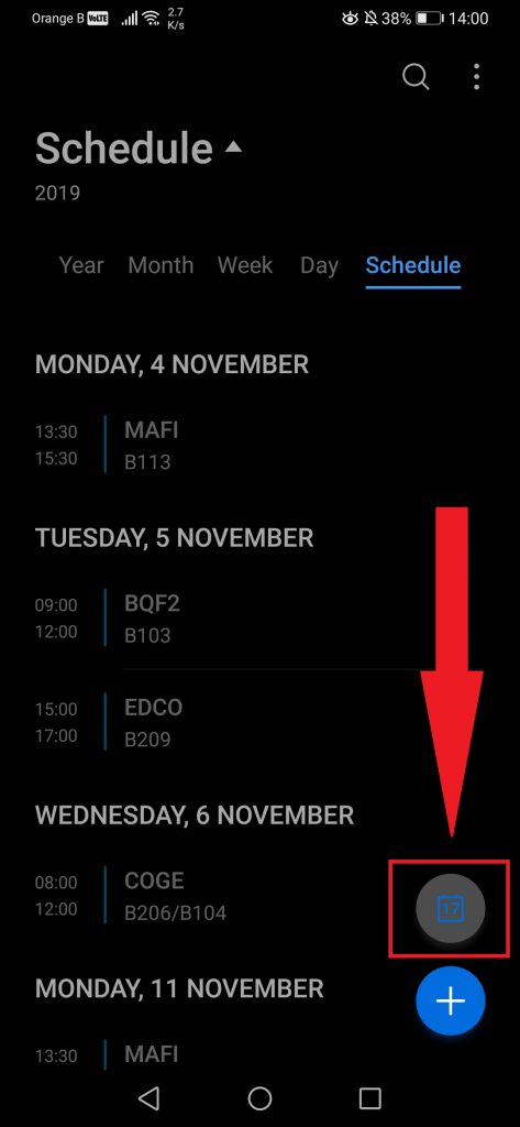
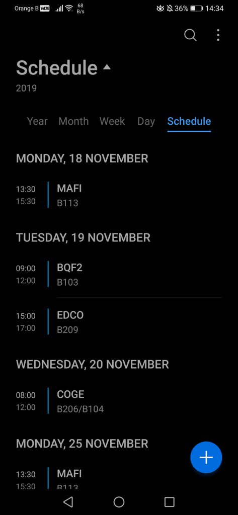
When opening the new version of the Calendar, one will notice how this one will always open the “Schedule” section first, while on EMUI9.1, if one leaves the app on the “Week” section, on the next visit, this is the view we’ll get. It doesn’t seem possible to change this setting. Moving on to the design, the new version definitely looks cleaner. An interesting feature added in the Schedule section is a button bringing the user back to the current date, in case one scrolled backwards or forward to a distant date. We can also point out the change of colour of the button to add a new event, going from white to blue. This change makes sense, matching the colour used to show the user which section we are in:
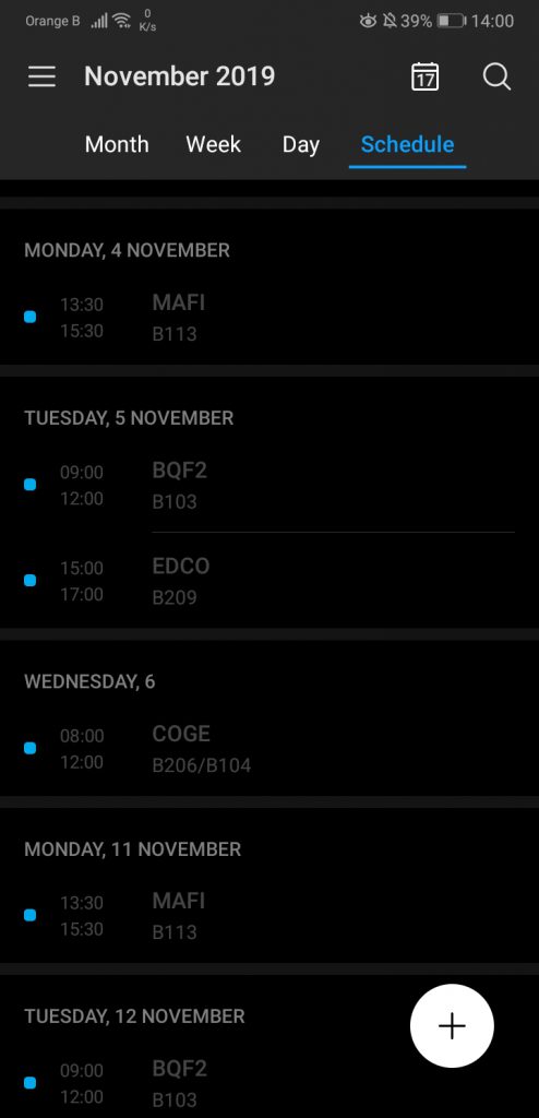
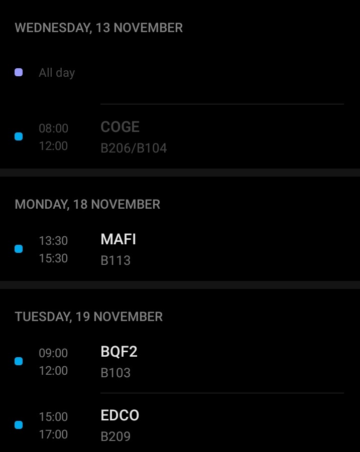
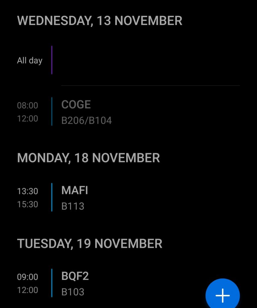
While this addition is nice, it appears some readability has been removed, as in the previous version, events that had already happened are fully greyed out, while on the new version, the dates are of the same colour as the event text but, when scrolling through past events, only the event is greyed out, and not the date. This makes looking at past events rather confusing, as it can be seen on the following screenshots:
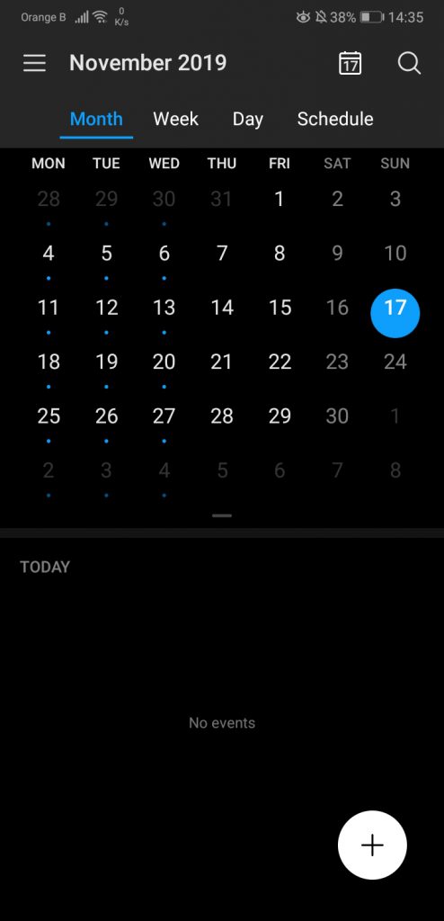
Here’s a more general look at the various sections, such as Schedule, Day, Week and Month:
The most notable change is in the “Month” tab, where now the calendar takes a bit more place, leaving less space for events taking place in the near future:
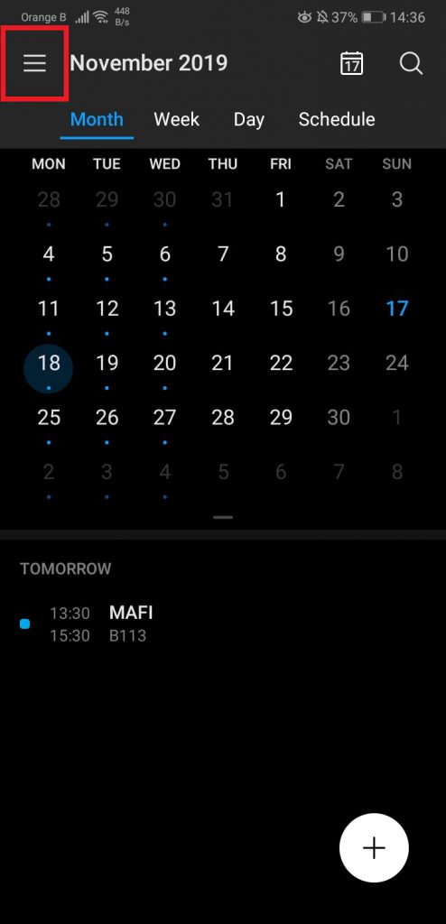
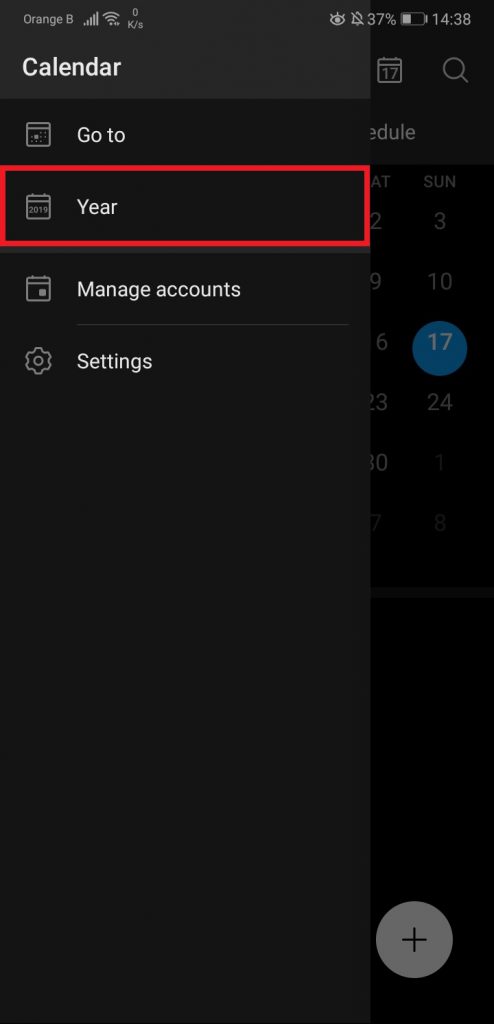
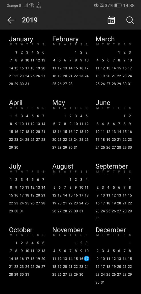
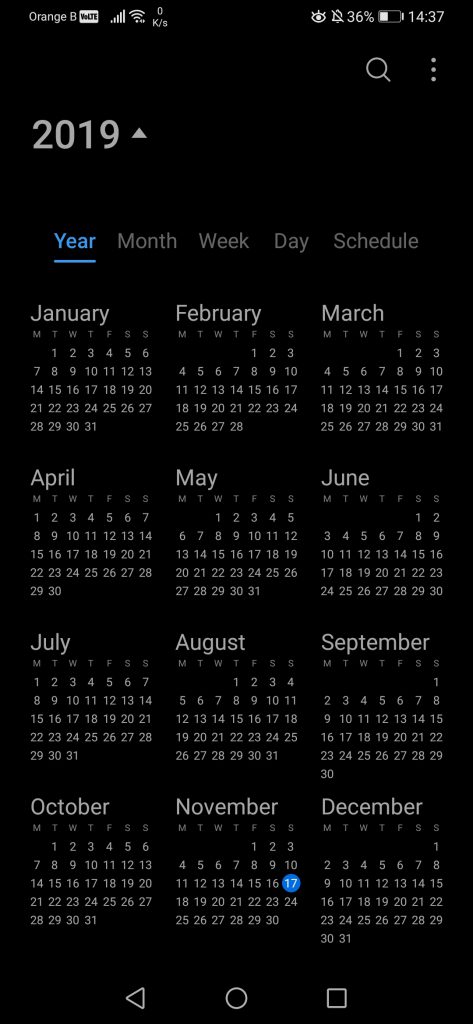
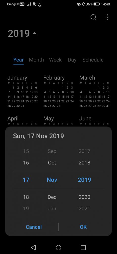
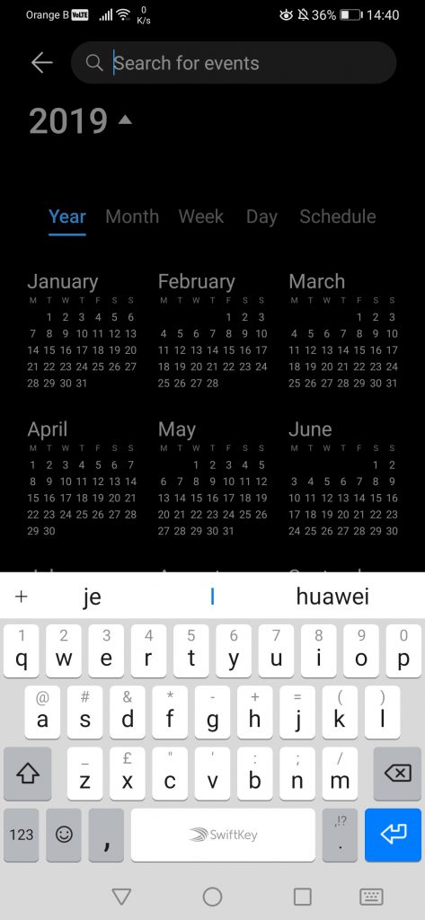
We can also notice the addition of a new tab, “Year”, which shows the full 12 months and allows users to go backwards or forward quicker. This tab also exists on the previous version of Calendar, although it is hidden in the settings. One has to go to the top left, tap on the three lines, then tap on “Year”:
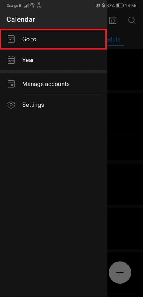
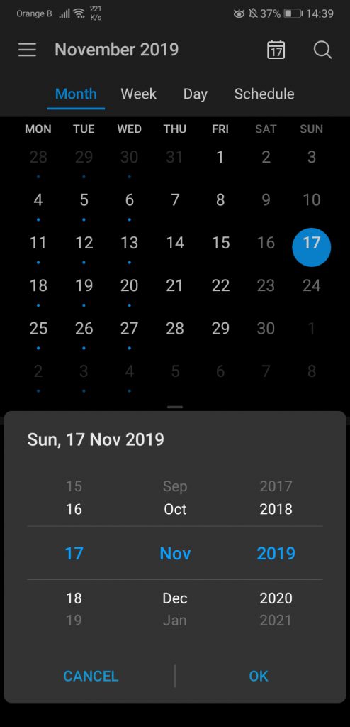
Speaking of the settings, we can see a “Go to” option, which allows users to set a specific date and go to it faster. This option has been moved to a different menu, which can be found by taping on the three little dots at the top right, “Go to”:
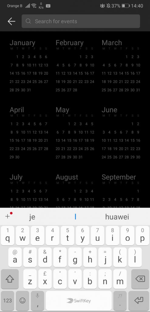
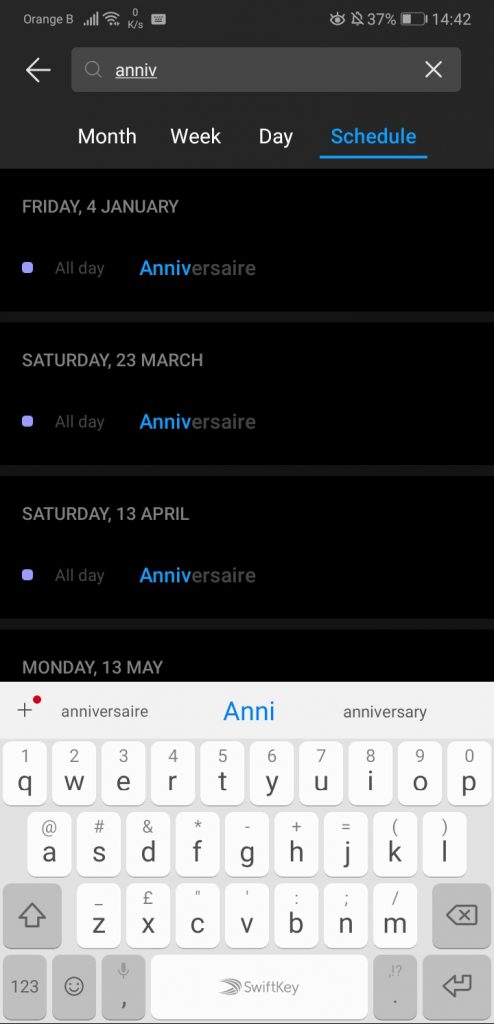
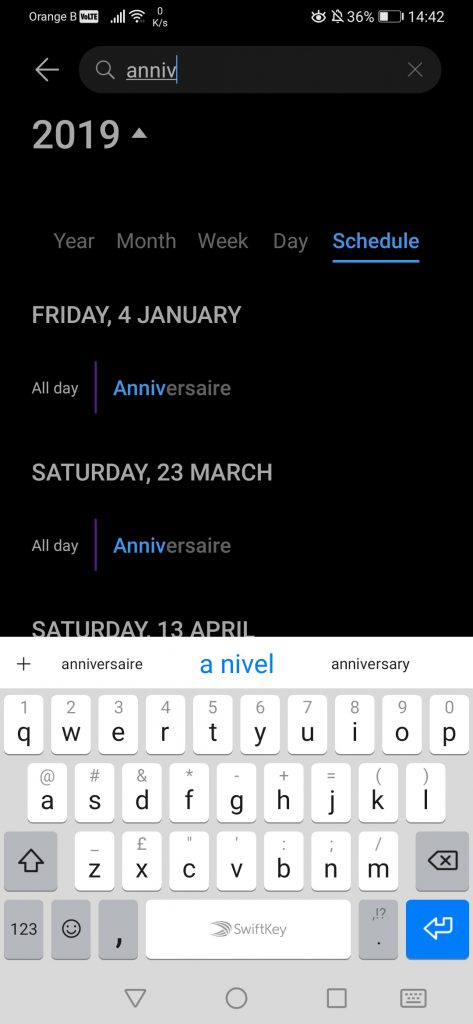
The search icon on the top right does exactly what one can expect it to do, which is search for events. One has to input the name of said event, and the Calendar will bring all results containing that word, whether it’s an event or the name of a person/location, etc. The changes made to the Calendar reduces the number of results shown on the screen, even if, ironically, the P30 Pro is slightly longer than the P20 Pro in terms of display size. In our example, we’ve deleted the name of the people appearing, as this is private information. On top of this, the search is for “Anniversaire”, French for “birthday”:
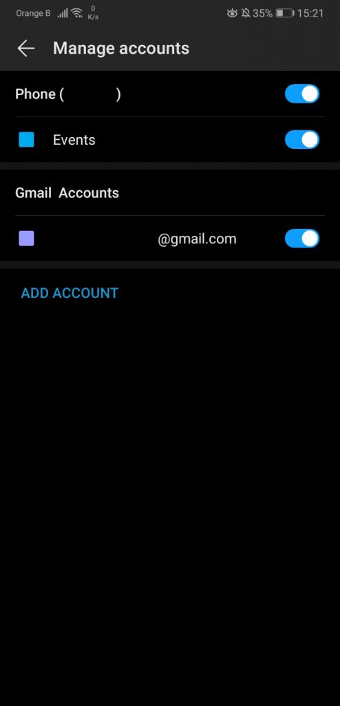
If we now go to the “Manage accounts” section, little has changed, if not for the addition of a “Contacts” section. We’ve, once again, removed all personal information:
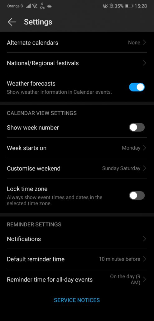
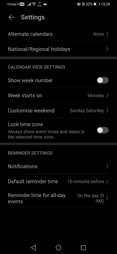
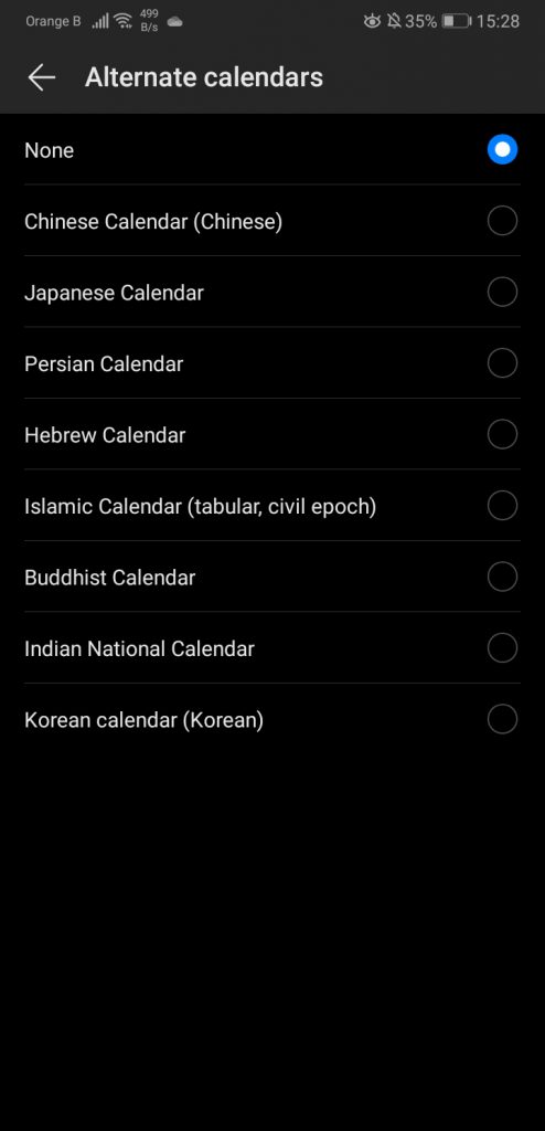
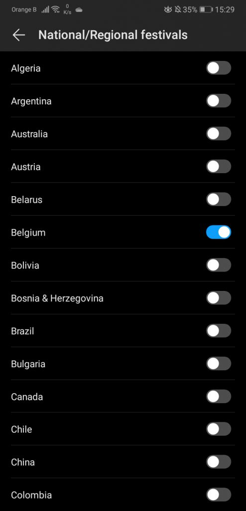
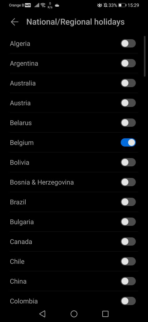
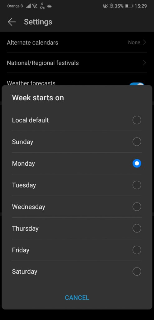
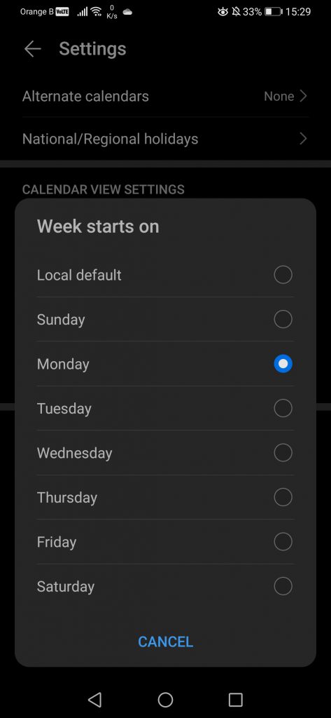
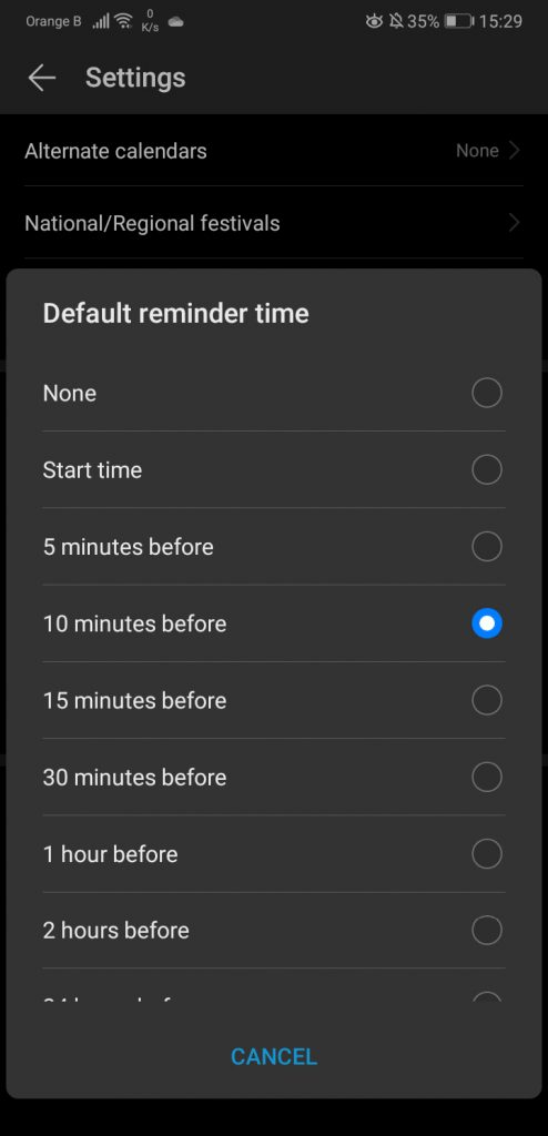
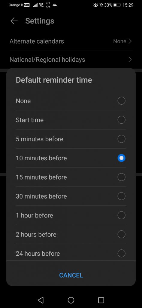
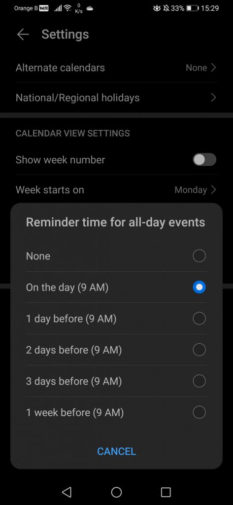
Finally, the last option in the Calendar is the “Settings”. Little to nothing has changed here, if not for the removal of the “Weather forecasts” setting and the removal of the “Service notices” at the bottom, although this one is linked to the weather service. Nothing else has changed:
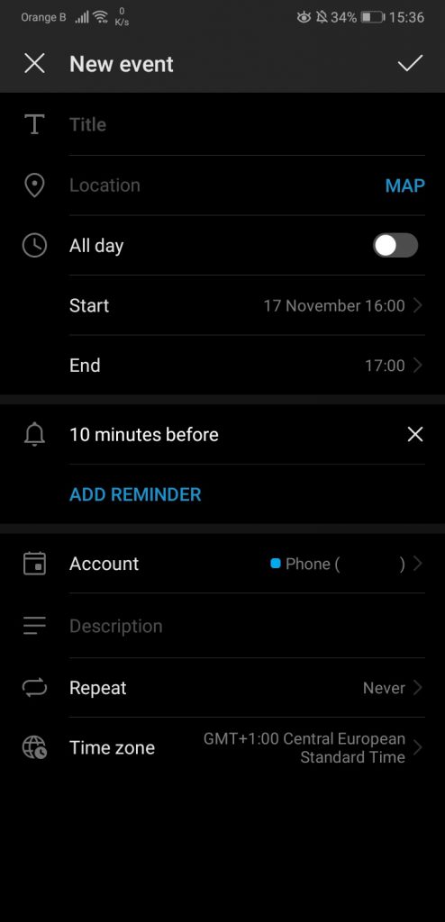
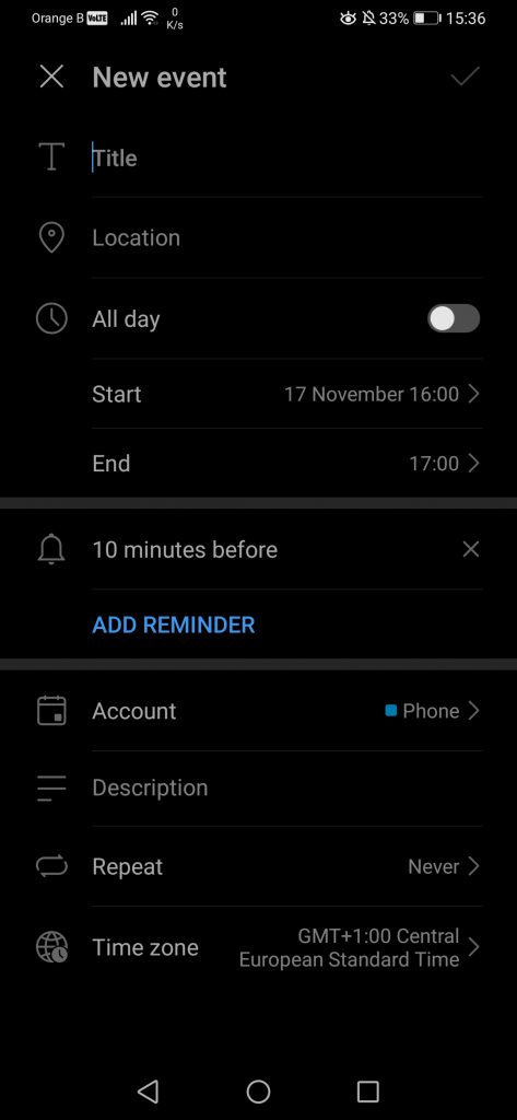
We were going to forget about it, but the section to add events is identical between both versions of the application, if not for the removal of the “Map” option:
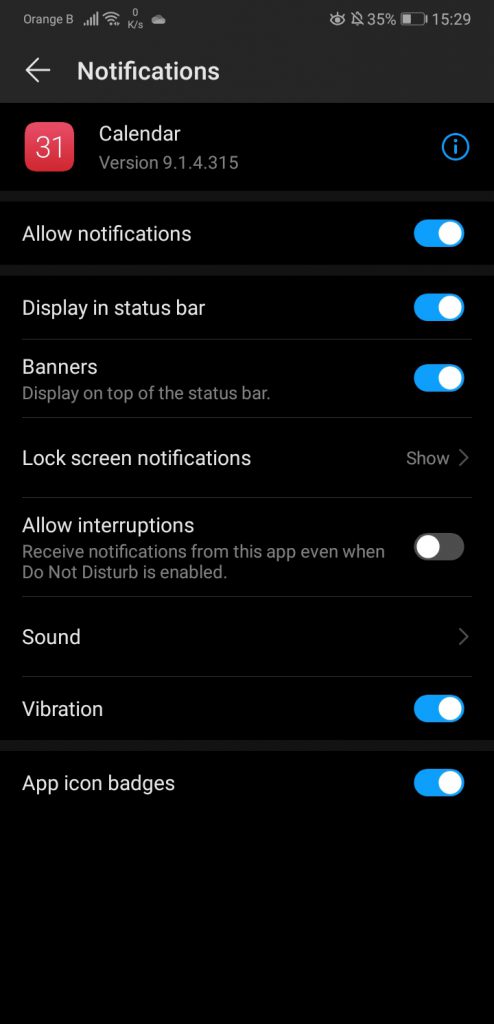
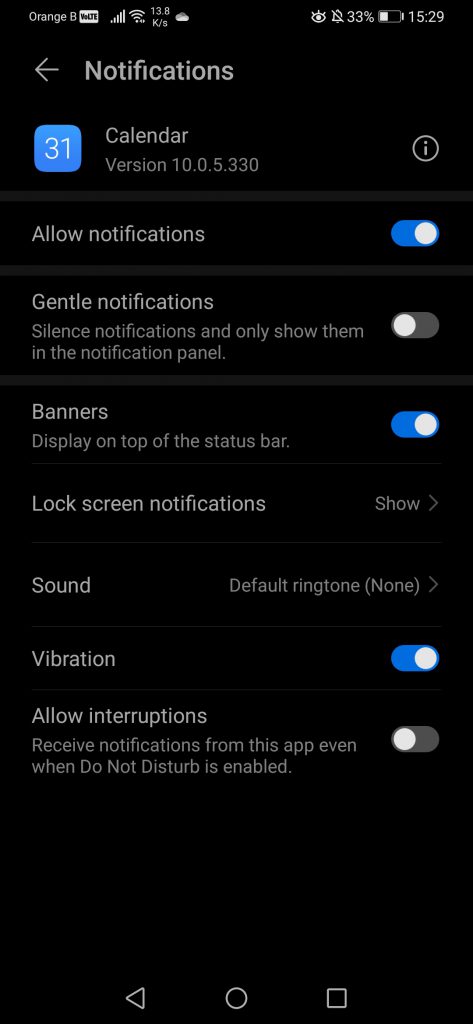
The Calendar version on EMUI9.1 is 9.1.4.315, while on EMUI10 it is 10.0.5.330.
Next is the Google search bar, which has changed from white to various shades of grey/black due to the “Dark mode” enabled by default on the system. If disabled, the bar adopts the same colours as the previous EMUI9.1 version. From top to bottom, EMUI9.1, EMUI10 with “Dark mode” enabled, EMUI10 with “Dark mode” disabled:
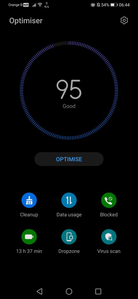
We’ll now have a look at the multiple phone applications pre-loaded by Huawei, leaving the Settings for later, as a lot has changed in that section. We will also be leaving the Camera for the end, as Huawei has also made some important changes to its lay-out. The first pre-loaded application we can see is “Optimiser”, which includes a set of interesting tools such as Cleanup, the phone Blocklist, Dropzone or Virus scan. Compared to EMUI9.1, Huawei has put colours to each icon, instead of sticking to a simple design:
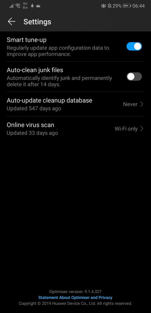
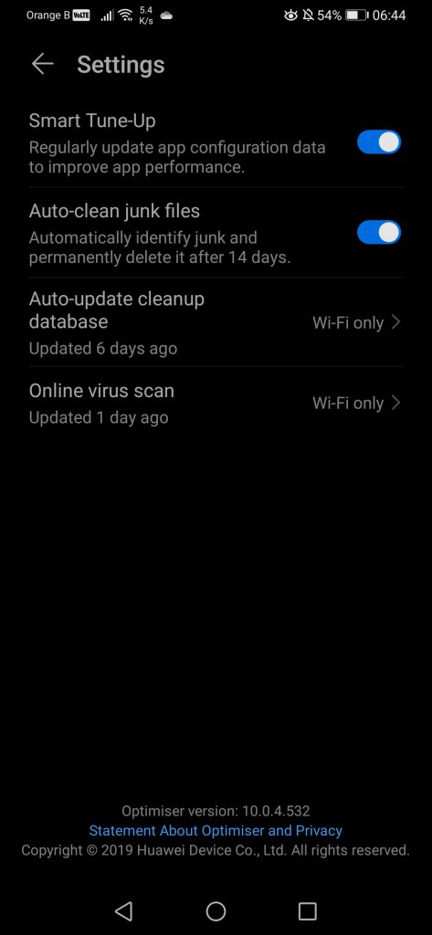
Starting by the settings, nothing has changed, except the version of the application, moving from 9.1.4.327 to 10.0.4.532:
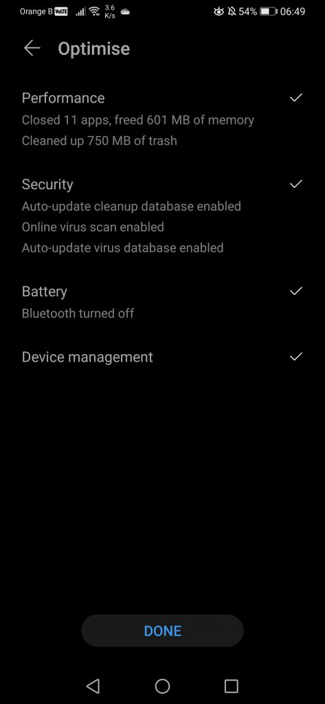
Pressing the “Optimise” button does what it says, optimize the device by closing applications that are running in the background and deleting “trash”, or, in other words, cache data:
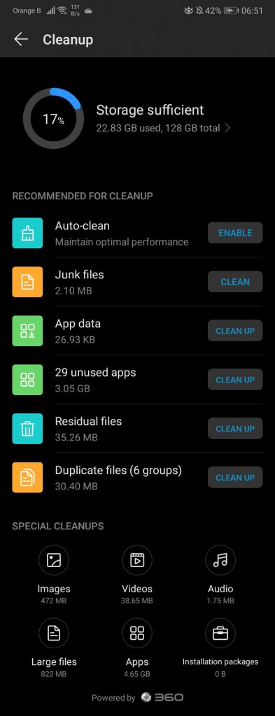
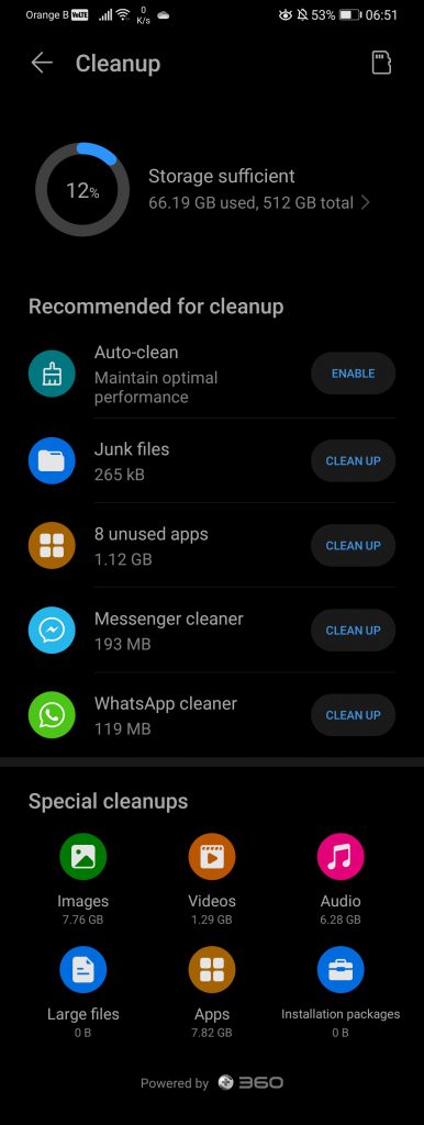
Overall, the design of the Cleanup section has remained the same, although the icons are now round instead of square. We also see some changes in the list, with the app mentioning Messenger or WhatsApp directly, although this is likely due to us not using those two applications on the P20 Pro:
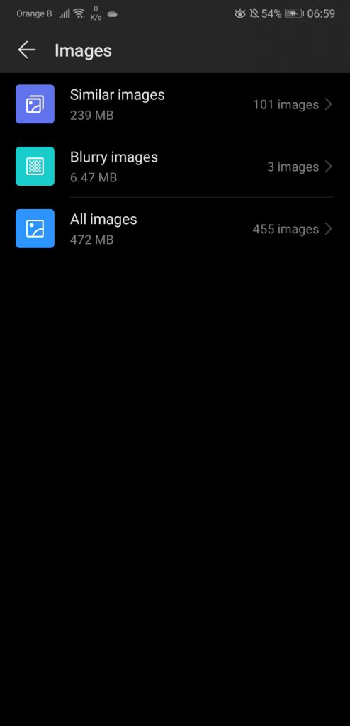
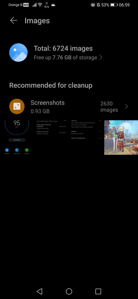
The “Special cleanups” found at the end of this section allows users to delete specific types of files, such as Audio or Videos, although this is a dangerous tool, as it essentially lists files we might need. This remains a recommendation from the device, just in case the user is running out of space. It also looks like some changes have been made there, with, for instance, the “Images” section now listing a specific category for cleanup, instead of dividing pictures in various groups:
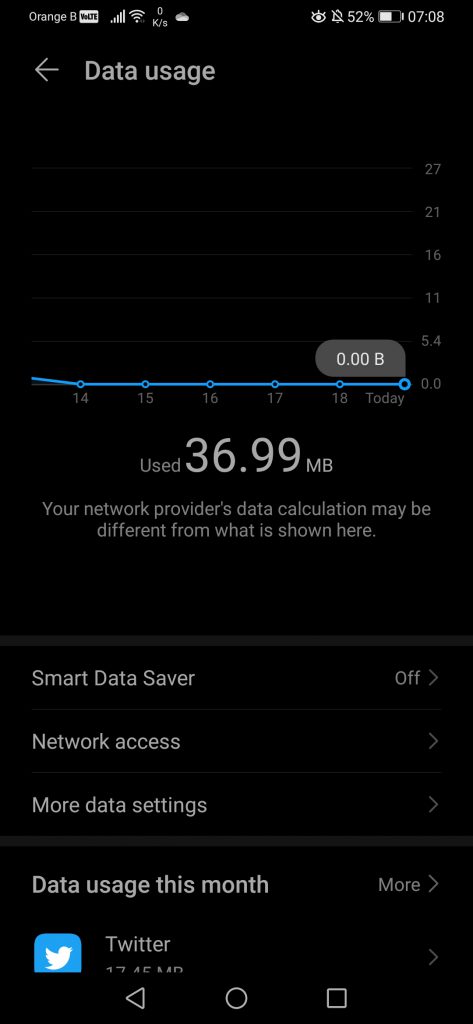
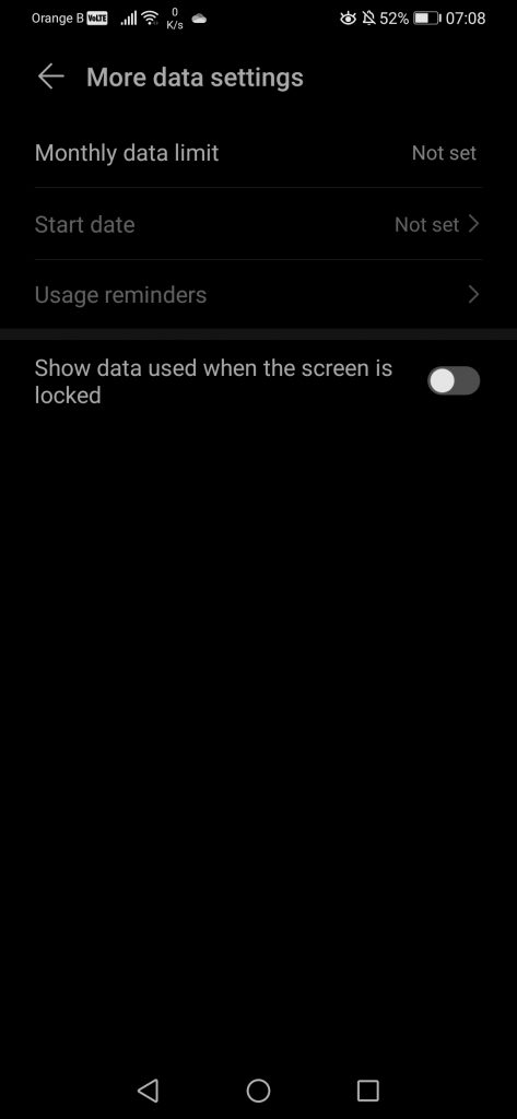
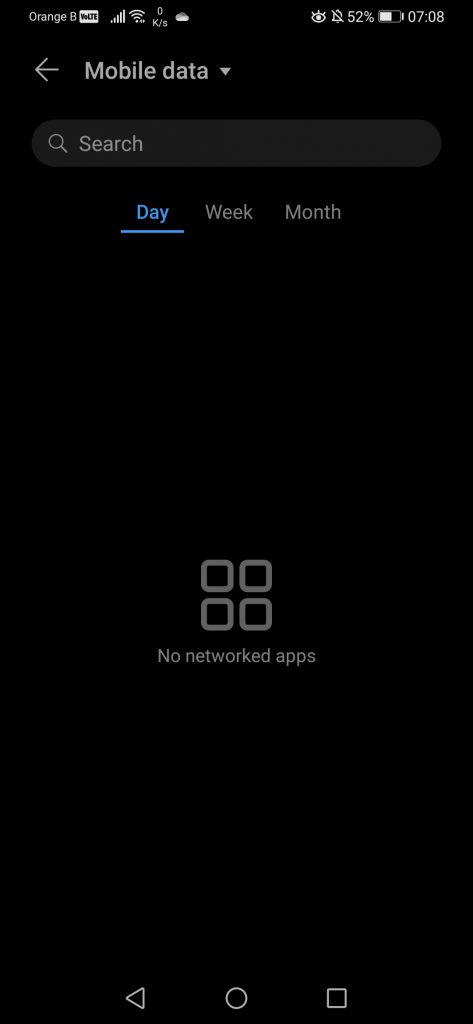
For the “Data usage” section, nothing has changed, if not small design choices such as the text being centred:
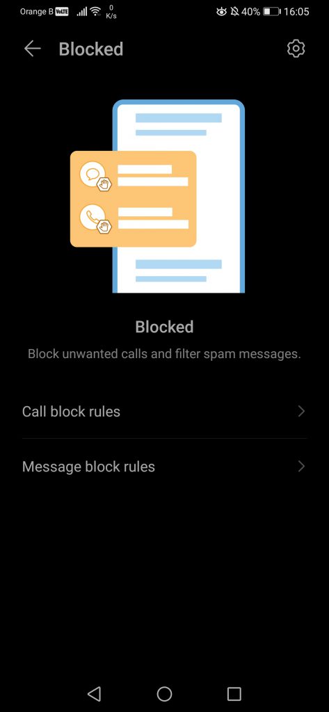
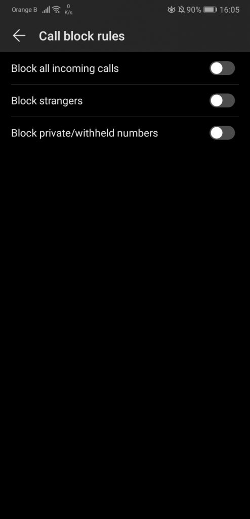
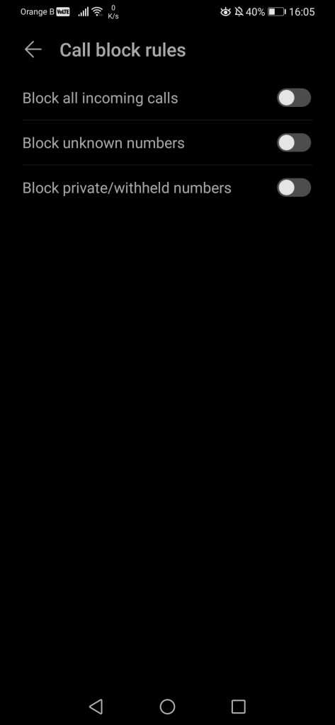
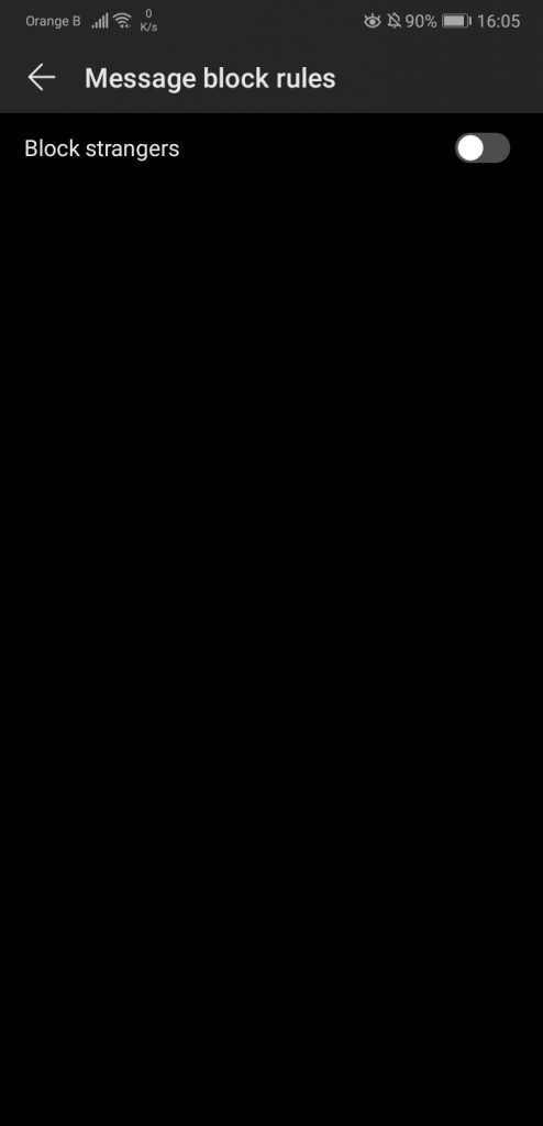
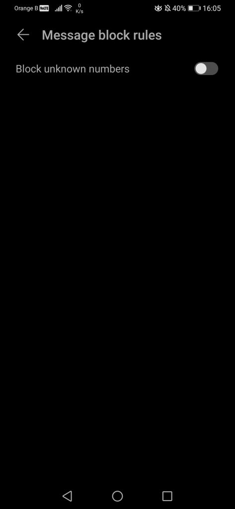
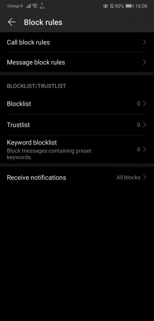
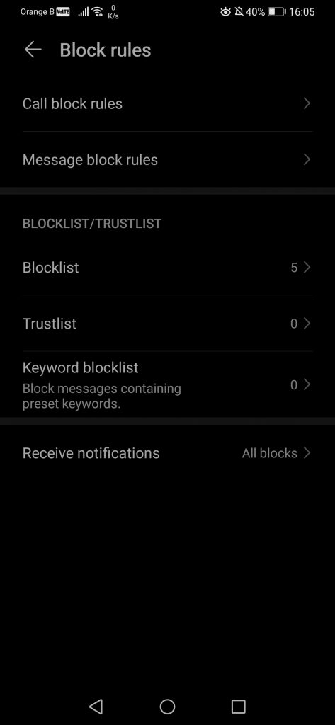
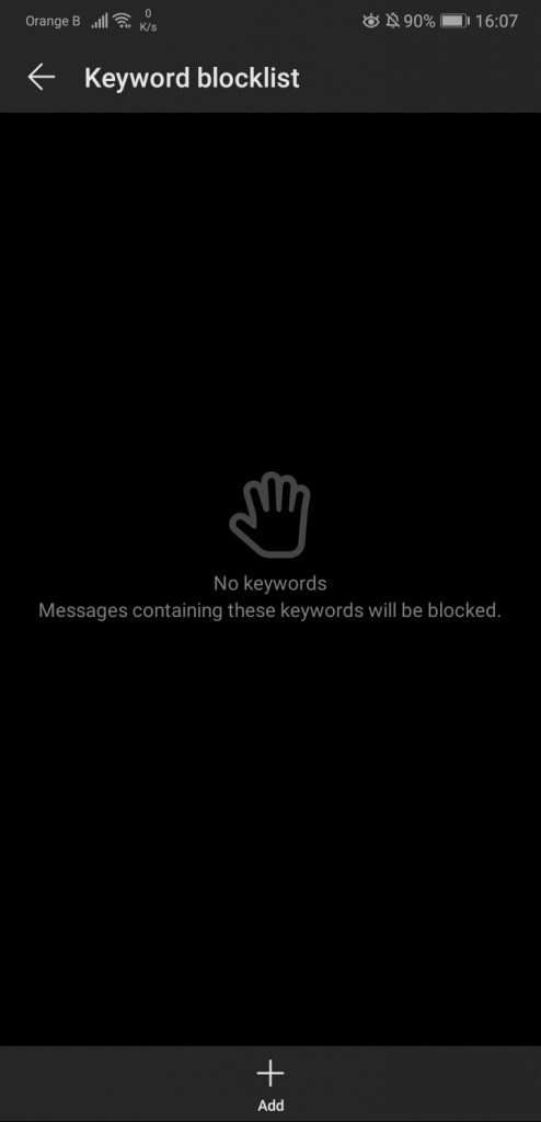
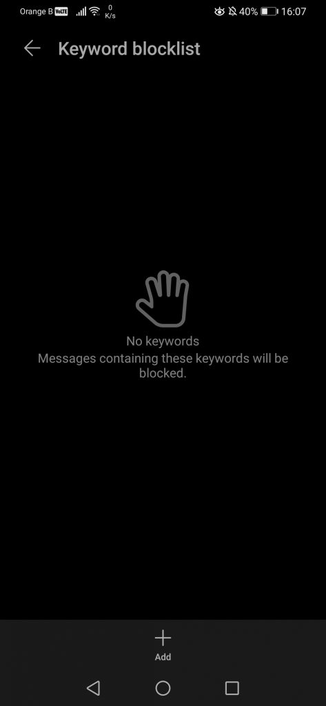
For the “Blocked” section, which allows users to block specific phone numbers or keywords to block specific SMS, such as SMS from spam numbers attempting to sell a specific good, nothing has changed, if not for the wording of some toggles, changing from “strangers” to “unknown numbers”, which makes more sense overall:
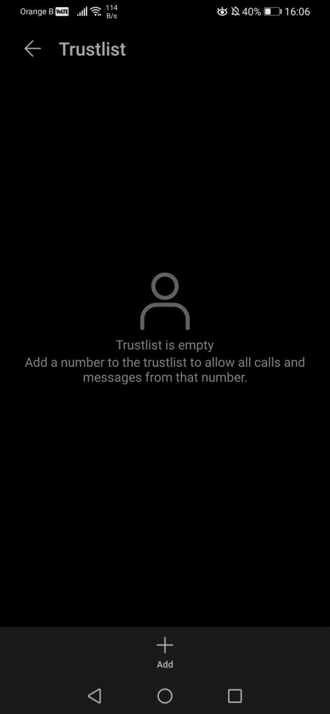
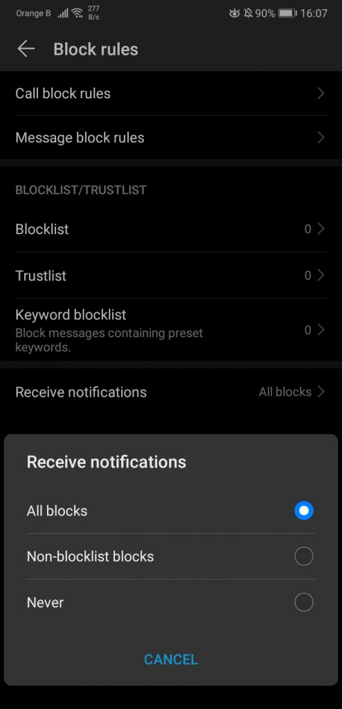
A weird design choice in this specific… application? is how the place to input the actual numbers to block is hidden under a menu on the top right, which is a curious choice. In that specific section, nothing has changed either. After all, why change something that works? The first two options just redirect to the sections found earlier, raising some questions about repeated content. We then have the options to whitelist or blacklist specific numbers, as well as blocking specific words to stop spam SMSs. We can also choose whether to be notified when we receive a message/call from a blocked person or not:
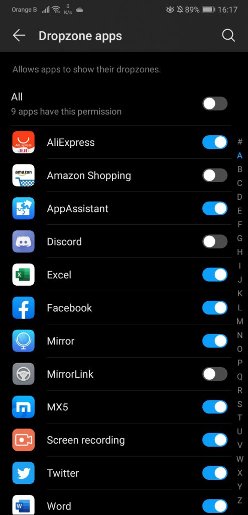
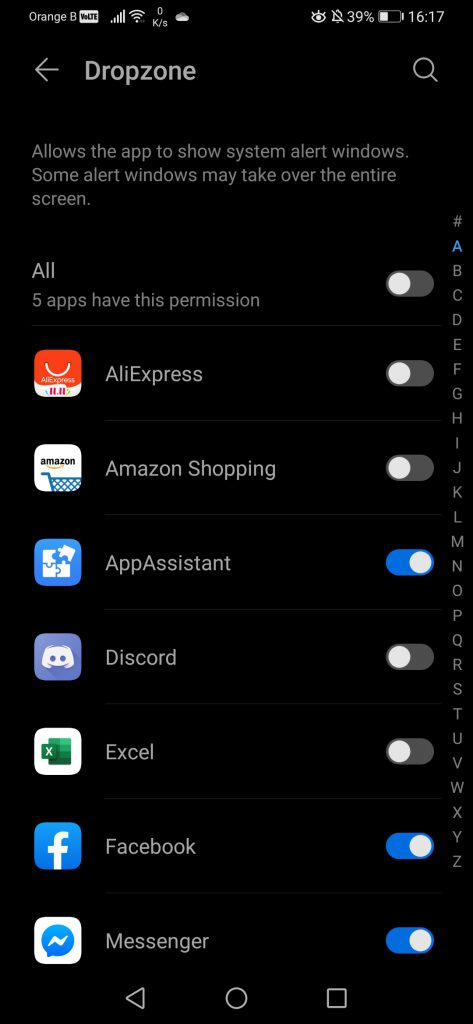
The Battery option redirects to the battery section in the phone settings, thus we will skip it for now. We then have the “Dropzone” settings, which are apps that appear on top of other apps, such as Facebook’s Messenger:
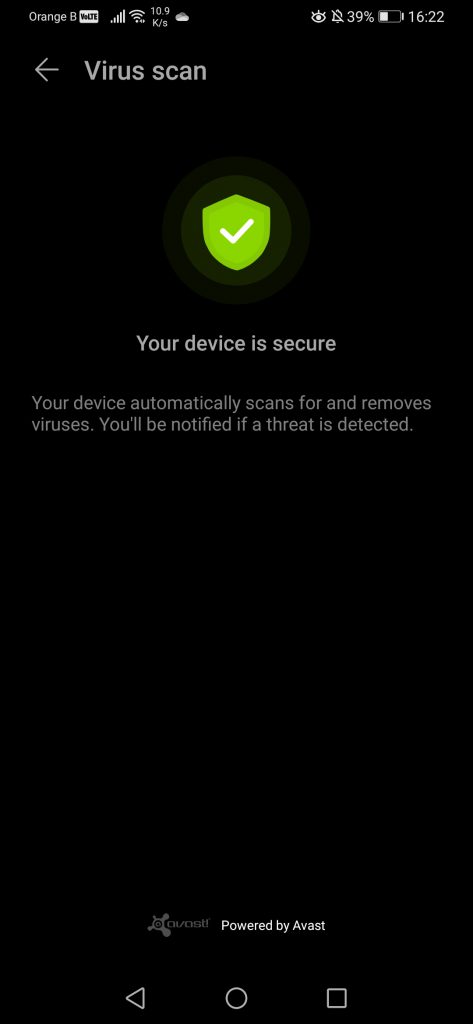
Finally, the last setting we can find in “Optimiser” is the “Virus scan”, which uses Avast’s antivirus to keep users more or less safe. Of course, it is recommended to not click on weird links… in general. Or open attachments from weird e-mails/spam. These are common-sense recommendations, although it appears a lot of people still fall for these:
We’ll now be moving to the Themes application, which allows users to customize the background of their device. Overall, there’s nothing to say about Themes, as Huawei has updated this application for most of their smartphones, with an EMUI10 variant, 10.0.8.306. We’ve also explained how some new themes were added for the P30 Pro on EMUI10, and how two themes that were available previously for a short period of time seem to have vanished. We’ve also written a number of articles covering how to customize the themes, such as on our HiSuite article.
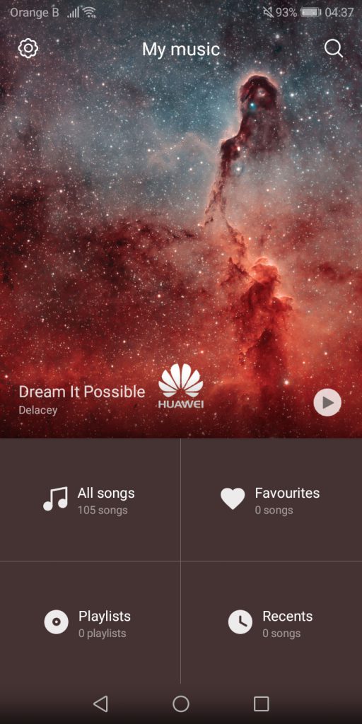
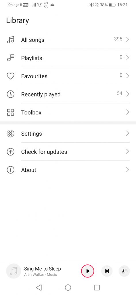
We’ll then move on to the Music application. This one has been recently updated on the P30 Pro, right before the EMUI10 update, adding what is likely it’s new look. If we are fully honest about it, this new update is terrible, making the application quite boring. On the precedent version, we were shown a big layout with the image cover of whatever music track was there, but now we are presented with a boring list. Furthermore, the dark mode is not present in the app, while Huawei has applied it by default pretty much everywhere else in the system. This is quite curious, as the older design of the music app, still present on other devices, used to have a dark mode, at least back in August… 2018. This dark mode likely disappeared somewhere along the EMUI9.0 or EMUI9.1 update, for some unknown reason:
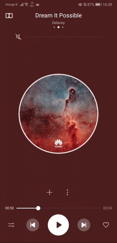
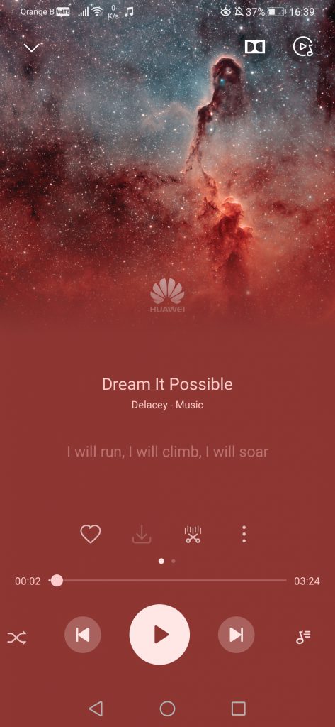
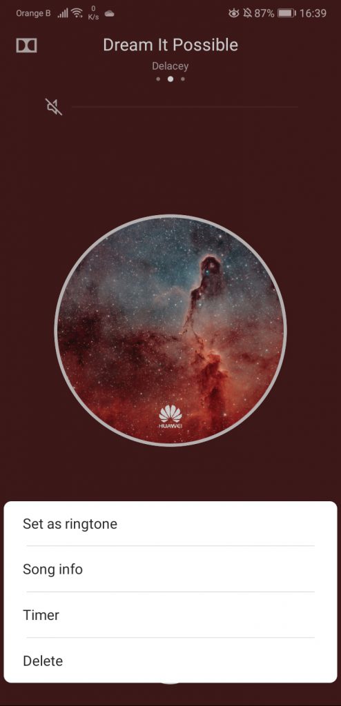
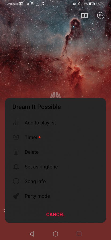
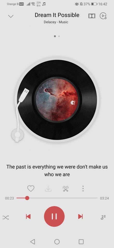
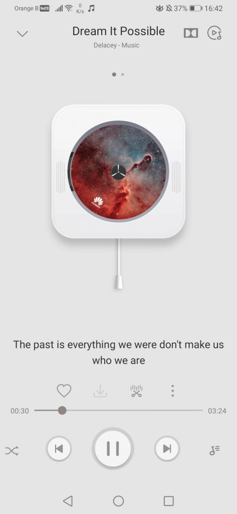
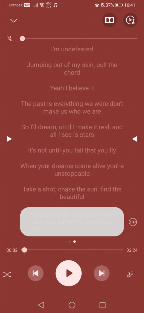
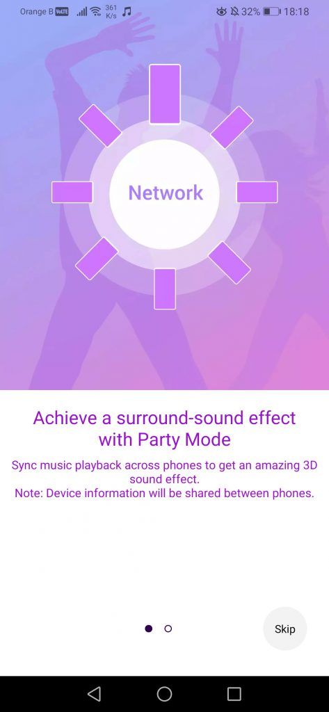
If we now focus on the main changes of the application, such as the player appearance, quite a lot has changed, with a cleaner version of it. Lyrics, if available, now also appear directly on screen, instead of having to swipe to the right to see them. Settings-wise, the previous player allowed users to set the song as ringtone or view information directly. This option is still available, although extra settings have been added to the list. Sadly, this extended list is not optimized for dark mode, actually being too dark for the text to be readable. In the extra options, we see “Add to playlist”, which was previously on the “+” before the extra settings, as well as “Party mode”, which allows users to sync various devices to play the same song at the same time:
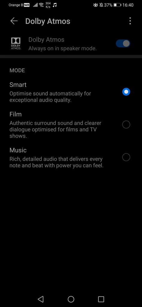
We then see the addition of an entire set of new options, such as the possibility to create a specific Shuffle list or being able to crop songs. We also have Dolby Atmos and the possibility to tweak the sound, although for some curious reason, this setting doesn’t work on the P20 Pro anymore:
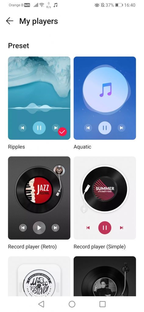
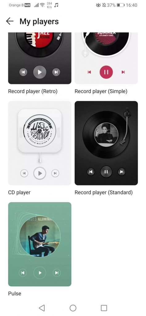
Huawei seems to have added various customized “faces” for the music, from which users can pick one to have a specific visual effect. Overall, that’s where it stops, a visual effect most people will look at for a few seconds before never looking at it again:
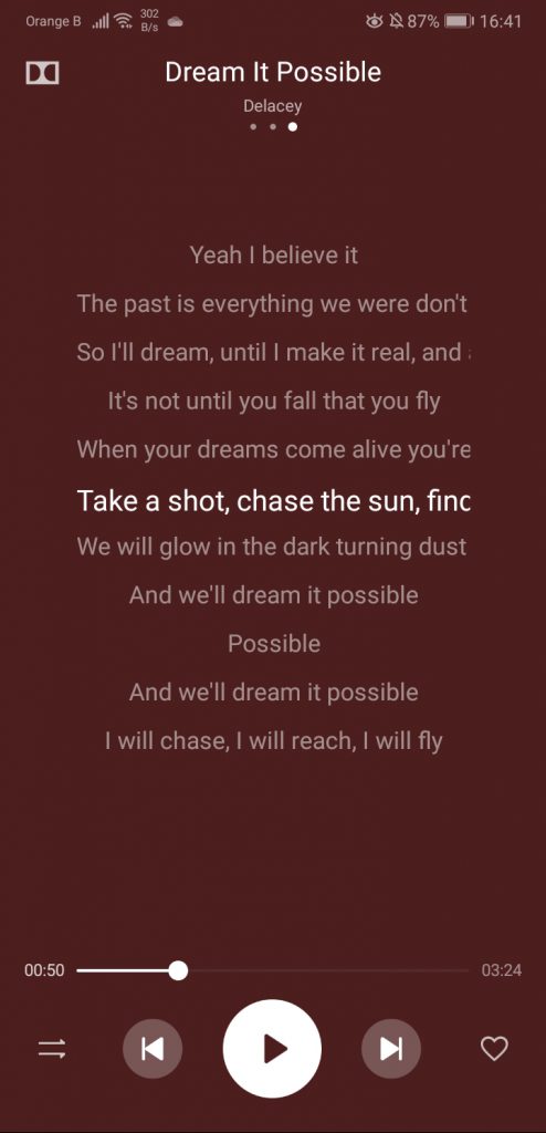
We can also access a lyrics section, if lyrics are available for the song. Some have these pre-loaded, but in most cases, these have/can be manually added, if the user so desires. This section has been slightly modified in the new version of the app:
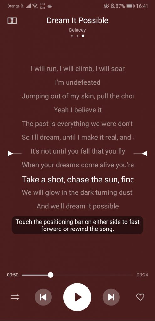
The previous version allowed to rewind or forward the song. The new version still has this option, although with a few extra settings, which, once again, aren’t optimized for the current dark mode, for whichever reason. Good luck reading that white text in a white textbox:
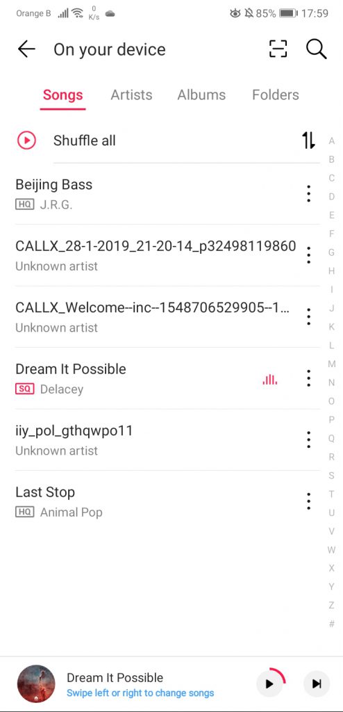
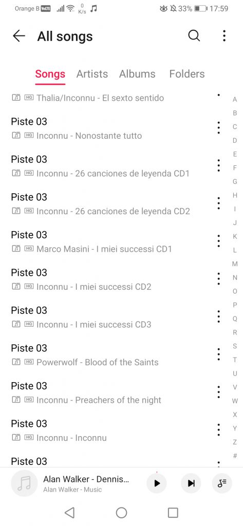
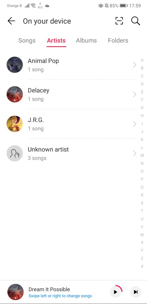
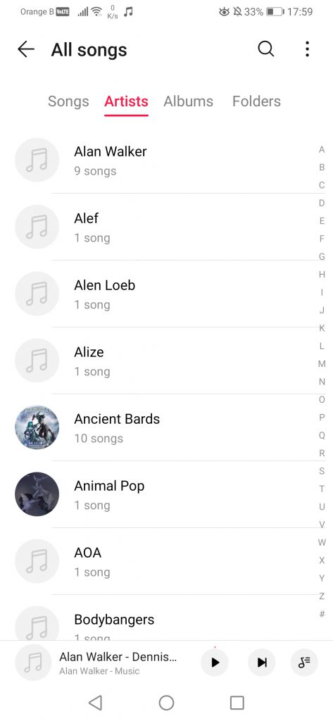
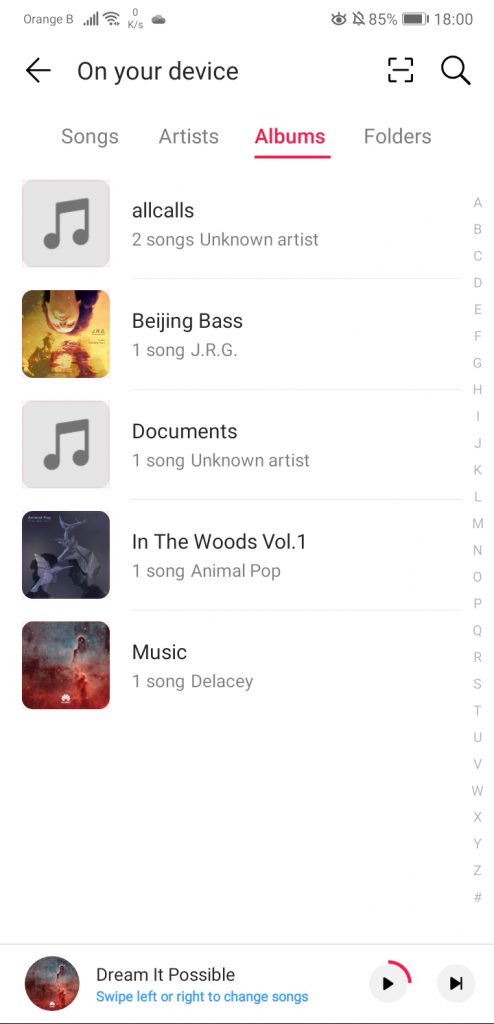
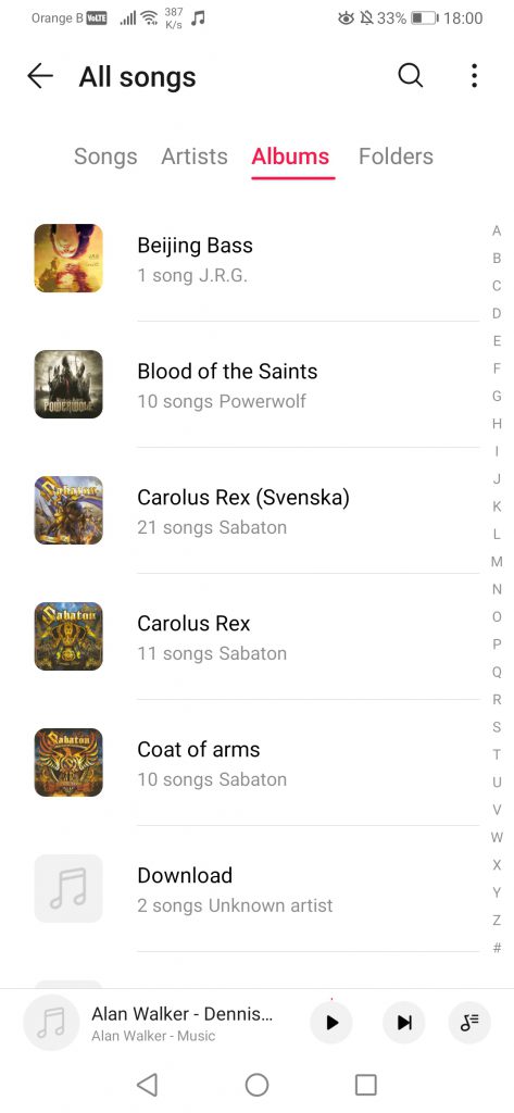
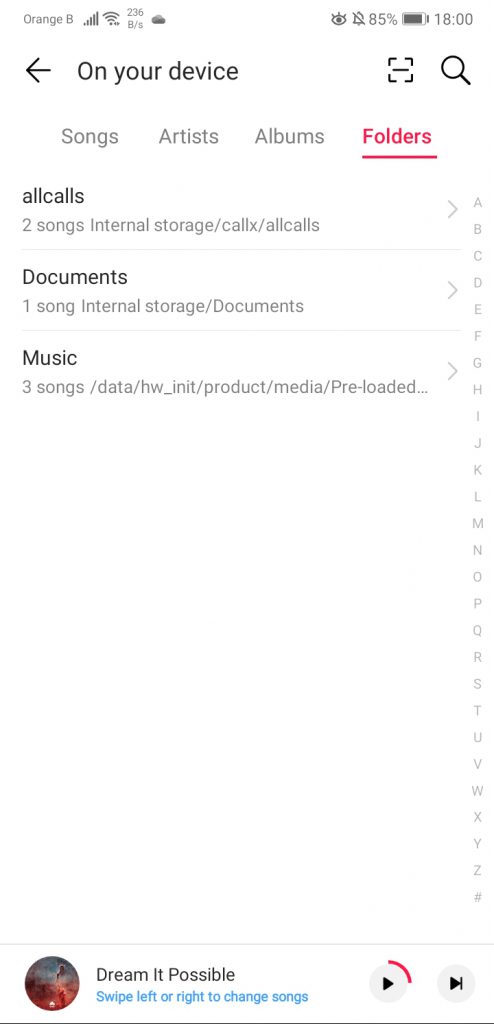
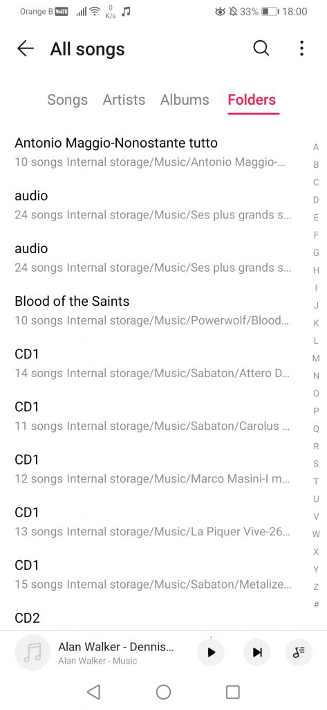
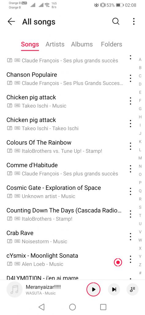
For the option of “On your device”, now renamed to “All songs”, not much has changed. More songs seem to be displayed in the list, while Artists’ names seem to have been given a bit more space. We then see the contrary on the Albums section, with albums being displayed smaller on the new version, raising some questions about the design process:
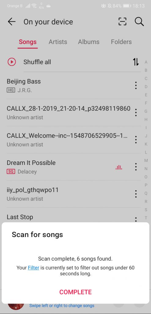
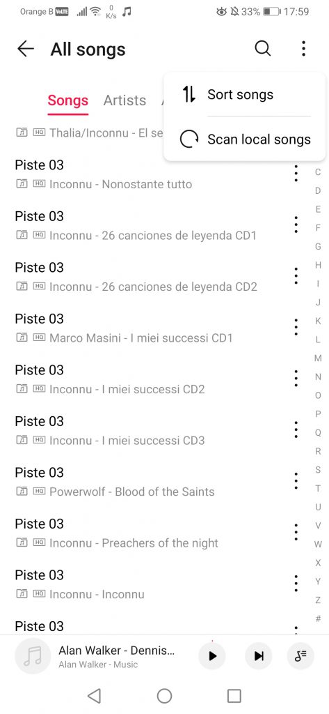
For scanning for new songs on the device, the option has been redesigned slightly, now being hidden under a supplementary menu on the top right. The design of the scan message is also a bit different:
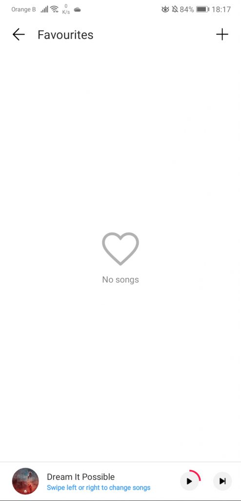
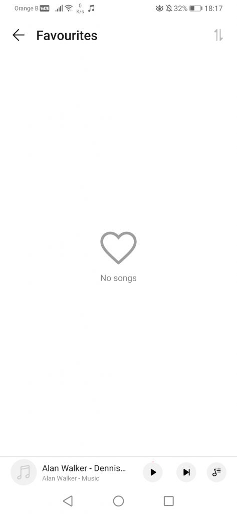
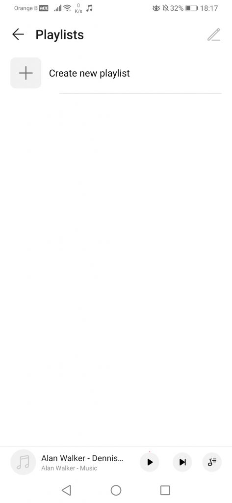
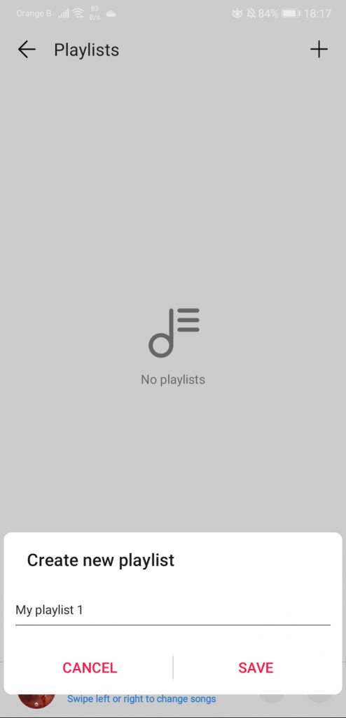
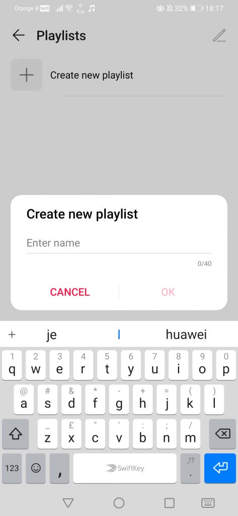
For Playlists or Favourites, little to nothing has changed:
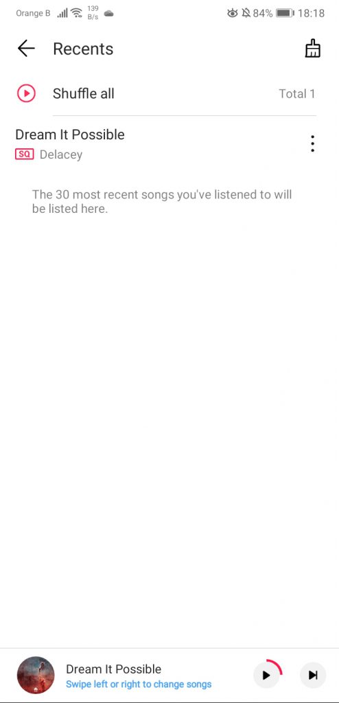
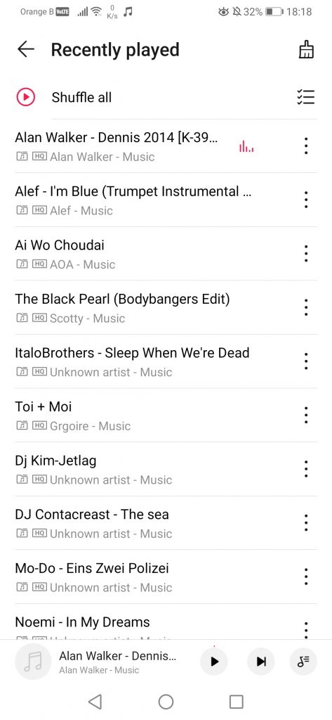
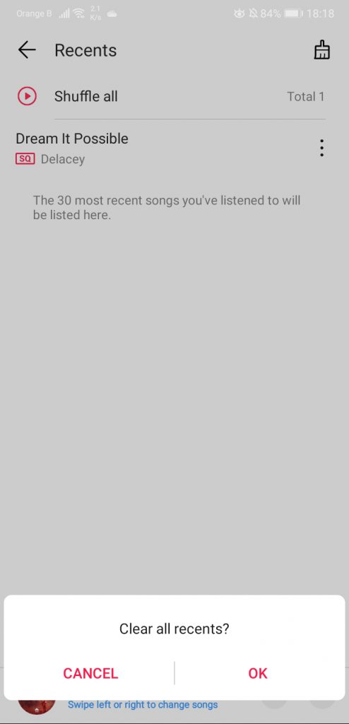
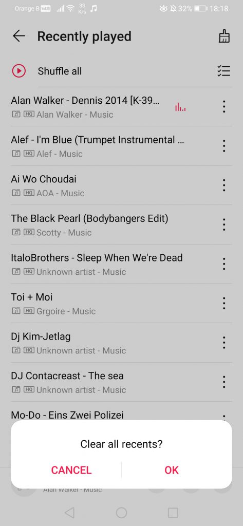
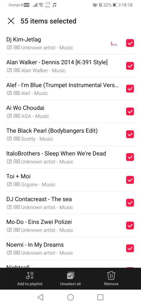
On the “Recently played”, not much has changed either. The brush at the top right allows users to clear the recently played list, although the new version of the music player comes with an extra option, allowing to add the recently played songs to a playlist or remove them all at once:
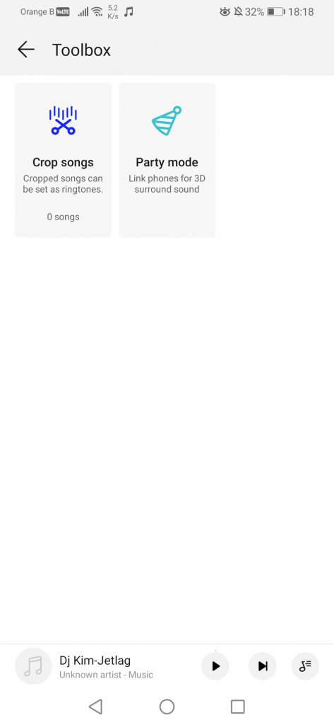
We then find the “Toolbox”, which includes an editor to crop songs, as well as the “Party mode”, which was added around Summer 2018. We first saw it on the P Smart+ (2018) (Nova 3i), although we never tested it:
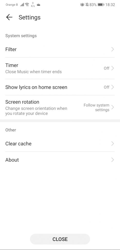
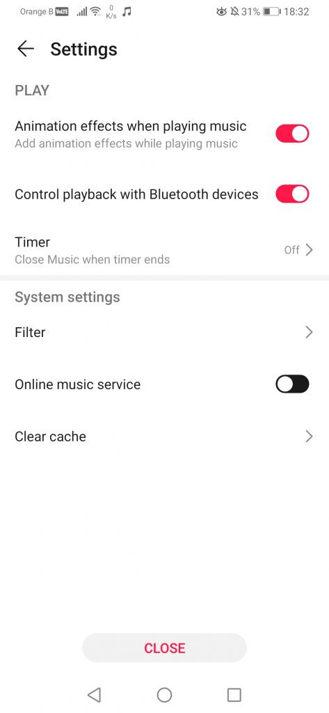
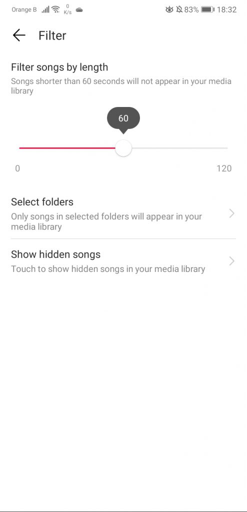
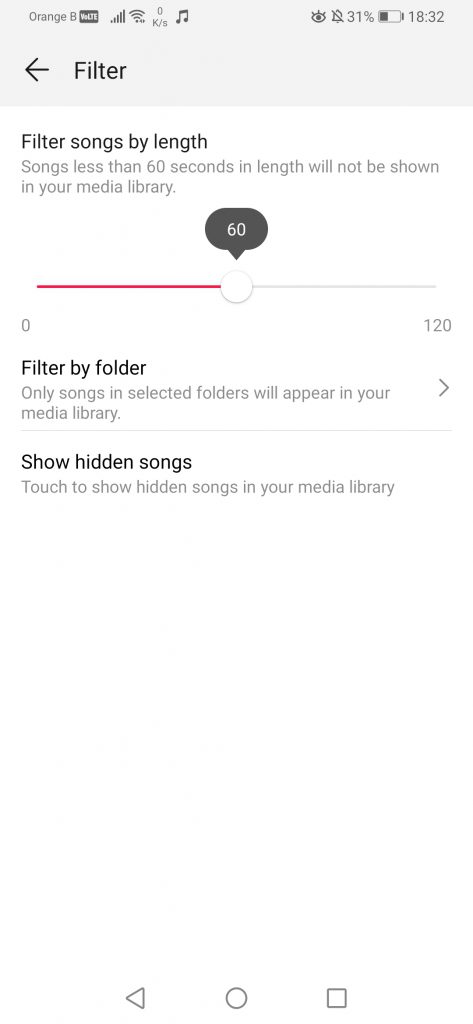
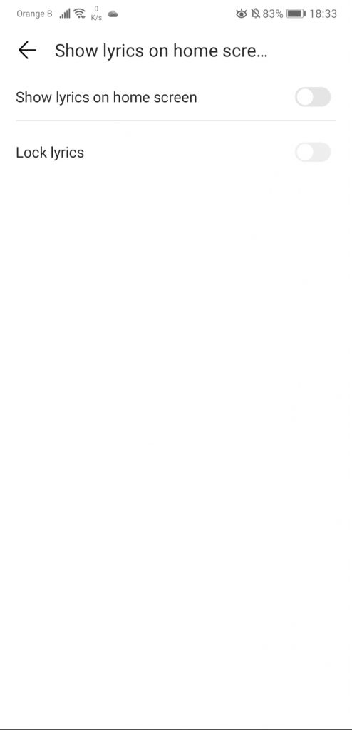
In the settings section, some changes have been made, such as moving the “Filter” to the bottom, or the removal of the option to show lyrics on the home screen. The filter allows users to filter out specific songs that might be under a specific duration, for whichever reason. It is also possible to ignore/deselect specific folders, such as WhatsApp voice messages, so those are not included in the list of “Songs”, as the Music app recognizes as “Songs” anything that is in a sound format (.mp3, etc):
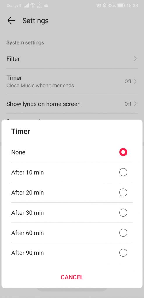
The “Timer” allows users to stop the music after a specific amount of time, although on the new version of the music player, this one seems to be broken, as the list shows nothing, or, more likely, this is once again the dark mode interfering with the application:
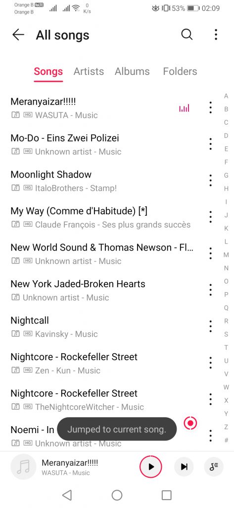
Finally, we also see the addition of a red dot that appears “at random”, which allows users to jump to the current song being played:
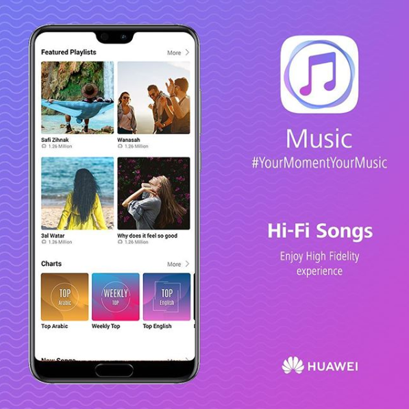
An interesting setting that cannot be enabled is the “Online music service”. While in Europe this service is still not available, Huawei Music works in a similar way to Huawei Video in Spain, Italy or China, with Huawei Music allowing users to play music in a similar way to Spotify. We actually covered the launch of Huawei’s streaming service in the Middle East region last year, in this article. There’s currently no information on when the company plans to bring this service to Europe, although it had been announced during their Developer Conference, in August 2019, that they intended to launch it soon:
The previous version of the music player was 12.0.0.350, with the new one being 12.11.5.322. For the Video application, there are various variants of this one. For instance, under EMUI9.1, the device has the version 8.2.30.306, and EMUI10 comes with 8.3.20.334. Some differences include a slightly redesigned icon, as well as disabling whatever is at the top of the app. Keep in mind that, as previously mentioned, in Spain and Italy, Huawei Video is a video subscription service similar to Netflix, as we’ve covered in a previous article. Please note that we’ve edited the screenshots to hide private information:
This is the end of the second part of this EMUI10 overview. Here are the past and following sections:
More on this subject:
